

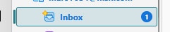
Change color or eliminate highlighted rectangular area
How to get rid of the rectangular highlighted area where ever I click that pops up.
See attached photo.
It is totally annoying!
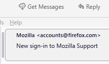
Also do the same for messages that are always surrounded by this rectangular box annoyance.
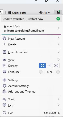
Bring back ability for user to select and change these items from the main menu.
Many support articles refer to "preferences" and "options" but both of those are gone as well at least with 137.0.2 version!
This rectangular box is a total annoyance!!!
All Replies (1)
I see settings on windows in versions 128 and 139, so i assume you have it as well. I much the same place as such things have been located for a number of years now. Prior to option they were options. Although preferences might have made a one version appearance on windows a few years ago. But it is still de jure on other platforms to windows as an entry point for settings. https://kb.mozillazine.org/Menu_differences_in_Windows,_Linux,_and_Mac
These two entry points to settings are what I see.
Prehaps you might find the highlighting in Thunderbird to be less garish if you changed your windows theme to something less garish. The colours and highlights are derived from the windows theme and I can only assume that colourful display is a direct result of that in this instance. Mine looks nothing like that as far as the distracting background colour of the highlight as the two side by side images below demonstrate.
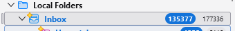 The color blue text signifies the folder contains new unseen unread messages. Bold black folders just have unread messages and non bold black folders have no unread messages.