

Mail folder no longer changes color to indicate a new message
Before FF 78, new mail received would highlight the folder to indicate there was a new message in the folder. With ff78 this no longer happens.
I have more than 40 folders, sometimes with unread messages that I am not ready to get to. But I would at least like to know I received a new message. Upping the unread count doesn't do it for me; I have many folders with unread messages that I leave to process when I get a break.
I don't want to change from Firefox, but if I can find something better, I will.
All Replies (20)
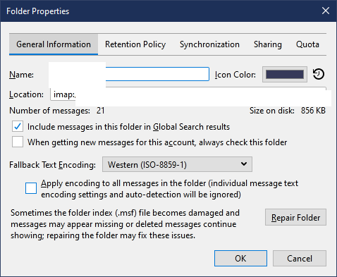
Right-click a folder, Properties. Is the 'When getting new messages...' box checked?
When I looked at the Properties > Folder, there was no "When getting new messages," box. The Properties layout is different. Thank you for answering
Modified by JohnnyBeau
The box isn't necessary for folders like Inbox. See the attached picture for a custom folder.
This is helpful, but I don't have that line in my folders properties. When I get a chance I will get a shot of what I have. Thank you. At least I know there is something that I might be able to fix.
Below, is what my Folder Properties looks like. There is quite a difference.
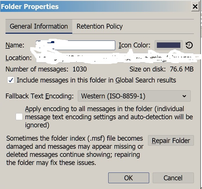
Modified by JohnnyBeau
As far as I understand this is some sort of Thunderbird "design decision" I have the same sort of folder set up as you and although there is a subtle change in the colour of the mail account for unseen messages it is nowhere near as usable as the simple bold or non bold of older versions. Really a very bad upgrade.
hopkingn
I agree on the bad design. Not very well thought out.
Although you said that the folder was made bolder, I remember that the folder or message number was turned blue. I could be wrong, I frequently am.
Anyway, now I have to go looking through folders I don't want to.
Thanks for responding
It could have been that the message number turned blue, to be honest I just remember, like you that it was really clear and now it isn't. A view cluttered with things like padlocks on the mail accounts, presumably to show they are password protected ( incredibly useful feature ;-) ) I have discovered this morning that if I use a dark theme (yuck) the change colour of the mail account is quite obvious, sadly I am not young enough to want a black desktop, but maybe with theming it is possible to get a useful and usable interface. I'll let you know if I find anything.
hopkingn,
Thanks again. I have the same problem with the dark theme. I don't have eyes that are good enough to be able to see clearly with a dark theme. I find that the choices left for me on the internet are fewer than before.
Perhaps there is someone out there who has the same problem and knows how to override software with a cssChrome(sp?) or who sees well enough but is able to see a problem they can fix and help others at the same time.
I'm not optimistic about this since there seem to be only you and me who find this a problem.
Anyway, let's see what happens. And thanks for your replies. They are helpful.
Hi again, so far the best I have managed to find is an addon called "Phoenity Icons" I am now using that with the Thunderbird Light Theme. It puts some colour into the icons and adds a star (a very small one but it is there) for mail accounts that have new mail. The addon has some instructions to also allow changing the icon size, I didn't try that since I was happy with the size. So, best I have so far.
Thank you. I will check Phoenix Icons out. That's good news.
I tried Phoenity Icons, but it doesn't solve my problem. There is no color change when I read in a new email.
I'm glad I dd install Phoenity Icons because they do make for a pleasanter experience.
As I am writing this, I see that I am not using Thunderbird Light Theme. I will check it out.
Firefox used to use the Unvisited Links color for folders that had new mail - made sense, since the mail hadn't been visited by the user. I had mine set to a bright color so I could see them easily. Now, in version 78.4.0, it has a bland blue that can't be changed and is washed out by the bright white background. Why did TB remove this color option when the update added a color option to the static folder icon? While unread mail isn't an "unvisited link", the option to flag unread mail with a chosen color shouldn't just disappear - it should be added as another user input.
Thanks for replying to my query. Although it doesn't solve the problem, it does help to understand what's happening. Because I keep the background bright to see better, I cannot see the change in color. Also, the highlight line frequently blanks out everything underneath.
I've posted a bug report and I'm trying to get the devs to understand the issue. https://bugzilla.mozilla.org/show_bug.cgi?id=1676697
Toad-Hall said
I've posted a bug report and I'm trying to get the devs to understand the issue. https://bugzilla.mozilla.org/show_bug.cgi?id=1676697
I think the old method, of using the Unread Link color, is a great one, because if you can easily read the unused links in your messages - no matter what the color scheme - you can read/see the unread folders as well. Also, since it's user selectable, there's no longer any reason for "this single color works best" arguments. I hope you can get them to pay attention, Toad-Hall!
Has anyone else found that with Thunderbird 78 the file folder icon and the text name of the file folder do seem to change color when new mail is filtered into them via a message filter, but the color change is basically from black to an extremely dark navy, so that it is almost impossible to see the difference. This on the regular setting with a white background.
Under Thunderbird 68, the file folder text would change to a light blue when new messages were filtered in, so it was easy to tell when a particular folder had new mail in it.
To correct his, the only thing whoever set this up for Thunderbird 78 would have to do is change the color indicating new emails from the dark navy text, back to the light blue text.
Does anyone know how to get them to do this?
Otherwise, the only work around appears to be to change the color of the folder icons from black to some other color, e.g. gray, for all those folders that do not have message filters. And change the color of the folder icons for those files with message filters from black to some other color, e.g. red. Then when the new mail comes in, the folder icon color for those with filters changes from e.g. red to that dark navy, so you can tell you have new mail in that folder.
As soon as you click on the folder with the new mail to look at it, the folder icon color goes from dark navy back to red for the next time you Get Messages.
Has anyone else come up with a better work around?
Thanks.
The colors of the folder names for folders with new or unread mail can be set with css:
Thanks for the reply, I read the link, but I don't even know where to start on changing coding. I just need whoever changed the color of the folder name text from the light blue in Thunderbird 68 to the dark navy in Thunderbird 78 to put it back to light blue, so I can tell that the color of the folder name text changed when new emails come into the folder.
Maybe it looks ok on a black background, but on a white background there is so little difference between black and dark navy that I can't tell when new emails come into the folders anymore.
Is nobody using the white background anymore? Did no one check when they made the changes that on the white background the color difference is basically non-existent?
Do you know how I could go about pointing this out to whomever made these changes?
I don't get why they would want to make it so hard for an average user just to tell if they received new emails in a folder. This functionality has been in Thunderbird forever, why would they essentially take it away in Thunderbird 78. I wish I had known before I updated to 78. Anyway, thanks for your help.
I use a simple css code to change the folder name to red if it has unread messages:
/* Change the color of folders with unread messages */

treechildren::-moz-tree-cell-text(hasUnreadMessages-true)
{color: red !important;}
Help/Troubleshooting, Profile Folder, Open Folder, close TB, create a new folder named chrome, create a new document in chrome with a text editor, name it userChrome.css, Save as type: All files *.*, copy in the above code, change the color as desired. Double-click toolkit.legacyUserProfileCustomizations.stylesheets to true in Options/General/Config. editor, restart TB.
sfhowes said
I use a simple css code to change the folder name to red if it has unread messages:/* Change the color of folders with unread messages */ treechildren::-moz-tree-cell-text(hasUnreadMessages-true) {color: red !important;}Help/Troubleshooting, Profile Folder, Open Folder, close TB, create a new folder named chrome, create a new document in chrome with a text editor, name it userChrome.css, Save as type: All files *.*, copy in the above code, change the color as desired. Double-click toolkit.legacyUserProfileCustomizations.stylesheets to true in Options/General/Config. editor, restart TB.
This does not really solve the problem.
As it stands now, folders with unread messages have the number of unread messages at the right. The css will still show that there are unread messages, but will not indicate if there were more emails added to the folder or if the number remains the same; I have over 30 folders and I can't remember what I did or didn't read before. The change of color on the new read is important.
And whoever came up with a black/blue opaque bar to indicate that a folder or email is chosen hasn't a clue what is going on. That bar should be transparent.
For example, if I choose an email to open, it covers up any tag color it may have. I don't have a problem with it, but my wife does; some technology is difficult for her to deal with. Also, I frequently find myself thinking to tag the email, but not knowing at a glance whether it is already tagged or not.
There is a partial solution if you use the addon "Phoenity Icons," It is not a great solution, but it works. It changes the color of the mail icon to red and adds a little red dot that there was mail added. It is small and hard to see and easy to miss if you are rushed. A solution, but not a satisfactory solution.
TB has become less valuable with the new update.