

email with A4 (or Letter), aspect ratio + zoom
I'm looking for a (not so) basic A4 (Letter/Legal/e.a.) margins email sender. We'll, at least the aspect ratios fixed of, for example, an one cell table, sort of like with Print preview already on, with eventual separate notes above or below. For concept document correspondence; why not put the words on a rectangle representation straight away. (A4 ≈ 0.707, close enough.)
The easy way of course (there) is the attachment/Dropbox for people who want more functionality. And, perhaps Google Docs IMAP access to 'Thunderbird wysiwyg pretty accurate css Sent items' is another way; Let's see if I can fix such html browser copy paste snippet.
I'll just kick off with this, and see where I'll get.. http://www.briangrinstead.com/blog/keep-aspect-ratio-with-html-and-css
Speaking of markup a page in this case; I never understood why pure text with a markup section below (like the complete example below), wasn't a good idea though, I even added the option to (auto) respond that these type of messages will be refused and deleted by preference, reason or no reason (just no), in a polite manner, (command,) (auto) accepted (ie. set) by the sender...
{email header}
Dear Sir, Madam,
this word is bold. And perhaps you like this composition:
cdec zGc
M@RKop {or '%markup', indicating start of markup email part}
second word (after salutation part) bold
second paragraph is ABC+ {music typesetting, so it renders correspondingly}
Chosen solution
The Thunderbird support forum is a fairly laid back place WRT user banning and comments. We do draw the line at personal attacks, but we are human and rant to so we tend to be understanding of criticism, or at least try to be.
To add to what Zenos said, the whole reason PDF was invented by Adobe was to produce a portable document that looked like a sheet of paper as the web is not in the least paper centric. They got out a viewer in the first instance
Here in Australia, the legal system has jumped onto the PDF bandwagon and almost all legal filing can be completed using interactive PDF files downloaded from the web. They apparently still use paper for everything so use the most appropriate solution. (In their opinion)
Microsoft battled against the flow and tried to shoe horn Word into the Web. Personally I think their efforts a failure that has made email on step less interchangeable as Outlook users send huge mails with Microsoft Office Binary blobs in them that are meaningless unless the mail is opened in Outlook. The result is that there are more people than ever with the misguided idea that email should have some sort of affinity to paper.
Unfortunately I am old enough to remember the click of a manual typewriter and the mantra of the paperless office. I also worked for many people who saw email as the "new Teletex" and the "new Facsimile machine" and printed everything that ever came into their inbox. Mostly they were buried under a sea of paper that they dutifully took home to read. These people complained a lot about the fact their emails did not translate well to paper. They were also big dictaphone users and as late as the Millennium employed people they called "typists"
- If layout is critical, use PDF.
- If layout is only for a corporate livery, HTML tables will allow letterheads and signatures to be "forced" into particular places on the page and while most companies these days have a "corporate font" it is usually one of the web safe fonts almost everyone has that their web developer convinces them to use. Or their mail looks nothing like they think it does.
- If layout is simply a personal preference everything Zenos has said is correct.
All Replies (13)
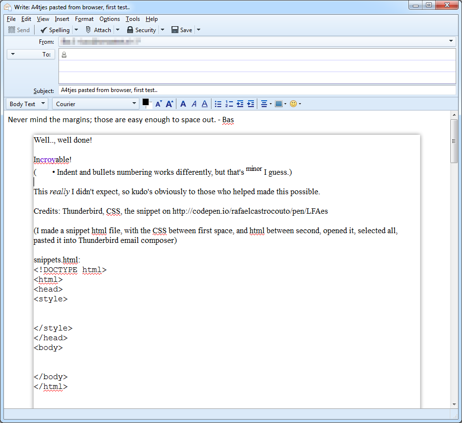
Well, at first attempt, and just a little help from http://codepen.io/rafaelcastrocouto/pen/LFAes I got three pages out of five! (That's another issue, but it's there, one page at least.)
Thunderbird 'no tabs' version 2 displayed an indent, fixing the last three words of the longest sentence on the next line, but that's fair (and not an issue); that's the nature of newer versions, like the uploaded image I posted.
O wait, that's how OperaMail displayed/word wrapped; Thunderbird v2 shows it exacly like I sent it, it just doesn't show the page border. Just (to) say thanks to the Thunderbird developers, and pay tribute!
By the way, please do distribute finances, manage if you will, in the way you see fit; I just see Thunderbird. :)
Have you ever seen or found a "basic A4 (Letter/Legal/e.a.) margins email sender"?
I haven't. I wonder why you imagine one exists.
Hi Zenos,
if I read you correctly, you wonder why I (or anyone) would want that. Or why it would be useful. That it doesn't exist for a reason, even though it's technically passible, but just not useful.
Well, if that's the case and what you're saying, please allow me to elaborate slightly. (Or please skip if I'm mistaken.)
Attaching a document is what we normally do to send something printable, but something displayed inline (like the screenshot) allows for unrestricted and accessable, direct reading. (And not unimportantly, writing.) That just could be enough, for anybody wanting to send an A4 paper representation.
It doesn't have to be PDF accuracy (at first), but it does give a quick rough idea (concept quick design) of something that eventually has to be printed on paper. Those details and exactness can be added later, for example in Google Docs or Onedrive MS Apps, if that's sufficiently featured.
I did try Word App (Onedrive) after I posted my question (I forgot), easy enough to be recommended just for that, but was reminded that I ended up sending a link to the document with my accompanying email in a Microsoft fixed email template. (Off topic: I do like not to have to log in to edit the MS document, but it has to put a warning like Youtube does, that the link is the access key.)
I'd say it's a good idea, fixed like the screenshot, or a fixed aspect ratio (one) table cell. But that's open to discussion.
OK, I have a standard rant which I aim at users who become over precious about fonts, especially when they start using arcane or minority interest fonts in a mail signature. I'll leave out the complete rant right now, but the gist of it is to point out to them that all their hard work may come to naught if their correspondent cannot or chooses not to display their specific mix of fonts, sizes and colours.
On a more general note, I find certain combinations of typefaces, colours and font sizes hard to read. This is a particular grudge I have with recent versions of Windows, where some default colours, grey text on light blue backgrounds in particular are effectively unreadable, and there is no simple or obvious way to change these. Microsoft have apparently decided to abandon certain attempts at accessibility wrt to users' vision. Yes, I know the Windows 7 login splash screen can be set to use a different (and, importantly for me, a darker) background image, but it requires a registry hack to implement this. Hardly user friendly. The route via the registry appear to be there for OEM customization rather than for the average end-user. But I digress.
For this reason, I set Thunderbird and Firefox to use MY choice of fonts and colours, overriding and ignoring what the web page designer or email sender chose. If I recieve an email where the plaintext part says "you need to enable HTML to read this message" then I am very likely to delete it unread. So I for one am not interested in recieving email that tries to look like a sheet of A4 paper. I will want your text to be shown to me in a font and colour and size that suit me and my eyesight, and this may well not be compatible with it wrapping to whatever width is dictated by it trying to look like A4 paper. Yes, I can reach for my reading specs, but I am still likely to consider if that's more bother than it's worth to read a message from an inconsiderate sender. And if your layout forces me to scroll left and right to read the whole line, then it would very quickly be copy and pasted to an alternative environment where MY preferences are honoured.
Web browsers are notoriously bad at printing web pages well. They tend to split pages arbitrarily and often split images and tables over page boundaries. Designers of web pages know the pain of checking their work in multiple browsers at multiple resolutions, and on various platforms to ensure their work remains acceptable, as far as is possible.
So, I view your efforts as an interesting but misguided effort, since HTML shows itself to be very bad at handling the transition to paper. The markup is designed to be flexible, to re-wrap to suit screen width, letter widths and screen resolution. It does not aspire to be WYSIWYG and all of this means that it simply cannot be relied upon to deliver the required result.
Between consenting adults, you may get it to work, if both parties, you and your correspondent, accept certain limitations; you agree to work with a limited set of fonts (available on both sender and recipient machines) and a restricted set of screen sizes and resolutions. As a general solution, in a world where email may be read on desktop screens, phones, tablets, projectors, any approch reliant on paper size and point sizes is doomed to failure.
Left to itself, HTML can do an acceptable job if all text is set at "normal" size and it is allowed to re-wrap to suit the reader's display. Forcing line lengths and text sizes on your recipients is contrary to the intended use of HTML in general, eand email in particular.
I wish you luck, but IMHO you're swimming against the flow.
Thank you Zenos, *you make an excellent case. Just to beat someone to it; fonts can be linked from online fonts (even though that was not your point), and CSS cán specify the look in measurements, but obviously, as you stated, (just) not to make it unreadable or impractical.
I do respect your view, and, I think it's a very good reason for the Thunderbird hero's (**programmers, designers, support e.a.) to make it see the light.
Thank you for your clear view; it's actually very motivating, for me in what I can achieve, and I'm just a cloudy writer. ;) I already made my point, and the moderator allowed it to stay.
Thanks again, for my purpose* I would click 'Mark it as solved', (you make an excellent case, and I'm indeed not powerful enough to lead the task,) but not yet.
I'm more of a word artist "comp lead", and honestly, I hope this tread will go your way. So I'd better 'create some room' for the experts** to be able to have their say, on a clear clean sheet.
Good thing to add though in that markup section (I proposed) as a specific request. Thank you for your specific request, granted, which is very clear word for a puzzler type such as myself.
Chosen Solution
The Thunderbird support forum is a fairly laid back place WRT user banning and comments. We do draw the line at personal attacks, but we are human and rant to so we tend to be understanding of criticism, or at least try to be.
To add to what Zenos said, the whole reason PDF was invented by Adobe was to produce a portable document that looked like a sheet of paper as the web is not in the least paper centric. They got out a viewer in the first instance
Here in Australia, the legal system has jumped onto the PDF bandwagon and almost all legal filing can be completed using interactive PDF files downloaded from the web. They apparently still use paper for everything so use the most appropriate solution. (In their opinion)
Microsoft battled against the flow and tried to shoe horn Word into the Web. Personally I think their efforts a failure that has made email on step less interchangeable as Outlook users send huge mails with Microsoft Office Binary blobs in them that are meaningless unless the mail is opened in Outlook. The result is that there are more people than ever with the misguided idea that email should have some sort of affinity to paper.
Unfortunately I am old enough to remember the click of a manual typewriter and the mantra of the paperless office. I also worked for many people who saw email as the "new Teletex" and the "new Facsimile machine" and printed everything that ever came into their inbox. Mostly they were buried under a sea of paper that they dutifully took home to read. These people complained a lot about the fact their emails did not translate well to paper. They were also big dictaphone users and as late as the Millennium employed people they called "typists"
- If layout is critical, use PDF.
- If layout is only for a corporate livery, HTML tables will allow letterheads and signatures to be "forced" into particular places on the page and while most companies these days have a "corporate font" it is usually one of the web safe fonts almost everyone has that their web developer convinces them to use. Or their mail looks nothing like they think it does.
- If layout is simply a personal preference everything Zenos has said is correct.
It's very natural to type like on a typewriter, and it's actually a gift, to try to use paper as a natural source. It can be undone with for example WindowsUtilities.com's Unwrap (v2.1), but it should also be detectable, close to the right border, and lots of carriage returns. That is, detectable by a friendly receiver. But for me it's definitely OK if I cannot convince them to write on (past the cliff); I'll just provide them with an informed 'max-width' snippet if they want to write columns. Which is good enough for me :)
If someone would send a document as an attachment, there is an added advantage to this method because the zoom function works perfectly to enlarge all text to fill out the page (to see what works), while keeping the paper pixel dimensions unchanged (793x1123). Of course the paper width should be able to fit, but perhaps that could be done with a graphics zoom if the sender hasn't done this already.
Printing this A4 email part, for which it is intended, is not (yet) easy to do, but I can get the table width right right away pasted in MS Word and LibreOffice Writer, setting the left margin to zero. And I can get a backdrop screenshot to work on the supplied rough concept.
Here's the template 'A4tjes, whole page - one A4.html': https://onedrive.live.com/redir?resid=89B67DE249C754FF!180&authkey=!API6RsGgqtxtfag&ithint=folder%2chtml
I didn't go all this way though; I got a concept text from someone, text only (albeit with a little of HTML), saying that perhaps I could help get it on paper, resorting to Word or Writer (Word in this case), and came up with the PDF file: 'Beste leden (FV's KBO gedichtje).pdf'
It's a Dutch Santa rhyme (hopefully with some piggy rhythm), for a organisation lead by and for our valued (and mostly gray/silver) senior citizens. For sending such attachments, this would have some potential as an viable practical and approachable alternative.
But still, readability does have my priority (it was also a condition for this font), so I hope Zenos we're able to keep, and I concur. I'll try to concur, that should be easy enough. It's about on-screen access after all!)
I believe Verdana and Tahoma.., wait, I'm mistaken. Well, at least I remember Verdana (Windows standard) is one of the best readable fonts (they say), which is important to get an (important and relevant) message accross, but I'm still keeping an eye out for fonts with 'a zero with a /', and distinguishable liLI1 string.
I think we're going the right way (which can't be deleted;). Perhaps one tip then; non-capital sensitive numbers should probably be with letter and number differences in height, and then there's lots more tips posted on the web, so ones more I think I have to resign. :)
I do a fair amount of my computing on Linux and Android, where neither Verdana nor Tahoma can be found. Just pointing out some of the unconscious assumptions behind your thinking. ;-)
That's a good point Zenos, and as for Linux, I hope they'll create fonts with attraction points as well! Serving as fonts, there is always room for improvement. In the meantime I'll have to check on some good Linux fonts. Thanks for straightening me out. (I'm actually curious, so I'll check it out soon.)
reasonable article on what is safe here http://forbrains.co.uk/web_safe_fonts/web_safe_fonts
But I must point out another assumption. That A4 can be described in pixels. It can be approximated, but not really defined. I tried in the early 80s using canons CAPSL language to define it for one of their printers. It was not pretty.
Generally 1 millimeter = 3.779527559055 pixel but printing in windows is done in points and points as an American invention so are described as 1⁄72 of an inch (25.4⁄72 mm = 0.3527 mm) but 1 point equals to 0.35 to 0.38 mm depending on the country. Result, something of a mess
BTW The only true definition of A4 is 297 X 210MM as ISO 216 defines it as such.
Yes, I winced myself at the notion of describing A4 in pixels. Here, I am looking at Windows 7 displayed on a laptop's built-in screen, about 15.5", and a separate nominal 23" monitor, using the extended display feature.
Both displays have a declared resolution of 1920 x 1080 so are the same "size" as far as pixels are concerned. However the built-in display must have smaller pixel pitch in order to display the same number of pixels in only 46.5% of the space (measured as its area) provided by the larger monitor. Unless the display drivers take this into account (and they clearly don't), they cannot render A4 (as an absolute size) accurately.
To the OP: Please consider; any attempt to force the display to some given size will annoy at least some of your readership, as there is a great risk of the text being too small (on a high-res display) or loo large and requiring left-to-right scrolling on smaller or lower-spec displays. Left to itself, regular html will fit things to the display, at the font size the user has set for himself, which is an important factor for those with poor eyesight. It's the way it is for good reason.
Don't you ever become frustrated by webpages that use fixed widths which have clearly been designed for a higher resolution than your screen offers? Graphic artists and web page designers who prefer "cool" over "usability" have a lot to answer for. ;-)
Modified by Zenos
Thank you for all the information. I have put a rough draft A4 template to be able to easily communicate the layout (vertical ratio is about 141%, portrait), the table can then be copied (by the receiver) to a text document processor. Or the receiver can just provide a link to an empty 'Google Docs Document' / 'online version of MS Word' document beforehand, for the sender to fill it in. No logon required; the link is the key. (Cool! Or both, whichever is easier, with some notes possibly.) So I ought to be very content with that.
Included a landscape approx A4, and a Brother laser printer I know has a 3mm margin printer space, so the smallest (A6) should have about 4mm, though slightly bugged :)
Good to know the preferences, requirements and wishes, and I'll note the fonts that is used by others coming my way. (Not sure though if Thunderbird mentions a font substitute, moreover I have to respect if a font is not to be copied so I can use it. Maybe a subset embedded in PDFs, for that particular document..)
Edit: I wasn't able to combine the max-width template with the A4 template, so a preferred max width of 700 or 800 applies to the width of the latter, roughly corresponding with the default 78 character wrap of (fixed width font) plain text emails. Well I generally make my screenshots/images 800px width (80% quality jpegs), to be included inline, mainly for optimum filesize bandwidth, because nowaydays large images are resized to fit the viewport, unless restricted in design.
Modified by bass7
Stepping multiple nice css paper templates aside;
I have for you a recent tweaked "best readability font/column" template (he's an acquaintance / accomplis of mine), which you can copy and paste, and duplicate if you want it in case I might change it. Tested on several email clients.
It only needs a default Linux screenfont, I suggest to put it in front of 'Trebuchet MS' (so the Linux font is choosen first), which I have chosen (and liked soon after) as suggested by Rachel McAlpine of webpagecontent.com (dated 2008), suggesting these three (Windows standard) readability fonts: Verdana, 'Trebuchet MS', and serif Georgia.
One note to mention is that the width expands to 100% viewport (ie. window), if this part is taken out: border-bottom:1px solid #fff; border-left:1px solid #fff; border-top:1px solid transparent; (Only in Thunderbird 'sent items' though, and, I did not test or investigate further, or cleaned the code for that matter. I wonder if a 'garbage' tool exists to log what code is used and what not (yet). But that aside.)
Perhaps still; an auto-zoom function might be handy, when focused on tiny(er) font, the zoom level compensates to same size fonts.. useful perhaps, or maybe just fun. Thanks! And er, to good designed emails, it's 2015 after all! Thumbs up!