

Non-selected Tabs - Highlight on Hover
I'd like to highlight a non-selected tab when hovering the mouse over it.
I've tried this code in userChrome.css, but it has no effect...
  .tab-background:not([selected]):hover { /* highlight on mouseover */
     background-color: #dbe3eb !important;
  }
Is this method correct, or is there a better way?
Thanks!
Modified by Slouch
Chosen solution
By chance, I tried the following, and it works...
#TabsToolbar .tabs-newtab-button:hover {
    background-color: #dbe3eb !important;
}

.tabs-newtab-button:hover .toolbarbutton-icon {
   background-color: #dbe3eb !important;
}
Didn't need the not([selected]) attribute, so I removed that as well.
Thank you :)
Read this answer in context 👍 0All Replies (5)
Does this code in userChrome.css wor for you?
@namespace url("http://www.mozilla.org/keymaster/gatekeeper/there.is.only.xul"); /* only needed once */

.tabbrowser-tab:not([selected]):hover .tab-content { /* highlight on mouseover */
   background-color: #dbe3eb !important;
}
Modified by cor-el
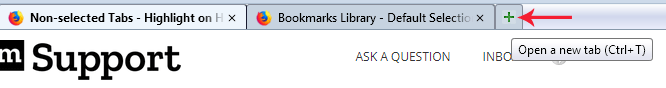
Yes, that does work, however it breaks my "Open a new tab" button, which no longer highlights on mouseover (only the '+' sign icon highlights, not the background of the button).
My code appears below yours. Without your code, the entire "Open a new tab" button highlights correctly.
.tabbrowser-tab:not([selected]):hover .tab-content { /* highlight non-selected tabs on mouseover */
   background-color: #dbe3eb !important;
}

#TabsToolbar .tabs-newtab-button {
  border-top: var(--classic_squared_tabs-border_size) solid var(--classic_squared_tabs-border2) !important;
  border-left: var(--classic_squared_tabs-border_size) solid var(--classic_squared_tabs-border2) !important;
  border-right: var(--classic_squared_tabs-border_size) solid var(--classic_squared_tabs-border2) !important;
  border-top-left-radius: var(--classic_squared_tabs-border-radius) !important;
  border-top-right-radius: var(--classic_squared_tabs-border-radius) !important;
  min-width: 0px !important;
  width: 28px !important;
  margin-bottom: 0px !important;
  border-color: #868b98 !important;
}

.tabs-newtab-button .toolbarbutton-icon {
 min-width: 0px !important;
 min-height: 0px !important;
 width: 14px !important;
 height: 14px !important;
 margin: 0px !important;
 margin-bottom: 0px !important;
 padding: 0px !important;
 box-shadow: unset !important;
}
Modified by Slouch
I think that this has more to do with background: unset !important; When I remove this rule then at least I get some change on hover, but it is only a small box with your code.
Yes, I took the background: unset line out, and now only the '+' icon is highlighted on mouseover.
Is there a way to have the entire button highlighted?
Modified by Slouch
Chosen Solution
By chance, I tried the following, and it works...
#TabsToolbar .tabs-newtab-button:hover {
    background-color: #dbe3eb !important;
}

.tabs-newtab-button:hover .toolbarbutton-icon {
   background-color: #dbe3eb !important;
}
Didn't need the not([selected]) attribute, so I removed that as well.
Thank you :)
Modified by Slouch