

Double icons on Stop & Reload buttons when using custom icons
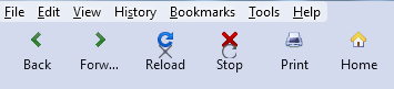
When reloading a page, or navigating to a new page, the default Stop icon momentarily appears over my own Reload icon, and the default Reload icon also appears over my Stop icon.
Please see attached image and animation.
Any idea if this is a minor bug?
Below is my code to split the Reload button into Reload & Stop buttons, then to add text to the navigation buttons, and finally to add icons to the navigation buttons.
This anomaly happens whether or not I split the Reload & Stop buttons. With just a single Reload button, I'm also seeing the default Reload icon appear over my own.
Thank you.
/* ---------- SPLIT RELOAD BUTTON INTO RELOAD & STOP ------------- */
#reload-button, #stop-button {
   display: inherit !important;
}
#reload-button > .toolbarbutton-icon {
  -moz-appearance: none !important;
}
/* ------------ ADD TEXT LABELS TO NAVIGATION TOOLBAR BUTTONS --------------- */
/* Shows both icon and label for toolbarbuttons */
toolbar .toolbarbutton-1[label]{
  flex-direction: column;
  align-items: center !important;
}
toolbar .toolbarbutton-1[label]:not([disabled]):hover{ background-color: var(--toolbarbutton-hover-background) !important; }
toolbar .toolbarbutton-1[label] > .toolbarbutton-icon,
toolbar .toolbarbutton-1[label] > .toolbarbutton-badge-stack{
  padding: var(--toolbarbutton-inner-padding) !important;
  padding-bottom: 0px !important;
  height: calc(var(--toolbarbutton-inner-padding) + 16px) !important;
  border: none !important;
  background-color: transparent !important;
  box-shadow: none !important;
}
toolbar .toolbarbutton-1[label] > .toolbarbutton-text {
  display: flex !important;
  min-height: 16px !important;
  padding-top: 3px !important;
  padding-bottom: 6px !important;
  background-color: transparent !important;
  overflow: hidden;
  width: 9ch; /* changes space between buttons */
}
toolbar .toolbarbutton-1[label] > .toolbarbutton-text::before{
  margin-inline: auto;
 }
:root:not([uidensity="compact"]) toolbar .toolbarbutton-1[label] > .toolbarbutton-text{ padding: 2px !important; }
/* ------------ ADD CUSTOM ICONS TO NAVIGATION TOOLBAR BUTTONS ----------- */
#back-button {
   list-style-image: url("image/back.png") !important;
   padding-top: 8px !important;
}
#back-button image{
   max-height: 16px !important;
   max-width: 16px !important;
   padding: 0px !important;
   margin-bottom: 3px !important;
}
#forward-button {
   list-style-image: url("image/forward.png") !important;
   padding-top: 8px !important;
}
#forward-button image{
   max-height: 16px !important;
   max-width: 16px !important;
   padding: 0px !important;
   margin-bottom: 3px !important;
}
#reload-button {
   list-style-image: url("image/reload.png") !important;
   padding-top: 8px !important;
}
#reload-button image{
   max-height: 16px !important;
   max-width: 16px !important;
   padding: 0px !important;
   margin-bottom: 3px !important;
}
#stop-button {
   list-style-image: url("image/stop.png") !important;
   padding-top: 8px !important;
}
#stop-button image{
   max-height: 16px !important;
   max-width: 16px !important;
   padding: 0px !important;
   margin-bottom: 3px !important;
}
#print-button {
   list-style-image: url("image/print.png") !important;
   padding-top: 8px !important;
}
#print-button image{
   max-height: 16px !important;
   max-width: 16px !important;
   padding: 0px !important;
   margin-bottom: 3px !important;
}
#home-button {
   list-style-image: url("image/home.png") !important;
   padding-top: 8px !important;
}
#home-button image{
   max-height: 16px !important;
   max-width: 16px !important;
   padding: 0px !important;
   margin-bottom: 3px !important;
}
Được chỉnh sửa bởi Slouch vào
Giải pháp được chọn
I tried this, but still see the default icons overlaying mine...
#reload-button, #stop-button {
   display: flex !important;
   background-image: url("image/home.png") !important;
}
However, the following 2 statements seem to work. Are they acceptable form?
#stop-reload-button[animate] > #reload-button > .toolbarbutton-animatable-box > .toolbarbutton-animatable-image {
   background-image: none !important;
}
#stop-reload-button[animate] > #reload-button[displaystop] + #stop-button > .toolbarbutton-animatable-box > .toolbarbutton-animatable-image {
   background-image: none !important;
}
Đọc câu trả lời này trong ngữ cảnh
👍 0
Tất cả các câu trả lời (4)
The Stop and Reload buttons use a background-image.
/* Separate Stop/Reload buttons */
#reload-button, #stop-button {display:flex !important}
I made the following change, but I'm still seeing the default icons overlaying mine.
#reload-button, #stop-button {
   /* display: inherit !important; */
   display: flex !important;
   background-image: none !important;
}
You need to use this rule:
background-image: url("image/home.png") !important;
Giải pháp được chọn
I tried this, but still see the default icons overlaying mine...
#reload-button, #stop-button {
   display: flex !important;
   background-image: url("image/home.png") !important;
}
However, the following 2 statements seem to work. Are they acceptable form?
#stop-reload-button[animate] > #reload-button > .toolbarbutton-animatable-box > .toolbarbutton-animatable-image {
   background-image: none !important;
}
#stop-reload-button[animate] > #reload-button[displaystop] + #stop-button > .toolbarbutton-animatable-box > .toolbarbutton-animatable-image {
   background-image: none !important;
}
Được chỉnh sửa bởi Slouch vào