How do I get rid of forbidden space on FF toolbars?
I have a space saving need on my small letterbox screen so I try to keep the FF toolbar area as narrow as possible. I use quite a number of add ons in order to do this, and use the Developer edition to make it easier to control.
The customisation panel/options is not very helpful in this (I hate the layout and lack of controls that have been in the customisation panel for the last dozen or so 'upgrades'.), but I've gradually managed to get the top of the screen looking good.
Unfortunately, the toolbar area does not seem to be very stable, and there is a double arrow at the right end of the navigation bar that is a real pain. This double arrow is not always there, so I can arrange all my icons nicely in customise, only to have several of them pushed off the side of the toolbar, when I go back to normal view.
Reading around these threads, I eventually found out about the navigation box and search box being set to take up the nav bar when on it together. There were instructions for writing a Chrome css file to get the search boxes down to a fixed size. I tried this, and got the boxes to a useful size, but, unfortunately, the rest of the toolbar still behaves as if the space was not freed up. :/
The toolbars area seems very temperamental, and seems to allow arrangement of its elements sometimes, but not others. Juggling with where to put the nave box and search box, I did find an arrangement that let me use all the space for my icons, but, minimise and maximise, and the unnecessary double arrow thing, pushes three or four icons off the end, and introduces forbidden space as if the search box and nav box are still taking up the old space even though they appear to be reduced in size. :/
Can anyone give me another tweak to get rid of the 'forbidden space' and double arrow behaviour, so that I can get everything neatly into my preferred two rows. I think I've got the FF layout pretty near perfect for my set up: if only I had control over this annoying space wasting function.
I'll add snips of the toolbar area in customisation and full screen modes. As you can see, there is 7cm of navbar that it simply will not let me use.
Many thanks for any help in getting this space back for me.


All Replies (13)
Easiest to get more space on the Navigation Toolbar is to move the search bar and other items that you do not use frequently to the "3-bar" Firefox menu button drop-down list. Then you can still access it fairly easy and it doesn't take space on the Navigation Toolbar.
As you can see from my snips, I rarely use the 3 bar menu button, and have replaced it with the proper old Firefox button. There are also difficulties with making the 3 bar button stay where I put it. The layout you can see in my snips is the best, and most convenient I've been able to make. It has all the functions I use frequently on it, in good positions. The only irritation, is the way FF pushes icons off the side even though there is still plenty of room on the toolbar.
What controls the space that the double arrow 'sterilizes'? Why is this space not adjustable in the customise view? I want to take the double arrow off the toolbar and allow icons to use up all the space. This should be an obvious customising option. :(
"What controls the space that the double arrow 'sterilizes'?" I think that is caused by the "slider" or "resizer" element that allows to the width of the Location Bar and the adjacent Search Bar to be inversely sized by using the <-> "button" that appears on hover. That "button" doesn't appear when the Location Bar and Search Bar are moved away from each other.
I have had massive problems since Australis landed in Firefox 29, with my customization of the UI Toolbar area, which includes separating the Location Bar and the Search Bar with either a toolbar button or the "Bookmarks Toolbar Items" which is only one un-named folder that contains over 200 bookmarklets. That customization worked fine from from the days of Phoenix up thru the Firefox 28 versions; although as of Firefox 4.0 I did have to change what I was doing a bit.
The "fix", which is a bit flaky at times when switching the browser window from "Maximized" to "Restore Down", involves "locking" the Location Bar and the Search Bar to a fixed size, thus eliminating the "auto-expand to fill the available space" or "flex" properties those two elements have when sitting nest to each other. Separating them to different toolbars does not remove the negative effects of the "flex".
I use this code in a userChrome.css file to specify the exact size of both the Location Bar and the Search Bar; completely overriding the "slider"/"resizer" effects.
#urlbar-container {max-width:1050px!important}
#search-container {max-width:200px!important}
Change the 1050 and 200 numbers to set the sizes that you want.
Hopefully that will solve that particular problem.
"Why is this space not adjustable in the customise view?" The "slider"/"resizer" element that allows to the width of the Location Bar and the adjacent Search Bar to be inversely sized by using the <-> "button" that appears on cursor hover is a hidden element that has never appeared in the Customize mode, even in the old pre-Australis days. But with Australis that "slider"/"resizer" element produces undesired side effects such as what I have mentioned and as you are experiencing. I get that >> a lot easier now than I ever did before Firefox 29, when customizing the UI.
IOW, user customization capabilities have been reduced, and a different approach is needed to keep that double-arrow (ellipsis) seems to be triggered by the separation or the moving of the either the Location Bar and/or the Search Bar, which forces an overflow condition resulting in a gap or space in usable space and the appearance of the ellipsis.
What I posted above probably went right over your head. Bottom line is that what you are trying to do just isn't going to work the way you want it to. If that is how you want your toolbar are set up save yourself a lot of time and install the Classic Theme Restorer extension that is close to having the old features that would allow you to do what you want to do with the toolbars.
cor-el mentioned the 3-bar button and the Menu Panel drop-down, please consider using that for your least used toolbar buttons and forfet trying to force Firefox into doing what you want it to do. See the screenshot I posted which shows what I have done with the Menu Panel.
Similar User Style that uses smaller icons is available here for use with Stylish - https://userstyles.org/styles/97314/australis-menu-list-view
I used that for UserStyle that I created for my own use and with the extensions that I routinely use. It doesn't "translate well" for most people who use a different mix of extensions that may not use "current spec" toolbar buttons. There seems to be like 3 or 4 different sets of coding styles used to create toolbar buttons for add-on extensions from Firefox 1.0 up thru Firefox 29 Australis. Some real old extensions that have been updated still use the original type of coding, which can produce inconsistencies in display in the menu panel when "blanket" modifications are added via UserStyles or userChrome.css code. I have to tweak my code sometimes when I add an extension.
Sorry for the length of this message, but what you are doing and trying to accomplish reminds me of what I was going thru back in the days right after Firefox 4.0 was released. Firefox 29 Australis didn't bother me as much because I just learned to "go with the flow" and not fight with what Firefox had done. IOW, work with what's there and not try to do the exact same UI mods that I had been doing for 10 years or so.
Further development:
See new snip of toolbar area. I was just using a cmd prompt to get a new ip address, and, was surprised to find that after I closed the cmd window, 4 icons that had been beyond the double arrow, had relocated to join the other toolbar icons, and a clear box like a search box had appeared between the icons and the arrows!?
If I click the arrows to see what is still beyond the end of the toolbar, a narrow dropdown box appears with nothing in it?
What on Earth is going on? It does look better like this, but I doubt very much if it will stay like it for long! :)

Where did you put the real search bar that in a previous screenshot showed on the Tab bar?
I assume that this is not the bar that shows at the right end of the location bar?
Note that you can sometimes force Firefox to reposition icons by temporarily switching Full Screen mode on/off.
Thanks for taking the time to give a detailed reply Edmeister! (y)
I too hung on to FF28 as long as I dared; and, if Mozilla would only separate the security updates from the style updates, I would still be using it! I wish they would stop doing all these style 'updates' because they nearly always result in more wasted space and less user control. :(
I read an earlier post on a similar topic, and had already made a similar css file to the one you have made. I wasn't entirely clear how much of the text in that earlier post had to be in the css file (I know very little about them), so my file looks like this:
@namespace url("http://www.mozilla.org/keymaster/gatekeeper/there.is.only.xul");
- urlbar-container { max-width: 400px !important; }
- search-container { max-width: 200px !important; }
This was a completely new Chrome file, as there wasn't a folder for it in my profile.
Do I not need the url part? [Sorry I don't know how to paste it as text here. I've not followed the link myself. I see FF has converted my hashes to numbers too. :/ ]
I don't need the full 1050 that you've allowed in the address bar, and find the 400, suggested in the earlier post, just about right.
I had not seen your post when I put in the update with the new snip, so these comments may seem a little out of sequence, but it rather looks as though the white box that has appeared behind the » might be a flexible space that was hidden before, due to the dodgy behaviour of the post FF28 customisation panel. (I wish, for example, I could get the mini window size controls in the corner of Thunderbird windows, like I have here in FF. The std ones are such space hogs, but the small ones don't appear in the customisation panels any more, and I only manage to keep them by copying my old profiles forward all the time with FEBE.)
I'm tempted to try customising again, while this new box is still there, but I expect it will vanish again, and I don't want to push my luck! :) I'll save a FEBE copy of it like this, but even FEBE doesn't always manage to get a restore exactly the same. FEBE is my life saver, many times over!
I already use Classic Theme Restorer and 'Hide Caption Titlebar Plus' to get the toolbar and tabs area as narrow as possible. They are two more brilliant add ons that I'd be lost without.
As it happens, your comment just prompted me to look at the add ons window, and, I find that CTR has just updated and is waiting for me to restart. I guess it must have been CTR that made the new white space appear. I'm sure the CTR writer could fix this little glitch, as he really seems to appreciate how to get the best out of the customising possibilities. I rather expect, that, when I do reload FF, my new space will be gone again, but it looks great right now!
I don't really see any advantage in using the three bar drop down. I have the icons that I use on view because I forget to use them when I don't see them regularly, and I also like to see that they are still there, and haven't disappeared after 'updates', as is often the case. The » dropdown itself, shows me the missing icons in any case, so the three bars box seems to have no logical use at all. [Australis, is pretty much a waste of space all round. I don't understand why Mozilla suddenly decided to make it's brilliant browser look just the same as all the other space hog ones. Why does anyone want a browser that looks like an ancient tab card drawer: I got a computer to get away from those?!]
Even on the new style you link to, there is just pointless waste of space: why does anyone need huge 'cut, copy, paste, - , 100%, and '+', in the box at all? I always copy and paste with right click or keyboard, and I have No Squint Plus, and miniature + and - buttons on my add on bar, along with go to top and bottom arrows, and the whole lot takes up less than a quarter of the space wasted in the pointless three bars box.
I can understand your not wanting to have to fight the FF changes, but, I've got them down to quite a fine art now, and FEBE has enabled me keep things looking trim without having to be continually resetting my add ons. It was only recent additions of an extra couple of security tweak add ons, who's buttons failed to appear, that made the problem come to light, and led me to shorten the address and search boxes as per your css tweaks.
I understand that big coding and permission changes are under way, and that some of my add on makers are packing up within the next few 'updates'. I will make the most of my layout until then. It's taken me years to get it the way I like it, and all other browses look very crude and childish, in comparison.
Thanks very much for explaining a bit more about how it all works. (y)
SteveH
Okulungisiwe ngu Spamlet
1, The line - @namespace url("http://www.mozilla.org/keymaster/gatekeeper/there.is.only.xul"); - is necessary at the beginning of the userChrome.css file. This support article explains the creation and usage of that "user file". http://kb.mozillazine.org/UserChrome.css
2. Your 3rd screenshot doesn't show the Search Bar, whereas the first 2 did on the lower toolbar.
I you removed the Search Bar, that blank box "box" in the upper toolbar might be due to the Search Bar code of#search-container {max-width:200px!important}If you have removed the Search Bar this code might solve your problem
#search-container {display: none !important} IOW, don't "tell" Firefox what size that you want the "search-container" to be, "tell" Firefox that you don't want the "search-container" to be shown at all. Using the "max-width" line might confuse the situation, especially with now knowing that CTR is installed.
And as far as the CTR developer trying to fix that minor glitch; I would consider it an "edge case" given the manner that you have customized to toolbars. Plus the Aris, the CTR developer, has already written an early epitaph for CTR for being DOA with Firefox 57.
3. Also, it is possible that CTR has created that glitch. I didn't address that as a possibility before as you neglected to post Installed Extensions information in the initial posting and it never entered my mind as a potential cause, which what prompted me to bring up that extension as a potential "fix".
You can check the browser.uiCustomization.state pref to see what items are popsitioned on each toolbar. The value of this pref is in JSON format and for better readability you can paste the text in the Scratchpad and click the "Pretty Print" button.
You can open the about:config page via the location/address bar. You can accept the warning and click "I'll be careful" to continue.
cor-el said
Where did you put the real search bar that in a previous screenshot showed on the Tab bar? I assume that this is not the bar that shows at the right end of the location bar? Note that you can sometimes force Firefox to reposition icons by temporarily switching Full Screen mode on/off.
Thanks Cor-el: The searchbox is still on the tab bar in that snip. It just has a search text in it so you think it's a tab.
Yes: I've notice that I can often juggle the unstable behaviour with changes to the window size. There is also the effect that few people probably notice, of the first window one opens, being 'dominant', so that changes (like FEBE back ups) one makes in a second window, look good, but don't actually save.
the-edmeister said
1, The line - @namespace url("http://www.mozilla.org/keymaster/gatekeeper/there.is.only.xul"); - is necessary at the beginning of the userChrome.css file. This support article explains the creation and usage of that "user file". http://kb.mozillazine.org/UserChrome.css 2. Your 3rd screenshot doesn't show the Search Bar, whereas the first 2 did on the lower toolbar. I you removed the Search Bar, that blank box "box" in the upper toolbar might be due to the Search Bar code of#search-container {max-width:200px!important}If you have removed the Search Bar this code might solve your problem
#search-container {display: none !important}IOW, don't "tell" Firefox what size that you want the "search-container" to be, "tell" Firefox that you don't want the "search-container" to be shown at all. Using the "max-width" line might confuse the situation, especially with now knowing that CTR is installed.
And as far as the CTR developer trying to fix that minor glitch; I would consider it an "edge case" given the manner that you have customized to toolbars. Plus the Aris, the CTR developer, has already written an early epitaph for CTR for being DOA with Firefox 57.
3. Also, it is possible that CTR has created that glitch. I didn't address that as a possibility before as you neglected to post Installed Extensions information in the initial posting and it never entered my mind as a potential cause, which what prompted me to bring up that extension as a potential "fix".
Thanks again for the extra info Edmeister. Apologies for the break in communication.
The search box wasn't removed: it just looks like a tab when it has writing in.
Things can get a bit fiddly, because in normal view, the tabs are pushed over to the left, but in customisation view they are pushed to the right for some reason. This makes any positioning a hit and miss affair.
After my last post, I noticed that the bars changed on their own again, and the nav bar gained a small, 'flexible space' marker where the double arrow had been. I thought that, maybe this was meant to be outside the nav and search box combination, so dragged it down to the right end of the tabs bar, as in the first snip below. At first, I didn't think that that had had much effect, but, when I opened FF today, I found that I had space at the end of the nav bar *without* the double arrow, even on a reduced sized window! This gave me the opportunity to put the search box back on the right side of the nav bar. Which is perfect! :) See second snip below.
However, in rather a repeat of my tests the other day, I notice that my add ons list tells me that CTR has updated again, and is waiting for me to restart. I rather expect that when I do restart, the double arrow will come back... But feast your eyes on the ideal appearance, while you can! :)
Even with these little glitches, I think that the CTR developer has been doing an excellent job, and Mozilla will be much the worse for losing him and his fine customising tool when it careers on with its insanely frequent meddling with FF appearance and reducing of user control. I will certainly be hanging on to this current style, I have, for as absolutely long as I can.


cor-el said
You can check the browser.uiCustomization.state pref to see what items are popsitioned on each toolbar. The value of this pref is in JSON format and for better readability you can paste the text in the Scratchpad and click the "Pretty Print" button. You can open the about:config page via the location/address bar. You can accept the warning and click "I'll be careful" to continue.
Thanks for the reminder Cor-el. I don't know about a 'Scratchpad', but I paste into notepad to get a bit of an easier view. It is still a rather confusing jumble though, as the controls don't follow their order on the toolbars, and it doesn't include the sizes or 'can grow/shrink' etc. I only rarely try to tinker with it, but, as you say, it does let me see if there is any control that the toolbar is hiding.
As noted to Edmeister, the toolbars have let me position the controls just right today. I think this may follow another CTR update, but it wants me to restart, and I bet that spoils it again! :)
Thank you both for helping me understand what is going on. (y)
There are items with a flex attribute and likely one of them causes the free space.
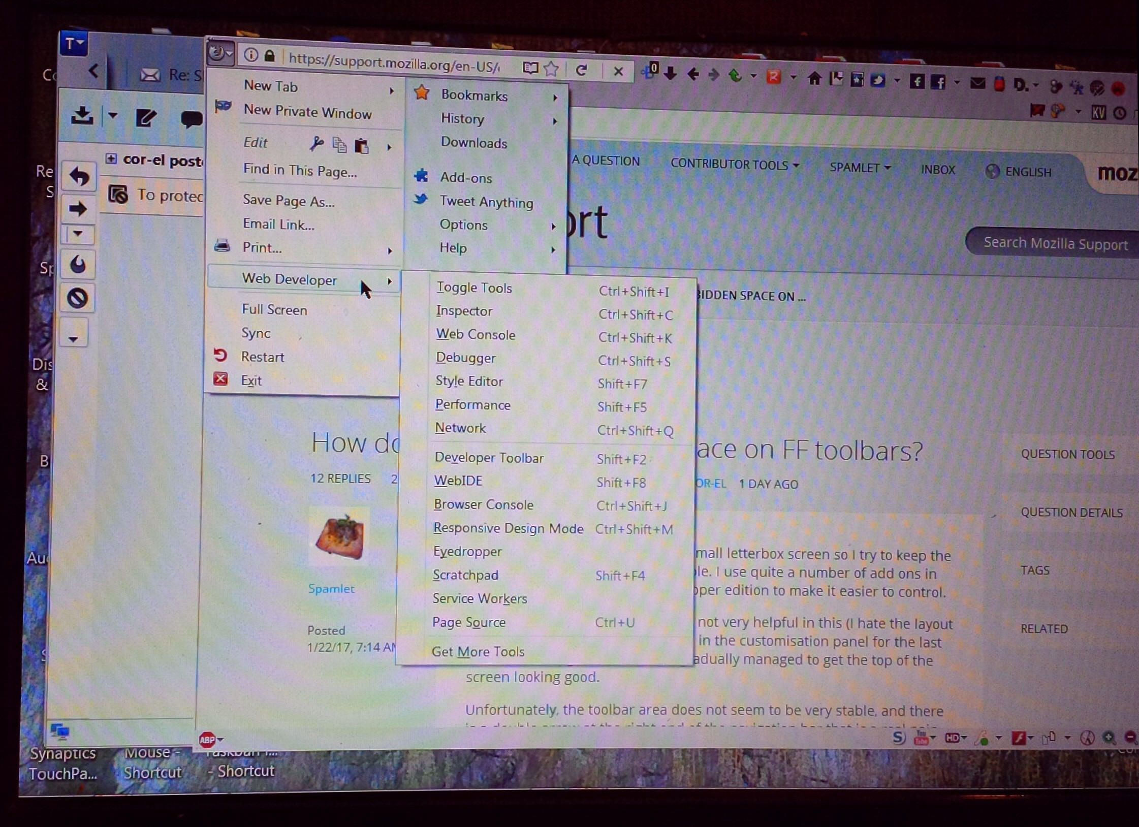
The Scratchpad is one of the built-in developer tools ("3-bar" menu button -> Developer or Tools -> Web Developer) that you can use as a text editor and you can also run JavaScript code from it.
cor-el said
There are items with a flex attribute and likely one of them causes the free space. The Scratchpad is one of the built-in developer tools ("3-bar" menu button -> Developer or Tools -> Web Developer) that you can use as a text editor and you can also run JavaScript code from it.
Thanks Cor-el. I've not explored what the web developer tools can do, but the scratchpad does look interesting, if I can get the hang of learning how to use it! I still have it in the drop downs of the original FF button, which, as you can see in my photo of the screen, is a lot neater that the three bar box.
I seem to have been unusually lucky, in that, when the CTR finished updating with my restart, all the icons and toolbars were exactly as I wanted them. I wonder if the CTR developer has been watching this, and fixed the glitch? If so: he's a genius! (y) :)
So, thanks once more for all your brilliant help Cor-el and Edmeister. I hope I can remember how to do all these tweaks another time!
(y) (y)