


Allow reordering of bottom toolbar icons on iOS mobile app
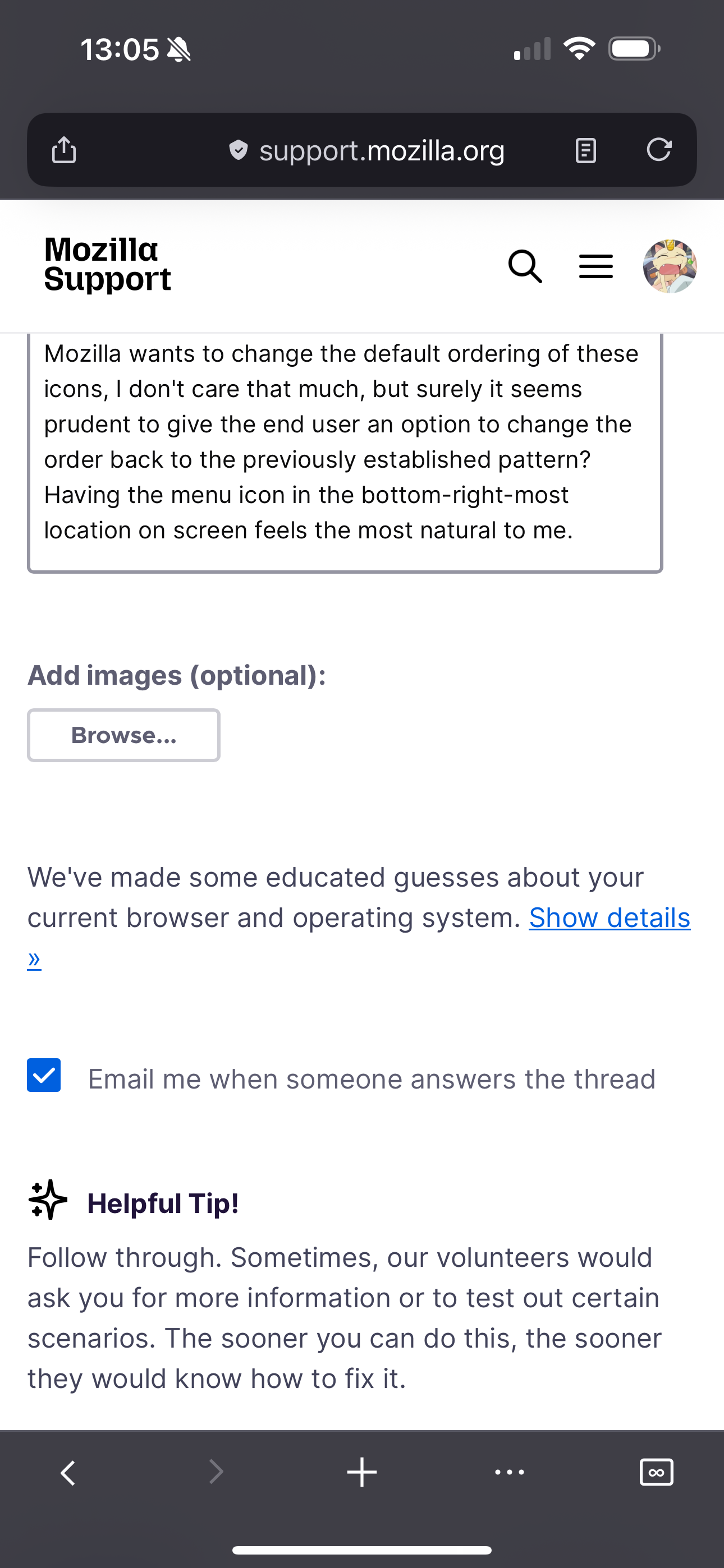
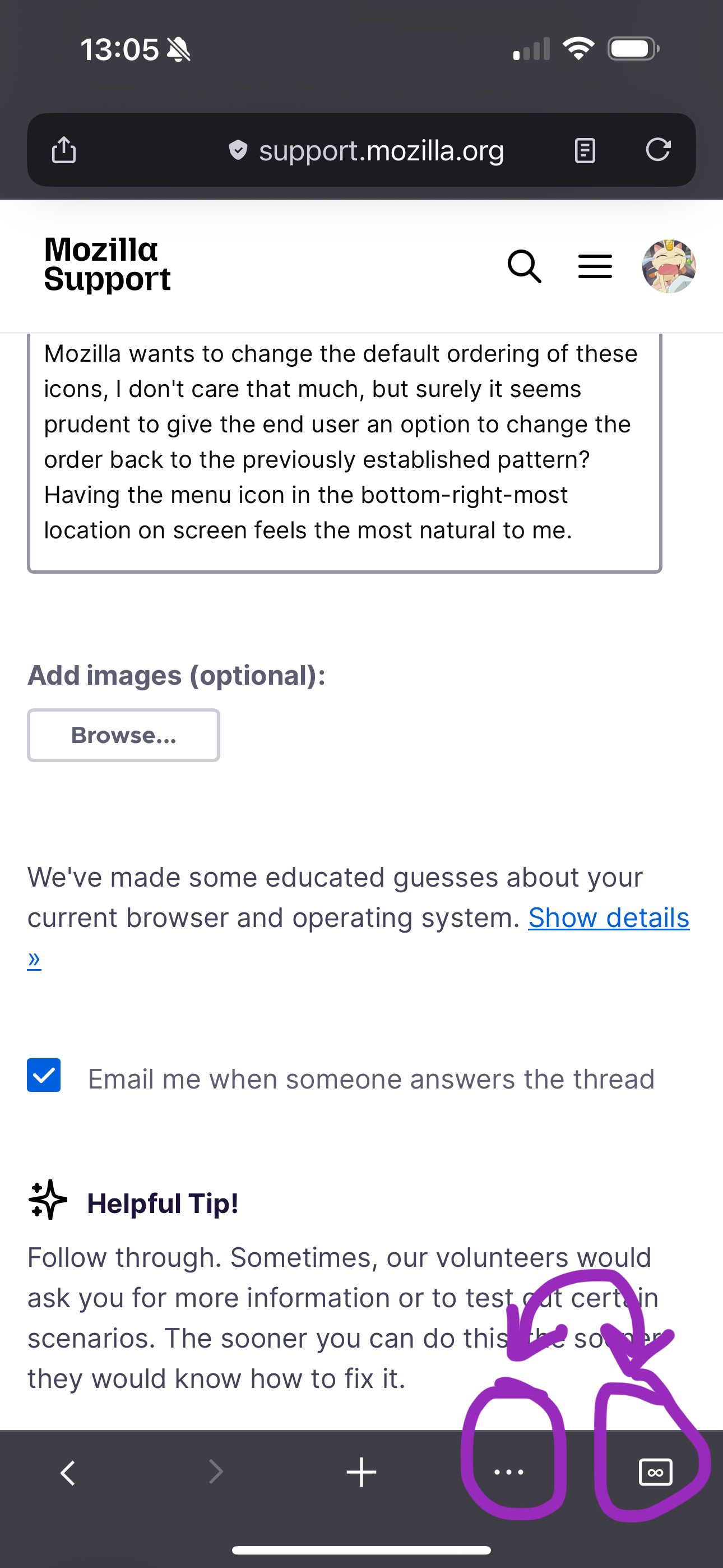
My iOS app just updated with a new ui for the mobile settings menu. It'll take me some time to get used to this, but I'm not opposed to it. However, it also changed the order of the icons in the bottom toolbar so that tabs view is the fifth icon rather than the fourth, and the menu icon has been switched vice-versa. This has caused my muscle memory of using the app to repeatedly tap the wrong icon, which has turned my usage of the app incredibly sloggish. If Mozilla wants to change the default ordering of these icons, I don't care that much, but surely it seems prudent to give the end user an option to change the order back to the previously established pattern? Having the menu icon in the bottom-right-most location on screen feels the most natural to me.
Tất cả các câu trả lời (2)
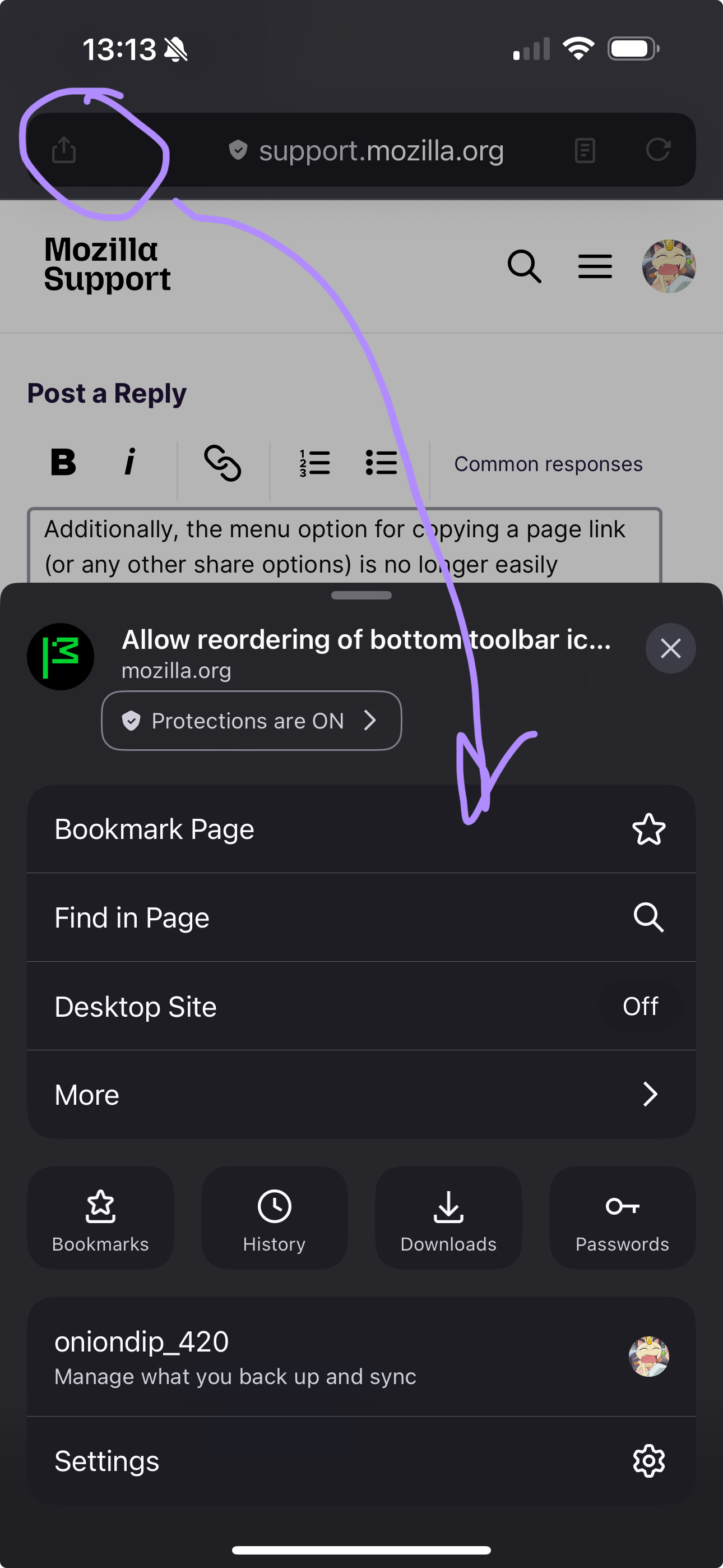
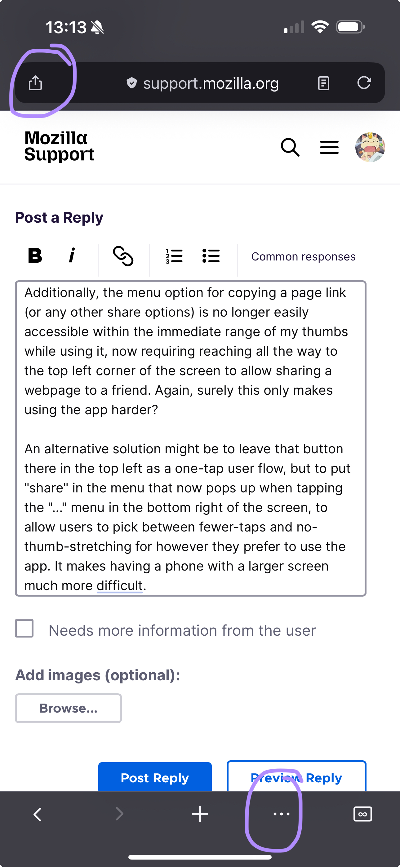
Additionally, the menu option for copying a page link (or any other share options) is no longer easily accessible within the immediate range of my thumbs while using it, now requiring reaching all the way to the top left corner of the screen to allow sharing a webpage to a friend. Again, surely this only makes using the app harder?
An alternative solution might be to leave that button there in the top left as a one-tap user flow, but to put "share" in the menu that now pops up when tapping the "..." menu in the bottom right of the screen, to allow users to pick between fewer-taps and no-thumb-stretching for however they prefer to use the app. It makes having a phone with a larger screen much more difficult.
Hi there,
Thanks for sharing your feedback about the new Firefox for iOS UI. For your first point about menu order, you may want to vote on this Mozilla Connect thread.
For your second point about the Share button, you may want to try moving your address bar to the bottom so you can quickly reach for the button. See How to move the address bar in Firefox for iOS for more information about that.
Hopefully that helps! I know getting used to new UI isn't easy, so appreciate you for sharing your feedback with us.