I'd like the old address bar (grey highlight, blue text highlight for visited websites.
The old address bar which got changed for no good reason--and it's actually smaller text, less detailed and harder to read because of that, and the plain white looks horrible and too flat.
Before this update, (just updated TWICE) and I doubt anywhere in the changelog was this mentioned, It had the rounded gradient selection area in light blue, the rows were considerably taller, and the portions that matched what you typed in were put in BLUE but not bolded. Even if they were, it would be much easier to see blue bolded instead of this fucked up mixture of nonbold then out of nowhere bold unbold bold all over the place, that just DESTROYS readability.
I'll try to find a few images for comparison if any of you all have horribly bad short term memory, it was about two updates ago that this was perfect and you all truly ruined it.
Well, that search didn't turn up any good results, but the current address / not-awesomebar looks horrible now and I suggest you just go back to what worked as it does not need to be changed.
Krejt Përgjigjet (1)
I suspect the new style is here to stay, but I seldom look at the changes in future releases (Firefox 50 is coming in a couple weeks, it's Firefox Beta now).
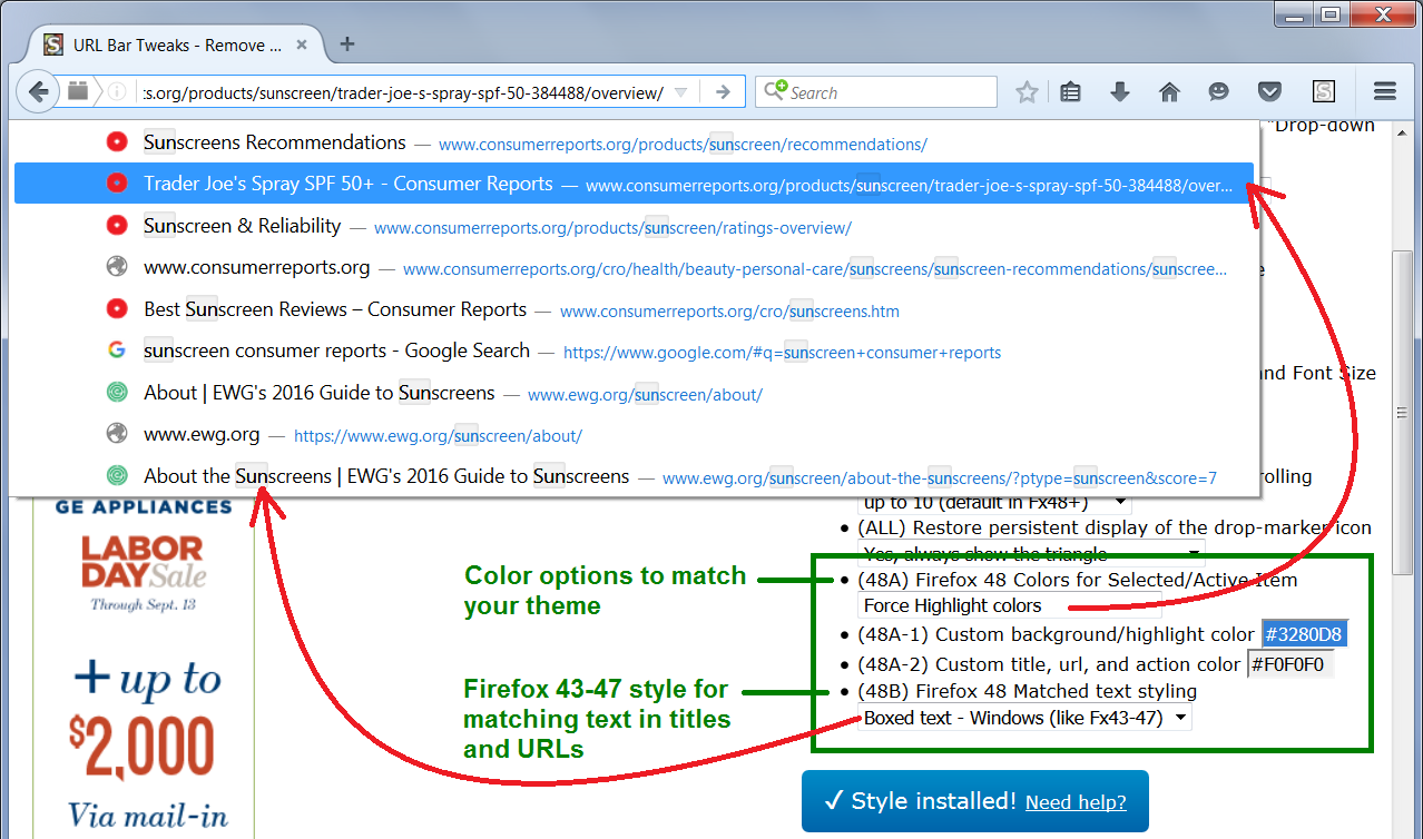
As you may know, you can modify many aspects of Firefox's interface using custom style rules. These can be applied using either the Stylish extension or a userChrome.css file. More info on those in a moment.
I maintain a multi-option custom style rule ("user style") that includes using the older style matched text highlights appear on the bar. See the attached screenshot.
If you want to try it, you can find it here:
https://userstyles.org/styles/122394/url-bar-tweaks-remove-visit-search-limit-width
Also: