

Accessibility issue - insufficient contrast for calendar reminders
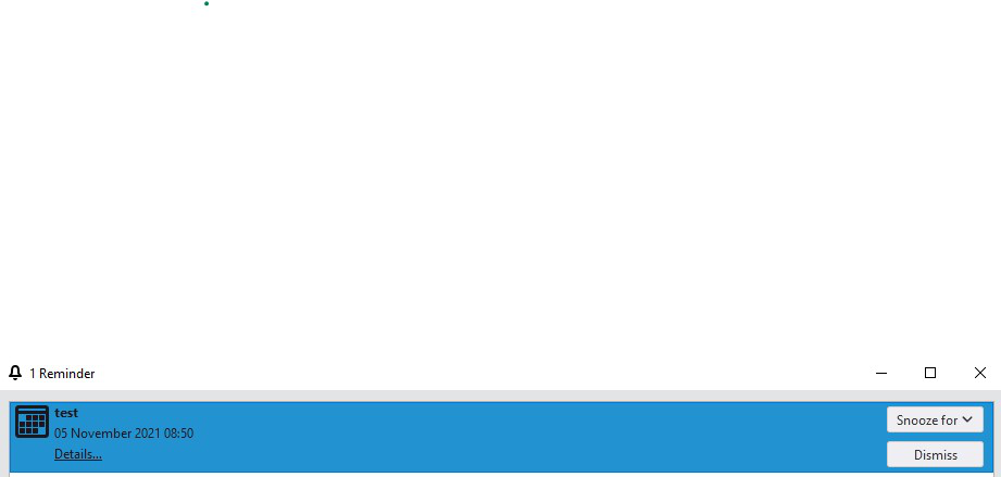
Since upgrading to 91.3.0, calendar reminders are displayed in black text on a darkish blue background.
This strains my eyes, and (apart from myopia) I don't have any particular vision issues. I would think that some people with vision differences are impacted more severely by this.
How can it be changed back to a higher level of contrast please? (It was black-on-white before upgrading to 91.3.0.)
All Replies (3)
This worked for me in userChrome.css (makes highlighted reminders white text on blue background).
It would still be appropriate to let users configure this without CSS: the default is going to cause people problems.
   #alarm-richlist:focus > richlistitem[selected="true"] label.alarm-title-label,
   #alarm-richlist:focus > richlistitem[selected="true"] label.alarm-date-label,
   #alarm-richlist:focus > richlistitem[selected="true"] label.alarm-details-label {
   color: white !important;
   }
Does the reminder look better when 'Optimize colors for accessibility' is checked in Preferences/Calendar? You can test in safe/troubleshoot mode, as this will bypass css.
sfhowes said
Does the reminder look better when 'Optimize colors for accessibility' is checked in Preferences/Calendar? You can test in safe/troubleshoot mode, as this will bypass css.
Thanks for the logical suggestion...unfortunately that setting doesn't seem to affect the colour of the reminder. With that box checked (and without my CSS) I got the low-contrast black on blue again.