


Open
Remove clocks and huge padding from input autocomplete list

The autocomplete dropdowns for form fields have recently changed appearance, and I strongly prefer the previous, simple design.
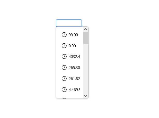
The new version has:
- Clock icons next to autocomplete/history entries
- Much more vertical padding, making the list unnecessarily large
- Rounded "pill-shaped" highlighting when hovering over an entry
The previous autocomplete list was much more compact and clean, without the clock icons, excessive padding or rounded hover backgrounds.
Is there currently a setting, `about:config` preference or other supported way to restore the old autocomplete list appearance?
Ideally, I would like to use the previous style:
- No clock icons
- Compact rows with the previous amount of padding
- No rounded/pill-shaped hover effect
- Otherwise retain the existing autocomplete functionality
If there is no setting to restore the old appearance, could an option be added to allow users to choose between the old and new autocomplete UI?
The autocomplete dropdowns for form fields have recently changed appearance, and I strongly prefer the previous, simple design.
The new version has:
* Clock icons next to autocomplete/history entries
* Much more vertical padding, making the list unnecessarily large
* Rounded "pill-shaped" highlighting when hovering over an entry
The previous autocomplete list was much more compact and clean, without the clock icons, excessive padding or rounded hover backgrounds.
Is there currently a setting, `about:config` preference or other supported way to restore the old autocomplete list appearance?
Ideally, I would like to use the previous style:
* No clock icons
* Compact rows with the previous amount of padding
* No rounded/pill-shaped hover effect
* Otherwise retain the existing autocomplete functionality
If there is no setting to restore the old appearance, could an option be added to allow users to choose between the old and new autocomplete UI?
Okulungisiwe ngu paul644