

Mozilla-provided font (I think) is just annoying/hard to read
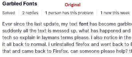
I've read some complaints about the font that FF desktop uses on some websites. I'm seeing a very annoying font with some letters thicker (almost bold) and other letters thin. This occurs, for example, on the mozilla.org website and when FF is displaying a PDF.
I have "allow pages to choose their own fonts" checked, and I am not using hardware acceleration.
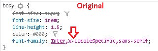
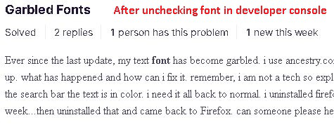
I went into the developer console and turned off the Mozilla-supplied font for a support webpage, and it then used something like a Times New Roman, but it was uniform in letter thickness.
I have attached screen snips.
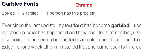
If I display the same page using Chrome, the font looks great, so I don't know exactly what the problem is, but it's clearly a FF problem.
Notice in Chrome that the word "garbled" is in bold, and it does not appear in bold in either of the FF font examples.

所有回覆 (2)
Type about:preferences#general<enter> in the address bar. Across from fonts and colors, press the Advanced button. On the bottom, turn on Allow Web Sites To Choose Their Own.
Make sure you haven't enabled a High Contrast theme in the OS settings.
選擇的解決方法
Okay, after doing some research, I'm now working on the hypothesis that the problem is how FF and Chrome render the Inter font family. That is, both render it badly (IMO). They just differ in when they actually display text with an Inter font.
If you look here, you can see images of a very nicely rendered font, but it looks nothing like the images I attached to the OP.
So I'm going to mark this as solved and move on.
Sorry for the trouble.