

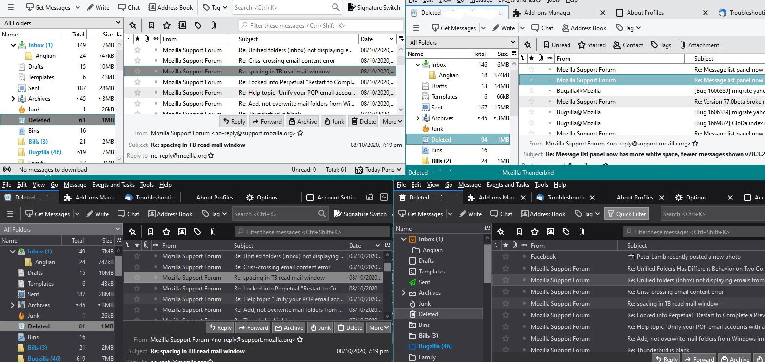
Message list panel now has more white space (fewer messages shown) and dangerously confusing hover highlighting v78.3.2
I just upgraded to 78.3.2, and the message list panel now has significantly more spacing, less denstiy. There is more whitespace between lines. And there does not appear to be any option to reset this back to the previous compact view?
EDIT: Adding a note about an additional issue with the message list panel that is discussed in this thread... Prior to v78.3.2, a message/line in the message list pane would not become highlighted until I *clicked* on it. Now, whenever I just pass my mouse over the list, the message under the mouse becomes highlighted (and the last message(s) *selected* also remains highlighted). This results in two or more non-adjacent messages being highlighted in the same way at the same time. This is a poor usability experience and dangerous design that has caused me to perform operations on unintended messages multiple times, even nearly accidentally deleting messages. This usability degradation creates a risk of data loss.
KEYWORDS: message thread pane, message list panel, UX, UI design, usability, accessibility
Modified by sells59
Chosen solution
Assuming you have done everything correctly...See if you need to change this:
- Menu app icon > Options
- Select 'General'
- Scroll to the bottom and click on 'Config Editor' button
- Accept Dragons warning
- In search type: legacy
- Look for this line: toolkit.legacyUserProfileCustomizations.stylesheet
If it is set to 'False'
- Double click on that line to toggle the 'False' to 'True'
Restart Thunderbird if you needed to alter the setting.
Read this answer in context 👍 6All Replies (20)
Done it!
That was the clue I needed Toad-Hall; the Star and various other mini-icons getting bigger. Ironically, the changes to TB that you referred to earlier made to fix "High Contrast themes for those with visual needs" actually made my visual needs worse (less on screen).
It was suggested that padding may be the cause but no matter what I added or changed with padding it made no difference at all, then it occurred to me to add a margin-top to the declarations. After some tweaking I have found the ultimate settings to have really compact row spacing (with no thin blue line artefacts remaining after hovering), which overall allows to have approx 50% more email rows showing both in the Thread (messages) view, and for the left Folder view.
Below is my full code for userChrome.css. For me on Win10 it works like a charm.
NB - what does the @namespace url... line do at the top? With or without it makes no difference to functionality of the file as far as I can tell.
/* Do not remove the @namespace line -- it's required for correct functioning */
@namespace url("http://www.mozilla.org/keymaster/gatekeeper/there.is.only.xul"); /* set default namespace to XUL */
#folderTree treechildren::-moz-tree-row {
height: 8pt !important;
margin-top: -2px !important;
margin-bottom: -2px !important;
}
#threadTree treechildren::-moz-tree-row {
height: 8pt !important;
margin-top: -4px !important;
margin-bottom: -4px !important;
}
/* Tweaking the below px values may stop the annoying thin blue row line artefacts remaining after hovering over items */
#folderTree treechildren::-moz-tree-row(hover),
#folderTree treechildren::-moz-tree-row(selected){
margin-top: 0px !important;
margin-bottom: 0px !important;
}
#threadTree treechildren::-moz-tree-row(hover),
#threadTree treechildren::-moz-tree-row(selected){
margin-top: 0px !important;
margin-bottom: 0px !important;
}
Nice find, Art!
There is still the problem I am having with the annoying mouse hover highlighting. Until this version, a message/line in the message list pane would not become highlighted until I *clicked* on it. Now, whenever I just pass my mouse over the list, the messages become highlighted (and the last message *clicked* also remains highlighted). This results in two or more non-adjacent messages being highlighted at once.
I'm finding this new behavior very confusing and leads to errors understanding at a glance which is the actual *selected* row for applying keyboard shortcuts to. I wish I could disable this new hover highlighting completely.
Thank you Art, works for me in the messages (threads) window (which for my liking is now even a bit over crowded j), but no change in the folder tree...
After another restart the tree-view was also compressed (did not really get why), but now again after restarting for the thread view adjustment, the white space is back in the tree and I cannot change it by adjusting the -4 px setting to any other value (-2, -3, -4 tried, no change on screen)
I adjusted the thread view from -4 to -3 pix, which works better for me (top+bottom, 2 changes); this works but the tree pane not!
Modified by Otto
sells59, could not agree more, you're absolutely right! The new hover over behavior is detrimental. It would be great if it could be removed.
re :Do not remove the @namespace line...etc It used to be essential for making things work and I've still got it in my file, but it may not be necessary in more up to date versions of thunderbird.
re: hover colour issue
Agree, the selected and hover over shades are very similar in the default. But, I changed my selected colour a while back, so do not have same issue.
Example codes I use:
/* Change colour of background for selected folder and selected email */
/*selected folder in Folder Pane */

#folderTree treechildren::-moz-tree-row(selected){
-moz-appearance: none !important;
background-color: #888888  !important;
}


/*selected email in thread pane */

#threadTree treechildren::-moz-tree-row(selected) {
-moz-appearance: none !important;
background-color:  #888888  !important;
}

/*Change colour of text in selected folder and email to dark near black*/
/*Decided to use bold in Folder, but not in Mailing List */
#folderTree > treechildren::-moz-tree-cell-text(selected){
  font-weight: bold !important;
  color: #181818 !important;
}

#threadTree treechildren::-moz-tree-cell-text(selected) {
-moz-appearance: none !important;
color: #181818 !important;
}
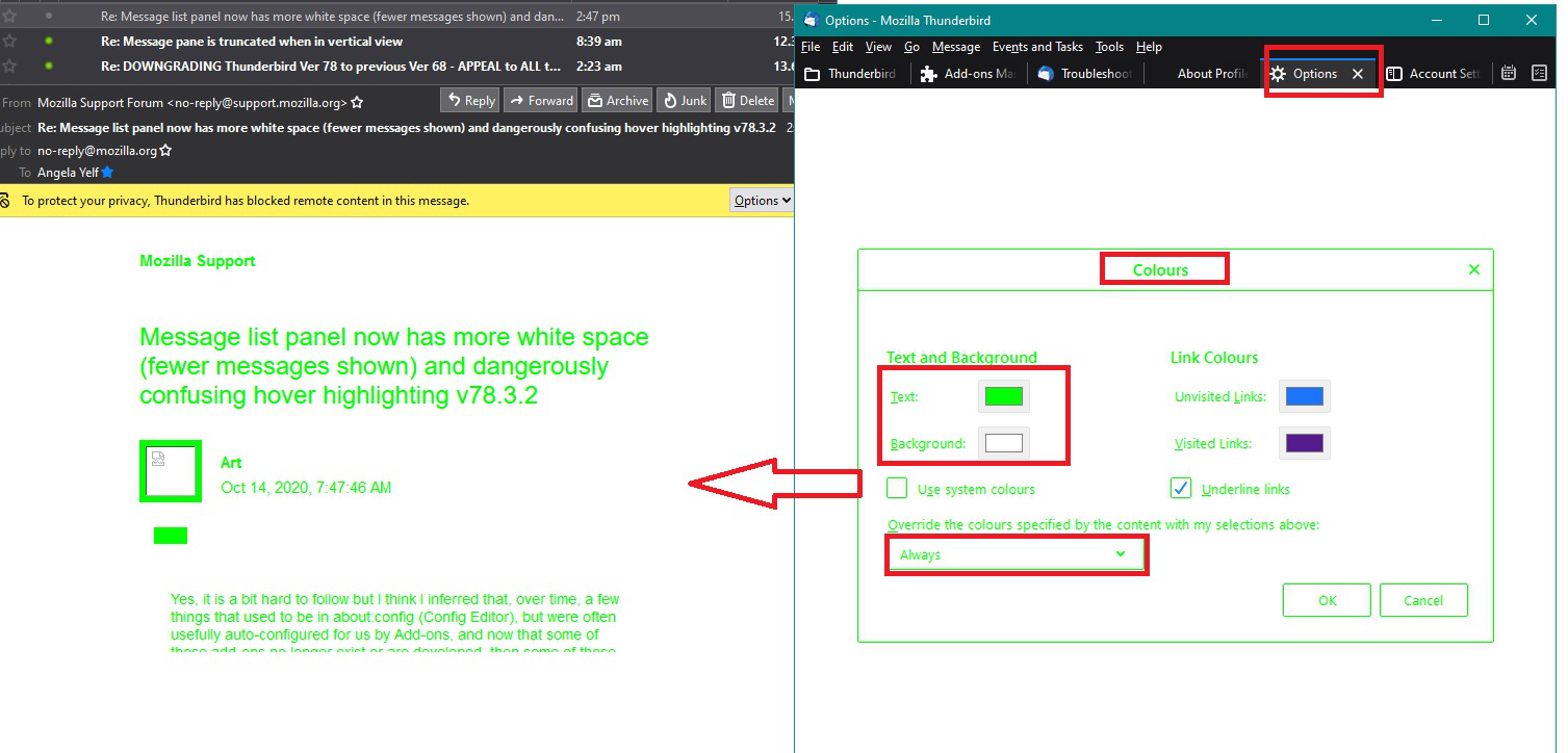
Image below shows:
Bottom right - dark theme default 78.3.2 - just as a comparison.
Top right - Light theme 68.12.1 modified with above code using #83bbc4 is green type of colour and I kept the font colour white.
Top left - Light theme 78.3.2 modified with above code using #888888 is stronger grey colour and I changed selected font colour to black and also made bold in folder.
Bottom left - Dark theme 78.3.2 modified with above code as above but shows how it looks in dark theme.
So this approach may help you to at least improve the difference between selected and hover.
Don't get confused .... In the image, the left side really is version 78.3.2 because I also changed all the folder icons as well. :) Only top right is a 68.12.1 version.
I usually have the 68.12.1 version running in Light mode as you see in image.
But, I usually run the 78.3.2 in Dark Mode, but I also show the Light Mode in image, just so you can see how the same selected changes appear depending upon the theme.
Modified by Toad-Hall
I see Toad-Hall has just added a solution or two as well, thanks - looks nice in the dark theme, below is what I'd just been trying for you although for me the highlighting and hover works fine (see pic attached).
Otto & sells59
I may have found a way to turn off the hover highlighting - in testing, for me just the selected one stays highlighted and hovering just produces two thin lines top and bottom of the hover position. See 2nd attached pic and code below to try.
I'm not sure what these thin blue lines are all about, it's as though something else is there but unless TB devs document what selectors they are using to style things then we can only guess and experiment (anyone know any tricks on how to see the underlying code/css in TB?).
Try adding/replacing the bottom part of what I previously listed:
/* Tweaking the below px values may stop any annoying thin blue row lines remaining after hovering over items */
/* background: none turns off the hover highlight */
#folderTree treechildren::-moz-tree-row(hover){
background: none !important;
margin-top: 0px !important;
margin-bottom: 0px !important;
}

#folderTree treechildren::-moz-tree-row(selected){
margin-top: 0px !important;
margin-bottom: 0px !important;
}

#threadTree treechildren::-moz-tree-row(hover){
background: none !important;
margin-top: 0px !important;
margin-bottom: 0px !important;
}

#threadTree treechildren::-moz-tree-row(selected){
margin-top: 0px !important;
margin-bottom: 0px !important;
}
Otto - I had the thread pane not doing anything at first (which is why I found this thread), then I tried Toad-Hall's idea of using min-height in place of just height - that seemed to work and when I was experimenting with the margins I switched back to just height and it all seemed to work again. Has been fine since and I've done a lot of restarts of TB while experimenting. I wonder if you have some other Add-on interfering?
Modified by Art
Good collaboration here with you all. =-) I have come up with a stylesheet that nearly reverts the UI to the previous behavior. Lots of work to get back to **no change**. LOL!
NOTES: - I have opted for a moderate line density that matches in both the folder and thread panes (more lines shown than Toad-Hall but fewer than Art/Otto). - I have kept the default Thunderbird selected item text/background colors but changed the hover colors to be very subtle. This works for me as I want the selected item to catch my eye since it is the entry that will be subject to keyboard commands!!! And I don't really care about any item that might be hovered. - I have preserved Art's adjustments for removing "annoying thin blue row line artefacts."
   /* Do not remove the @namespace line -- it's required for correct functioning */
   @namespace url("http://www.mozilla.org/keymaster/gatekeeper/there.is.only.xul");

   /* ----------------- FOLDER PANE ----------------- */

   /* row height in folder pane */
   #folderTree treechildren::-moz-tree-row {
     height: 8pt !important;
   }

   /* remove thin blue row line artifacts remaining after hover in folder pane */
   #folderTree treechildren::-moz-tree-row(hover),
   #folderTree treechildren::-moz-tree-row(selected){
     margin-top: 0px !important;
     margin-bottom: 0px !important;
   }

   /* hovered item background color in folder pane, default #0A246A */
   #folderTree treechildren::-moz-tree-row(hover){
     -moz-appearance: none !important;
     background-color: #EEEEEE !important;
   }

   /* hovered item text color in folder pane, default #FFFFFF */
   #folderTree treechildren::-moz-tree-cell-text(hover){
     color: #000000 !important;
   }

   /* selected item background color in folder pane, default #0A246A */
   #folderTree treechildren::-moz-tree-row(selected){
     -moz-appearance: none !important;
     background-color: #0A246A !important;
   }

   /* selected item text color in folder pane, default #FFFFFF */
   #folderTree treechildren::-moz-tree-cell-text(selected){
     font-weight: bold !important;
     color: #FFFFFF !important;
   }

   /* ----------------- THREAD PANE ----------------- */

   /* row height in thread pane (OLD WAY) */
   /*#threadTree treechildren::-moz-tree-row{
     min-height: 18px !important;
   }*/

   /* row height in thread pane */
   #threadTree treechildren::-moz-tree-row {
     height: 8pt !important;
     margin-top: -3px !important;
     margin-bottom: -3px !important;
   }

   /* remove thin blue row line artifacts remaining after hover in thread pane */
   #threadTree treechildren::-moz-tree-row(hover),
   #threadTree treechildren::-moz-tree-row(selected){
     margin-top: 0px !important;
     margin-bottom: 0px !important;
   }

   /* hovered item background color in thread pane, default #0A246A */
   #threadTree treechildren::-moz-tree-row(hover) {
     -moz-appearance: none !important;
     background-color: #EEEEEE !important;
   }

   /* hovered item text color in thread pane, default #FFFFFF */
   #threadTree treechildren::-moz-tree-cell-text(hover){
     color: #000000 !important;
   }

   /* selected item background color in thread pane, default #0A246A */
   #threadTree treechildren::-moz-tree-row(selected) {
     -moz-appearance: none !important;
     background-color: #0A246A !important;
   }

   /* selected item text color in thread pane, default #FFFFFF */
   #threadTree treechildren::-moz-tree-cell-text(selected) {
     -moz-appearance: none !important;
     color: #FFFFFF !important;
   }
Thank you sells59 - this seems to work! light gray hover (instead of hover-text-white=nonvisible j), and I like the 3pix margin as best option for myself!
Excellent work sells59 - I just tried it and it's working nicely here on my Win10 TB (pic attached) - which platform/OS are you all using?
I might squeeze things up a bit more particularly on the folder pane later but it's looking good - nice work.
All we need now is another TB update to ruin things again - see all you here next time!
I wonder why TB/Moz don't include some customisation of all this within the options, surely that would be useul for everybody and would accomodate all people's visual and practical needs?
Regards
Most people are quite happy to leave things as they are, but for the likes of you and me, they allow more customisation via this 'userChrome.css' method as it can be personalised. This ability to personalise it, is probably the main reason why I like Thunderbird. It is often the collaboration of people like us who share info which allow others to tweak around with display to suit individual needs and come up with solutions.
Modified by Toad-Hall
I think it's not so much about people being happy to leave things as they are, more that most people don't have a clue that anything could be changed and just accept things how they are and have to put up with the changes, being powerless to do otherwise, and even for us here in the last few days, spending hours figuring out how to get things back to how they were (with no mention of the changes in the updates).
It's not like the whole userChrome.css thing is really mentioned anywhere let alone documented with what the possible css targets, styles and settings could be, and it takes activating some weird legacy setting in Config Editor where dragon's await before one can even activate the possibility of changing anything! The very word 'legacy' indicates it could be wiped away from us at some point in the future (and probably without notice or sufficent workarounds in place!)
As far as I can tell, there is only one standard type size the interface shows - what if people want to make it bigger so they can see it better? I'm not sure if I have seen a setting for that anywhere, or for people with colour-blindness issues, how can they easily change things? It's not like there's even some sort of basic theme editor - it just puzzles me as to why this is all missing and we end up having to dig hard to find simple solutions to get things into a usable state to our liking (or just how it was a few days ago).
As an extra note re the css, just in case anyone wants to know how to close up the folder tree some more, just add the margin css as follows to the relevant section as per sells59 userChrome.css provided earlier:
/* row height in folder pane */
#folderTree treechildren::-moz-tree-row {
height: 8pt !important;
margin-top: -2px !important;
margin-bottom: -2px !important;
}
-2px is just about as close as you can go, it does crash the small icons slightly but I find that okay and bearable.
Thanks again to all in working this out.
re :As far as I can tell, there is only one standard type size the interface shows - what if people want to make it bigger so they can see it better? I'm not sure if I have seen a setting for that anywhere, or for people with colour-blindness issues, how can they easily change things?
There is a setting in the 'about:config' that allows you to increase the font in the whole UI. https://support.cdn.mozilla.net/en-US/questions/1297871
There are also settings in Options > General scroll down to 'Language & Appearance' You can choose font and font size and 'colours' which also provides an override when using High Contrast settings set on computer. You can also change the theme to use the computer default High Contrast.
There are loads of in built settings, but this question was outside that remit and was looking to perform a taylor made solution for specific issue with white space between messages in list.
The reason the white space was created was to help solve an issue with High Contrast options, so making Thunderbird more inclusive for those with specific needs.
I immediately noticed the whitespace change and found it annoying. (I opened a defect in the tracker that is now accepted but unassigned.)
But upon using the new interface for a few days, I quickly discovered that the hover highlighting is actually the more severe and **DANGEROUS** usability issue! I have performed operations on the wrong messages multiple times, even nearly accidental deletions! IMHO, this is just poor UX enginering that creates a sizable risk of workflow errors and even data loss.
I would like to log a bug but not sure the best terminology for describing it.
I am so glad we were able to collaborate here on a workaround solution to both issues!
I take your points (Toad-Hall), I glossed over those settings and forgot to confirm my thoughts - but still those things are somewhat limited in function for custom styling.
I think your last point is interesting where the comment from devs is that they made the changes to make: "Thunderbird more inclusive for those with specific needs" - well, I understand the needs for that, but should that mean that my specific needs should become less catered for? Why aren't the High Contrast options/changes being added to the possibilities? It's like if all new books had to suddenly be printed in large-format only with enlarged print so that everyone could see it, rather than keep or add to the small/standard way as well?
Not sure what my real aim to say is, but I'd like this visual customisation to be in TB itself as a basic default feature, with colour sliders, a few checkbox options and pixel size selectors for fonts, row spacing, hover effects, etc., not buried away in some dragon's lair for a directory and a file that don't initially exist yet which shall contain mystic runes of cryptic css.
Anyway, as sells59 says, thanks for the collaboration, great stuff.
Modified by Art
I did ask the powers that be about the white space issue and was told it was not going to change. So no point in pursuing that as a bug because technically there is nothing wrong. It's just something some people did not like, including me.
All basic changes for fonts, colours, updates, password and a whole host of stuff has always been in the Options under various categories. The usual all increase font size throughout the UI via that pixel change in 'about:config' was brought into Thunderbird when an addon that used to do it was no longer maintained. So I'm glad the developers did something that could easily be achieved within Thunderbird without the need for userChrome.css stuff.
Hi Toad-Hall. I did not follow your meaning with this sentence? "The usual all increase font size throughout the UI via that pixel change in 'about:config' was brought into Thunderbird when an addon that used to do it was no longer maintained. So I'm glad the developers did something that could easily be achieved within Thunderbird without the need for userChrome.css stuff."
Modified by sells59
Yes, it is a bit hard to follow but I think I inferred that, over time, a few things that used to be in about:config (Config Editor), but were often usefully auto-configured for us by Add-ons, and now that some of those add-ons no longer exist or are developed, then some of those things have been brought into the Tool>Options settings?
Would that be it? It still leaves us with a lot of things missing in Options that some of the previous wonderful "old/legacy" add-ons used to be very good at, especially when customising the interface (I miss the now dead add-on Account Colors - it used to do all I wanted).
Personally, as a TB user for many years, in all that time I'm not sure if I'd particularly noticed much changing in the Tools>Options. Maybe I've missed, misunderstood the meaning of, or not needed to change some of the perhaps obscure, subjective and default visual settings. Toad-Hall's suggestions about the new High Contrast settings buried in Tools>Options>General>Language & Appearance>Colours... had me wondering if I'd misunderstood the meaning and use of that whole Language & Appearance section so I changed the font sizes in various places to something larger to see if it increased the default font size of the interface...., and it didn't. It only changes the type size used to show new messages as they are typed. (tested without using a userChrome.css) (mind you, I didn't turn off the legacy setting in Config Editor).
So, I'm not sure what other settings there are in TB's Options that help people see, as was maybe suggested, whole interface larger if they need? e.g. how do visually impaired users get to increase the folder and thread list's font size? What really has changed for we people who need and want to customise the interface sizes, spacing, colours and hover effects for legibility? All in all, in recent times, everything seems to have got worse in that respect, especially with the many losses of treasured and loved Add-ons!
re : e.g. how do visually impaired users get to increase the folder and thread list's font size? .......increase font size throughout the UI via that pixel change in 'about:config' If someone found the entire UI somewhat difficult to read due to eyesight issues then all the font size can be increase throughout Thunderbird by changing a setting in the 'about:config' window accessed by the 'Config Editor' button as mentioned at the link shown below.
This setting was added for this purpose after the addon extension Theme Font & Size Changer for ThunderBird was no longer maintained.
Users who need to use the 'High Contrast' settings set up on their computer can also force those settings to be used in Thunderbird.
As an example of changing a couple of settings in Tools>Options>General>Language & Appearance>Colours.. take a look at the image below. Obviously you would need to test this in Thunderbird Safe Mode because you have a 'userChrome.css' file that can override default settings.
I could write a book on all the variations but it goes way beyond this question :)
Toad-Hall, thanks for your informative replies. So what you are actually saying is the other way around to what I assumed from your previous comment - new settings occasionally get added to Config Editor when old/legacy extensions die (due to demand or deemed need I assume), rather than make it straight to Tools/Options.
Which reminds me, Is there simple way to get to Config Editor by using about:config in say a TB tab (like in Firefox)? It seems like there should be and for any of the other destinations like about:profiles, etc. or even get to external URLs like Add-ons' search can?
The reason I ask is that the Config Editor is so hard to find or get to to utilise for mere mortals, let alone know what to do with its myriad of seemingly undocumented flags and settings once there.
I read the other post you linked to about globally enlarging font sizes, and I'm amazed at the 80+ year-old MaryLou that said she was about to give up on TB but then stumbled across the post and gave it a go. For every one of people like her, there must be thousands of others that never get that far, where the Dragon's secret lair of useful code lays forever unknown and dormant.
So is there anywhere that all the Config Editor settings are described with what we can actually do? Or is that also hidden from mere mortals and only seems gleanable through prophets like you who have open gateways of mystical communication channels during a full moon to the Thunderbird Code Goblins who occasionally give utterances of runic reasoning and guidance, sometimes relenting with an occasional snippet of useful css targets or other cryptic counter-intuitive descriptors along with further runes to decipher before deriving possible meanings and intent?!
I joke of course, but it does feel like that with TB's secret settings - if only there was a user manual, I love a good, updated and current manual.
If not, then you must get on with writing that book you mentioned - I'd buy it !
Many thanks.