

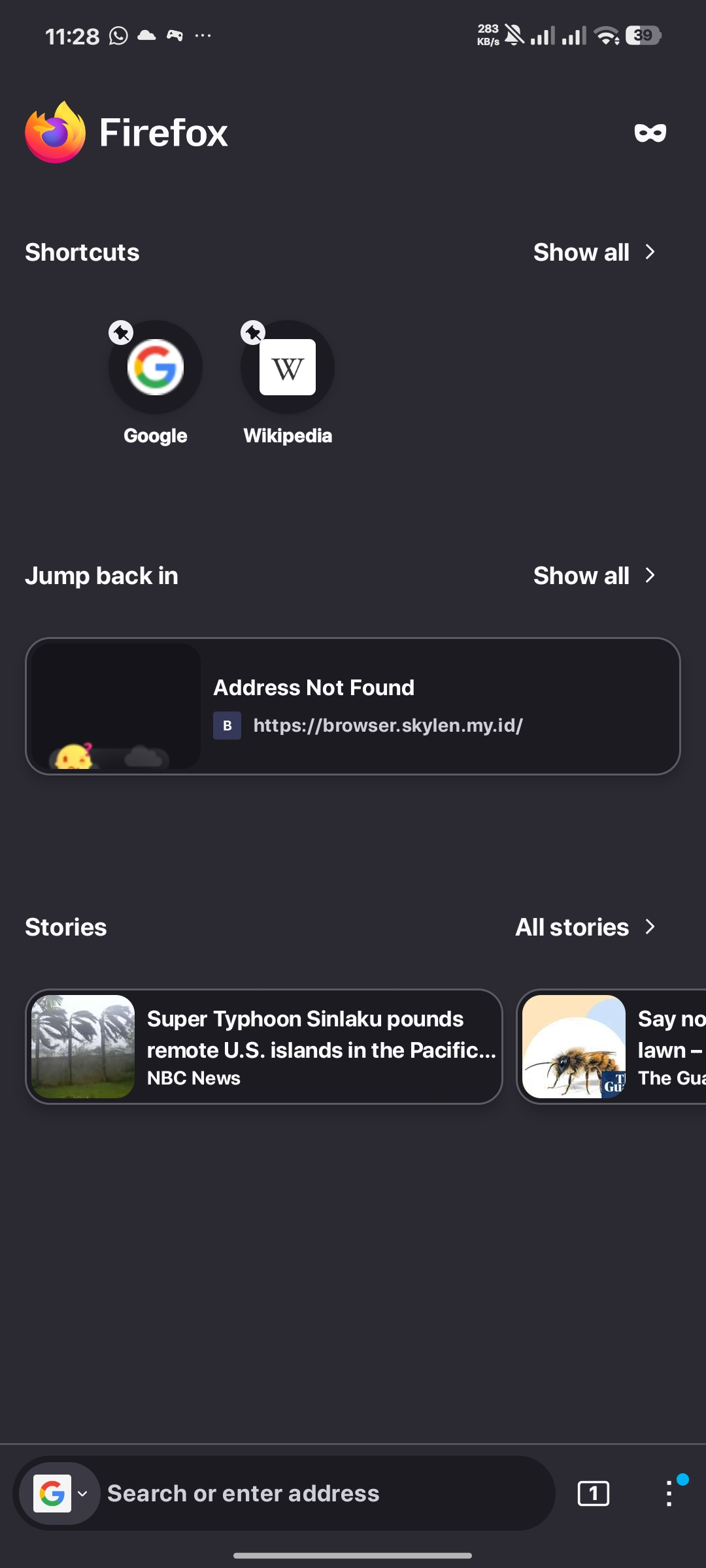
Why is the Google logo so ugly in the box search, it should be round/transparent, it would be better
Why is the Google logo so ugly in the box search, it should be round/transparent, it would be better
Why is the Google logo so ugly in the box search, it should be round/transparent, it would be better
All Replies (1)
Hi,
It's round for me. Please make sure you use the latest Firefox version, and if you do (and the issue persists), please file a bug on Bugzilla and share a link here.