
Fractional pixels with a 4K monitor
Hey guys, I'm having some issues when using Firefox with a 4K monitor.
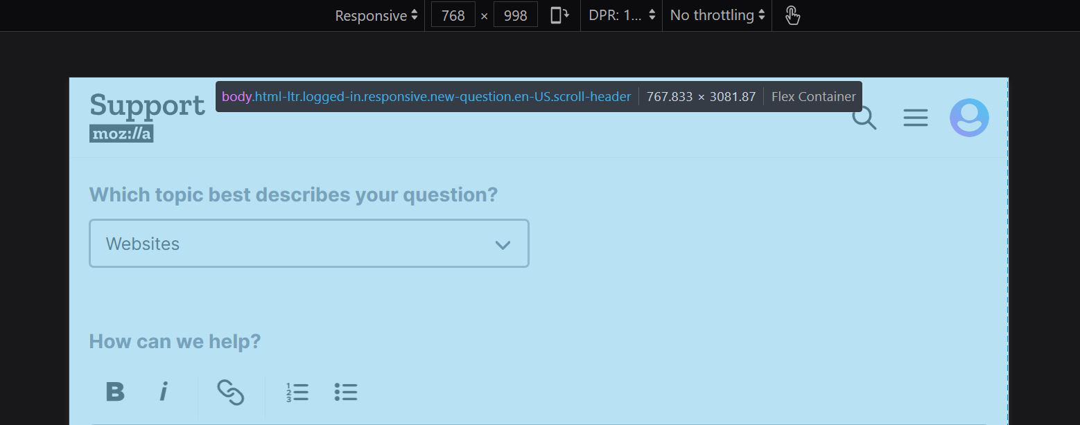
Whenever I resize the window to 768px using either the Inspector or a website page builder like Elementor (as an example), it actually resizes the window to 767.833px.
This causes a lot of websites to break, as most have styling for (max-width: 767px) and (min-width: 768px).
This has existed for months now, and doesn't happen on Chrome. In Chrome, 768px shows as 768px.
Any ideas on why this is happening, or how to fix it?
Thanks!
Hey guys, I'm having some issues when using Firefox with a 4K monitor.
Whenever I resize the window to 768px using either the Inspector or a website page builder like Elementor (as an example), it actually resizes the window to 767.833px.
This causes a lot of websites to break, as most have styling for (max-width: 767px) and (min-width: 768px).
This has existed for months now, and doesn't happen on Chrome. In Chrome, 768px shows as 768px.
Any ideas on why this is happening, or how to fix it?
Thanks!