

Text Menus in Tbird 140
This happens about every three or four major updates: After the programmers monkey with the interface, part of my personalizations disappear. This time, it's the text menus at the top of the screen. (And it's two computers since the last time I had a solution to this.)
The "menu hamburger" is not sufficient for touch-typists. I want the icons off to the right of the text menus, on the same line, the way it's been possible to establish since Tbird was in the low-30s for version numbers. Instead, the update refused to respect my personalizations, and hid the menu bar completely and makes it impossible to combine with the icons. I dimly recall that there was an about:config solution to this in earlier versions, but can't remember or find it (or confirm it would work with Eclipse).
ప్రత్యుత్తరాలన్నీ (11)
Sorry for the trouble. This sounds like https://bugzilla.mozilla.org/show_bug.cgi?id=1979002 which was a mistake, not an intentional change.
Well, that explains what happened (and that it wasn't just something in my setup), but not a user-level fix. I did find user level partial fixes, but they were different on different machines so I'm not sure details would be helpful. I at least have the text line of menus back near the top of the screen, even though (unlike Firefox) specific command icons like "download all messages" can't life on that line.
The suggestion that I'd make is a paradigm shift: Instead of operating from the presumption "I need to automatically and silently clean up/eliminate everything that's not consistent with the current interface model when there's a major migration," programmers should presume that clean up/elimination cycles should be "noisy": Those cycles should generate a "these settings/parameters were changed to conform to our new engine" list that's not buried in an obscure log. (Even better would be to have that list pop up in the welcome-to-the-new-version screen when it's associated with a major-version-number-level update to an existing installation.)
Thanks for the reply.
Not sure what you mean by command icons - but it sounds like what used to be available in the Windows title bar. What we have now is the unified toolbar.
I thought my example made it clear: "command icons" perform individual commands, not access a menu. "Next unread message" would also be a command icon.
When using Thunderbird Desktop, I'm not using a phone or a touchscreen. I therefore have full screen width to include both the text-display-menus and individual command icons for specific common commands... and I want them both on the same line, if possible, to preserve other screen real estate. That's also better for users with moderate visual impairments and/or other conditions that make it hard to activate a menu using a pointing device and then scroll through that menu using the same pointing device to several different levels (when moving the pointer outside a boundary changes or closes that menu).
This used to be simple; it's getting more and more difficult as the "I do everything on my phone/touchscreen" generation gets more control over user interface decisions and not only removes defaults, but takes away capabilities. Now get off my lawn (and command line), you rotten kids! This isn't about objecting to adding capabilities, it's about blind simplification without considering why some users might want it less simple.
If they are on the toolbar, then they are called "toolbar buttons". The text equivalent can be placed next to the button using customize of the unified toolbar.
But these can no longer be placed on the same line as the (text) menu bar - this changed multiple versions ago.
న Wayne Mery చే మార్చబడినది
(Hit submit too soon) As an example, in more-recent builds of Windows 11, customized startup sounds are flagged as "corruptions" to the operating system (this is even a problem when doing an integrity check!), and the startup sound reverts to the almost-inaudible Windows ding (without any notice or log entry). Windows 10 and earlier (and even the first build of Windows 11) didn't mindlessly revert to default. Some users have multiple machines, each with its own startup sound, and use that startup sound as a cue for when an update or reboot has completed on a particular machine, and rather resent some "branding" decision getting in the way of adaptive function without any notice other than the change itself.
Wayne, with all due respect it was a bad decision to remove the capability to put toolbar buttons on the same "bar" as the menu. If the default changes, that's fine; removing the ability to adapt to user needs, not so much, and even less so when done silently (IIRC with 115), resulting in continued user frustration when trying to reestablish a setup adapted to user needs and capability. Interface designers/debates need to stop assuming that everyone is a 23-year-old kid with the latest hardware and no unusual circumstances, disabilities, or other challenges. This hiding of the textual menus in the name of "cleanup" is just the latest example.
Not enabling the Menu bar by default - in my personal opinion - is a bad decision. After removing virtually all the menus from the menu app icon, the visibility of the 'Menu Bar' toolbar became vital. I do agree the menu app icon has been vastly improved as it was cumbersome and I was always clicking back and forth. So I'm pleased the latest; it is so much better and easier to use, but the improved version did mean the Menu Bar toolbar now needs to be visible. It's also easier to use.
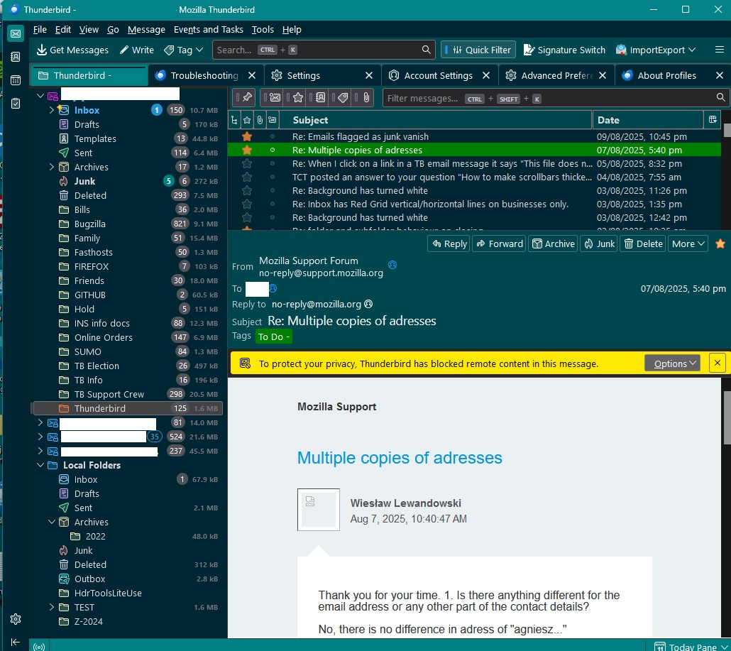
Think of the new 'Unified Toolbar' as a replacement for the 'Mail Toolbar'. The 'Unified Toolbar' is a neat idea as it means you can tailor required buttons depending upon what you are viewing, so it's not so cluttered. You can add toolbar buttons to the 'Unified Toolbar' via 'customise' such as 'Tag' or 'Write' or "Next unread' etc. You can enable the Menu bar and put it above the Unified toolbar if you prefer but you would need to follow the info at the following link. see image below https://support.mozilla.org/en-US/questions/1422908
If you add 'Get Messages, Write and Quick Filter to the Unified Toolbar, it means you disable the 'Folder Pane Header' and the 'Message List Header' - useful if you need to create more vertical space for Folder Pane or Message List. see image below. Some may say it's less cluttered view - depends on what you like. But there are more options in the visual display now than at any point in the past.
Oh to be 23 again - I'm nearly three times that age, but find once I've given things a go and discovered how I can tailor things, it's really a lot easier than you may first think.
న Toad-Hall చే మార్చబడినది
My objection is not to making new things available for those who wish to try them, even to establishing the new things as defaults. My objection is to removing/blocking the ability to personalize otherwise — and to override those personalizations as the default.
I do tech support — often remote — for a number of older and impaired (visually and otherwise) users, and personally I'm in the nearly-three-times-23 age group. Explaining to someone who's a thousand miles away how to access and manage their mail on Thunderbird (after putting them on Thunderbird to get them away from browser-based mail systems that prey on the vulnerable) is hard enough when the personalizations are respected. Try thinking about doing that for a victim of a recent stroke, or who has lost vision in one eye, or has significant hand-shakiness due to medication side effects… or who learned e-mail using AOL. There are times that taking advantage of muscle memory is the difference between isolation and function — especially in working around other program dysfunctions ranging from misnamed or incompletely-implemented features to outright bugs. Fortunately, Thunderbird hasn't had a "Tesla Autopilot" failure… yet.
It wasn't a bad decision to simplify the interface. It was a bad decision to block adaptations to the prior interface that had been carefully developed over time — especially unannounced, silently, and without regard to other aspects of "technological transitions." (It was also a bad decision to focus on touch-screen-like interfaces while simultaneously disrespecting touch-typists, who can have actual physical challenges moving back and forth between the keyboard and whatever pointing device they have, but that's much more personal.)
I do understand your situation after all this is a Support Forum and people use it from all over the world and they all have different abilities which are not necessarilly age related.
AS for helping people with more issues relating to disability, I've been there and got the T-shirt, so I'm very much appreciating your view point. Muscle memory plays an important part for everyone, it's what people get used to and you do not need to be older or have a disability to be upset or annoyed that something has changed and how it can effect work throughput etc. Many people create habits which cause a nuisance such as inadvertantly pressing the 'Ctrl' key at the same time as press Enter. They are composing a new message and wonder why Thunderbird keeps auto sending emails which are incomplete. They did not notice their hands were leaning on the edge of the keyboard. I digress....
Most changes relate to putting various buttons in the area where they are used. So the 'Menu app icon' became a menu for generic issues such as Font Size or Help etc. It vastly reduced endless searching to locate and drill down for menu items. The Unified Toolbar can be set up to display various depending upon area eg: you can manage all in one Customise view - you would like different view for Calendar than Mail. After all, it means you do not need loads of space occupied by disable items which you can't use anyway.
Senarios for the 'Reply'
The 'Reply' option is available in more than one way as this needs to help people who use alternative methods. The following various methods are considered in the design for those who use mouse, mousepad, touchscreen, keyboard, other considerations are also made for people using software such as readers.
Consideration in design has to be made for those who want to reply to opened messages whether in Message Pane or new tab or window and for others who just operate from the Message list and tend to click on Reply and then read the copied original message in the Write window.
One fit does not suit all and that's why in Thunderbird you will discover multiple methods. Sometimes you can introduce someone to a new method which may be easier than a previously used method and they wonder why they never used it before. Often people are never aware of the alternatives. If you are viewing an email in the Message Pane and you have a sight issue, it can be harder to locate the top Menu bar due to excessive screen adjustment than locate 'Reply' closer to the point of focus. People with shaky hands benefit from larger buttons etc, so buttons that have icons with Text can help as they are larger surface area, they also benefit if the space between items is greater hence the Density > Relaxed option would be useful.
You may already be aware of the many options for all kinds of functions but as an example: Alternatives just for 'Reply':
- select email in list to view in Message Pane/Tab - click on 'Reply' button located in Message Header
- select email in list to view in Message Pane/Tab - right click on opened message > 'Reply'
- select email in list to view in Message Pane - click on 'Reply' button which is on 'Unified Toolbar'
- right click on message in list > Reply
- select unopened message in list and use Menu Bar > Message > Reply
- select unopened message in list - click on 'Reply' button which is on 'Unified Toolbar'
- select email....then via keyboard Alt M then R
- select email....invoke via keyboard shortcut : Ctrl+R
- use keyboard arrow keys to select - use right click menu key to see options - press R and R again
- In Cards view - there is also the click on 3 dot icon and select 'Reply'