

Align Bookmark Folder Titles to the Left in iOS Firefox App
I’d like to request a layout change in the Firefox app for iPhone regarding how bookmarks and folders are displayed.
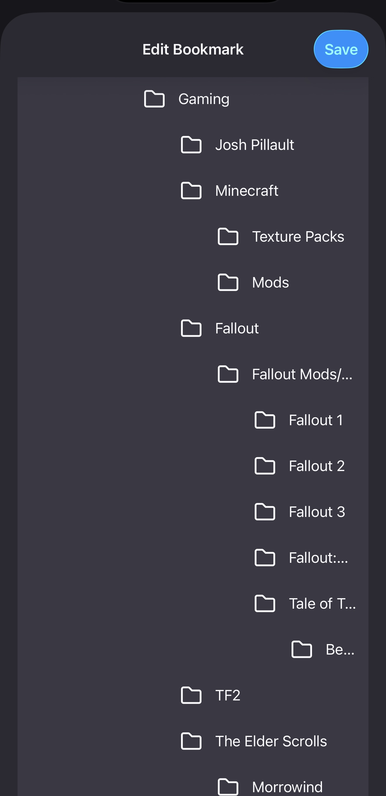
Right now, each level of nested folders is indented further to the right. When you have multiple folders within folders (which I do), the indentation pushes the folder names so far to the right that they become hard or even impossible to read. This makes navigating deeply nested bookmark structures frustrating and inefficient.
A simple fix would be to left-align all folder and bookmark titles or at least reduce the amount of indentation for each nested level. This would make it much easier to view and access folders, especially for users who organise bookmarks in detailed hierarchies.
I’ll attach a screenshot to show exactly what I mean.
Thank you.
Toate răspunsurile (1)
Hi Ryan,
Thank you so much for sharing your feedback about how we structure the bookmarks in Firefox for iOS. I can understand how that'll help users who relies heavily on bookmarks.
That said, to make sure that your feedback is taken into consideration, please file an idea into the Mozilla Connect platform.
You can also file a bug report or feature request. See File a bug report or feature request for Mozilla products for details.