


Remove clocks and huge padding from input autocomplete list

The autocomplete dropdowns for form fields have recently changed appearance, and I strongly prefer the previous, simple design.
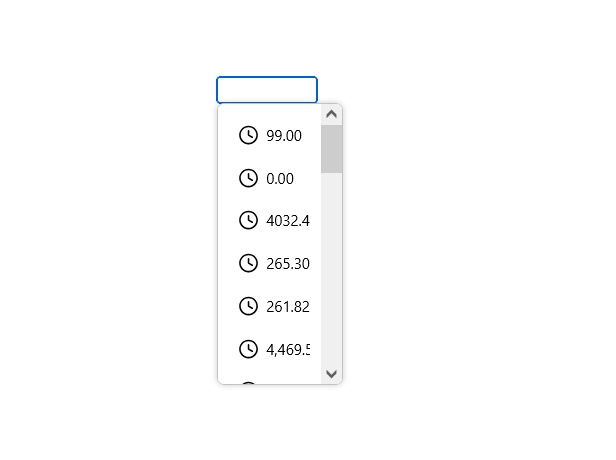
The new version has:
- Clock icons next to autocomplete/history entries
- Much more vertical padding, making the list unnecessarily large
- Rounded "pill-shaped" highlighting when hovering over an entry
The previous autocomplete list was much more compact and clean, without the clock icons, excessive padding or rounded hover backgrounds.
Is there currently a setting, `about:config` preference or other supported way to restore the old autocomplete list appearance?
Ideally, I would like to use the previous style:
- No clock icons
- Compact rows with the previous amount of padding
- No rounded/pill-shaped hover effect
- Otherwise retain the existing autocomplete functionality
If there is no setting to restore the old appearance, could an option be added to allow users to choose between the old and new autocomplete UI?
この投稿は paul644 により に変更されました
すべての返信 (5)
You might want to follow bugzilla.mozilla.org/2051506 and bugzilla.mozilla.org/2051370 as there are apparently some changes around these.
Or file a bug to that tune, so that these changes perhaps only target the "Nova" redesign, so that you can keep that disabled and get the previous experience.

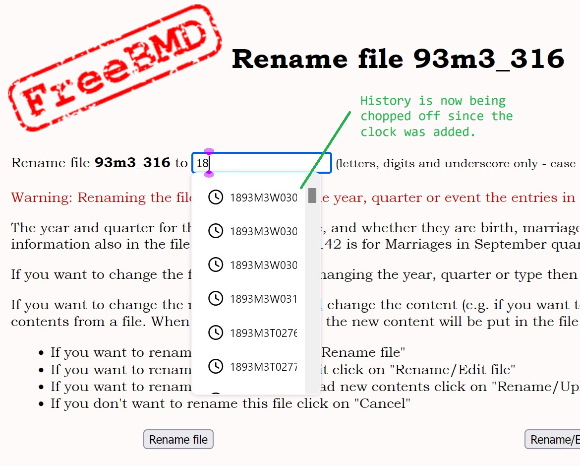
I am also inconvenienced by the change which adds a "clock" icon on the history list in an entry field. This causes the end of the dropdown list to be truncated, thus I can't see which previous entry I should select. I don't really want to turn off the "remember history" option, as then I don't get any dropdown list at all. Also the list is too spaced out vertically.
Unfortunately, there are no changes right now, and it's not clear whether they are planned
An official decision has just come: no changes planned.
After all, the decision has been reconsidered, and the fix has just landed in Nightly