

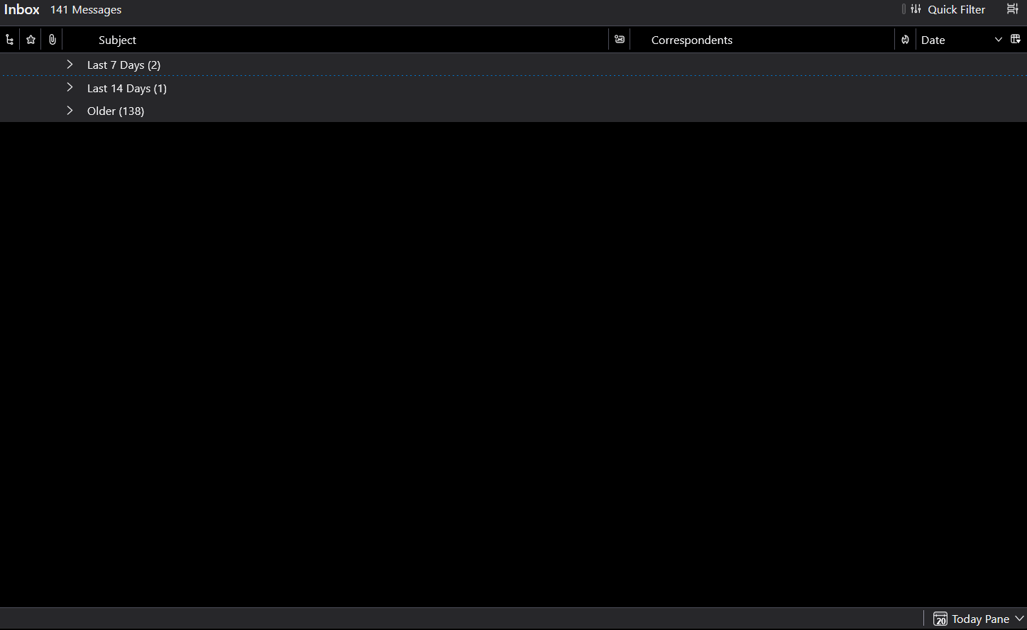
Message list background turned full black after 151.0 update
As the topic says, the message list turned from the usual dark-mode look, to a full black background after updating to 151.0.
Was this an intentional change? How can I revert it?
All Replies (11)
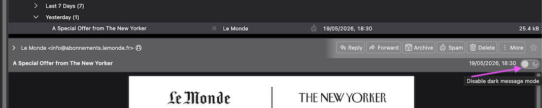
Maybe the update put your Thunderbird n "Dark message mode"? Open a message and in the message header pane toggle the symbol to disable dark message mode (see image)
Mapenzi said
Maybe the update put your Thunderbird n "Dark message mode"? Open a message and in the message header pane toggle the symbol to disable dark message mode (see image)
This has nothing to do with the dark message mode, as it only controls the email contents, not the theming of the program itself. Also, the messages themselves, the new message window and other parts all look normal. Again, the problem with the full-black background only occurs in the message list.
Do you also run the latest version? How does yours behave?
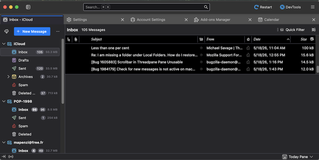
I run the last version TB 151.0. When I enable the "Dark" theme my main window looks like in my new screen shot, which means that the background color of the entire GUI is black, including the thread pane (message list). You may notice that my new image looks like yours, and I don't know what is bothering you. When working with Thunderbird I never use the dark theme, so I'm unaware of any changes in a recent update.
EDIT: I just compared with my Thunderbird 140.11.0esr profile and noticed that the dark theme has the same effect on the message list background color.
Modified by Mapenzi
Okay, your version seems to behave like mine.
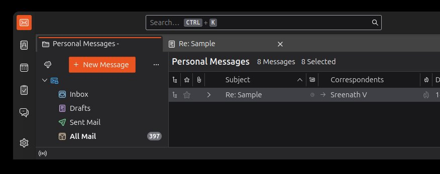
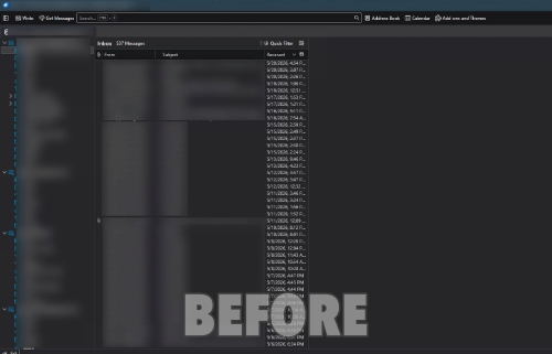
I've attached a screenshot I found of how it looked before the update. As you see, the background color used to be a deep dark grey (like it search-field up top), not pure black.
If you select a message in the thread pane its background will be either blue (my particular contrast color) as long as the thread pane is in focus, or it will be a dark grey when the thread pane is no longer in focus (see my images)
Hi,
Same problem: https://support.mozilla.org/en-US/questions/1582899.
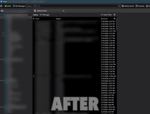
I already had dark mode enabled before and all panes looked the same dark gray/brown until 151 update. Now, the message list pane has a pitch black background which makes it very uncomfortable to look at and just plain ugly.
151 changed something, I hope this is just a bug and not by design. I've gone back to 150 and it looks normal again.
Modified by ADZ
If you are convinced that this is a new bug in v151 please file a bug report here https://bugzilla.mozilla.org/home
Mapenzi said
If you are convinced that this is a new bug in v151 please file a bug report here https://bugzilla.mozilla.org/home
I don't know, it could be by design. Some devs have really weird UI ideas these days. Few of my apps got atrocious UI updates recently that are apparently "better for me" and I'm tired of reporting bugs only to be scorned and patronized by the devs for questioning their "awesome ideas". Sure, this could be just a bug but I simply don't have the nerves for this any more, sorry, I gave up.
My Mozilla account doesn't work with bugzilla anyway, I closed my Github account and I don't want to open yet another N+1 internet account. I'll stay on 150 for as long as I can and then I'll see what happens.
Modified by ADZ
So yeah, my suspicion was correct, it seems. This change was deliberate:
https://bugzilla.mozilla.org/show_bug.cgi?id=2036174
Quote:
"this was intentional to increase readability in dark mode and create a consistent visual separation between the side panes and main content"
Resolution: won't fix
This can't be serious... "increase readability" and "consistent visual separation between the side panes". It would be pointless to argue since the devs seem to be absolutely convinced that this is somewhat "better".
I don't even know what to say... It looks terrible and it's hard to look at. Where are these devs getting their UI ideas from?
Time to look at Betterbird or go back to Mailbird, Thunderbird is going the wrong way, clearly,
Modified by ADZ
Jesus... One might at least expect from them to let the users decide for themselves.
Well, thanks anyway for following up on the issue. In contrast to the other "contributor" in this thread, you actually understood the problem before replying, and didn't drop comments like "I don't know what is bothering you.". So thank you for that!
7adm said
Jesus... One might at least expect from them to let the users decide for themselves. Well, thanks anyway for following up on the issue. In contrast to the other "contributor" in this thread, you actually understood the problem before replying, and didn't drop comments like "I don't know what is bothering you.". So thank you for that!
You're welcome. Yeah, it bothered me, it ruined Thunderbird for me as it makes the email list in compact table mode unbearable to look at (I bet nobody tested this before approving this "improvement"). This is very disappointing and upsetting but this is, unfortunately, a clear pattern in FOSS design where UIs are designed by programmers, not actual UI designers.
I don't know on what planet white on pitch black "increases readability".
Good luck.
Modified by ADZ