

When testing layout on Firefox Responsive Design Mode, page appears drastically different from other Chrome/Safari
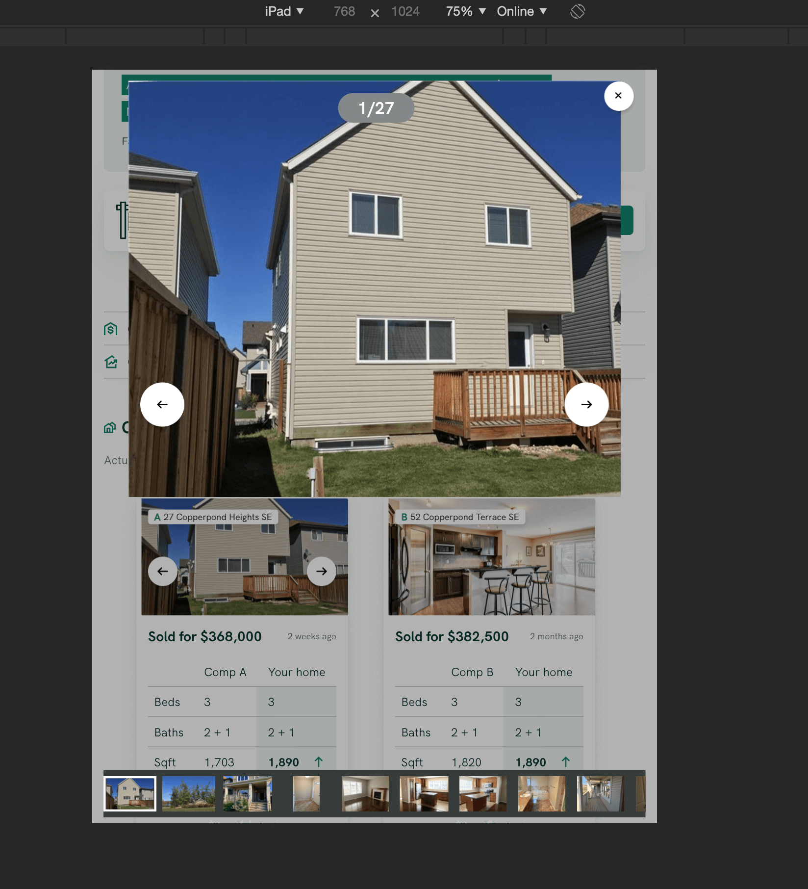
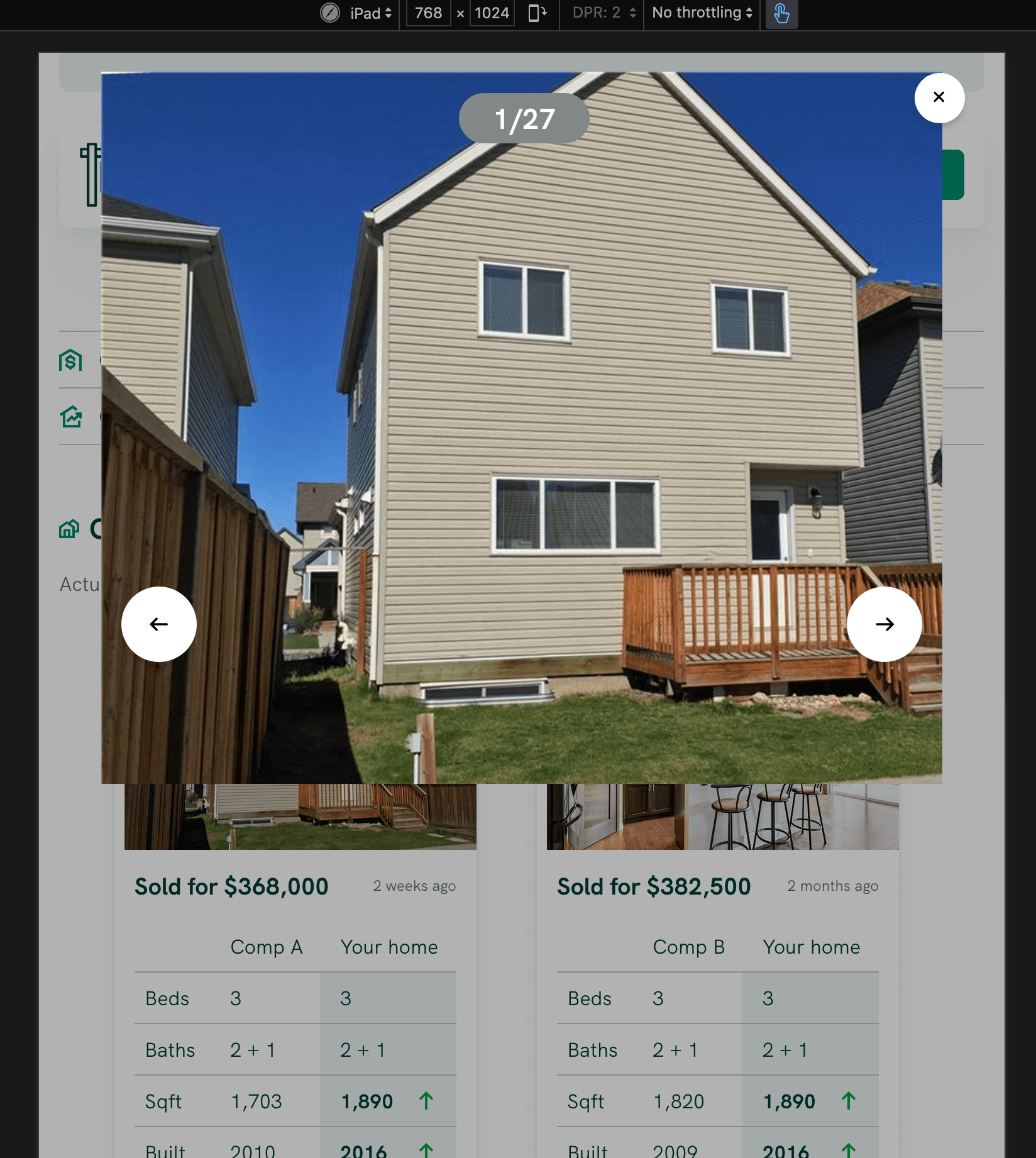
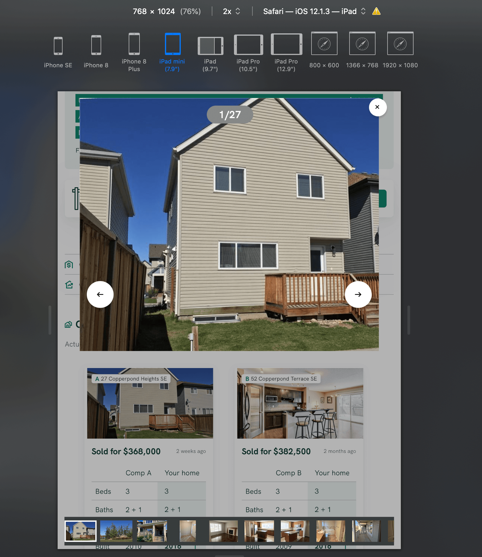
I spent hours struggling with my css and nothing would make my page look right. Whenever I tested on iPhone and iPad sizes through Firefox's RDM, the behaviour I was getting was far from what I expected. Then it dawned on me to try it on other browsers. Shockingly, it worked as expected. On Chrome and Safari sticky bar was sticking to the bottom (on FF, it's pushed way down, so can't even be seen on the screenshot. Also, putting them side by side, it's noticeable the size difference from the FF render. I did check my zoom levels (this is actual size) and minimum font (none), so I don't think this is a local configuration issue. I love the dev tools in FF, and find them much better for handling design overall, but this issue really threw me for a loop.
For reference, this was on FF 75.0 (64-bit) with Mozilla/5.0 (iPad; CPU OS 11_0 like Mac OS X) AppleWebKit/604.1.34 (KHTML, like Gecko) Version/11.0 Mobile/15A5341f Safari/604.1.
Is this a known browser issue?
தீர்வு தேர்ந்தெடுக்கப்பட்டது
Hi Taly:
There's no bugzilla instance AFAIK
For web developer questions again please:
1. ask it in stack overflow and tag it firefox https://stackoverflow.com/questions/tagged/firefox
2. or you can ask on discourse:
https://discourse.mozilla.org/c/devtools/213
I'd try both personally
Hope that helps!
...Roland
Read this answer in context 👍 0All Replies (4)
Hi Taly:
This forum is focused on user support questions. It's best to ask web development questions on other forums (which i guess is unclear even though we have an article about this Where to go for developer support)
For web developer questions please:
1. ask it in stack overflow and tag it firefox https://stackoverflow.com/questions/tagged/firefox
2. or you can ask on discourse:
https://discourse.mozilla.org/c/devtools/213
I hope that helps!
...Roland
Roland Tanglao மூலமாக திருத்தப்பட்டது
Roland Tanglao said
This forum is focused on user support questions. It's best to ask web development questions on other forums (which i guess is unclear even though we have an article about this Where to go for developer support)
Indeed, that page doesn't cover it. I couldn't tell from it what's the correct path to handle "browser (potential) bugs".
I know there used to be a Bugzilla instance, but that seems shut down now, so I was looking for the closest equivalent. Is that Discourse?
தீர்வு தேர்ந்தெடுக்கப்பட்டது
Hi Taly:
There's no bugzilla instance AFAIK
For web developer questions again please:
1. ask it in stack overflow and tag it firefox https://stackoverflow.com/questions/tagged/firefox
2. or you can ask on discourse:
https://discourse.mozilla.org/c/devtools/213
I'd try both personally
Hope that helps!
...Roland
Note that you can also select @media rules for a specific width in the style editor.