

How to stop FF from showing the wrong font in some websites?
Hi. I've had this problem for some time and I finally decided to try to do something about it....
What happens is, the text/font on some of the websites I visit is really hard to read and since the same pages look fine in Explorer, it looks like FF is somehow grabbing and using the wrong font.
I'm using FF17 on Win XP SP3, but I've been seeing this problem on earlier versions of FF as well.
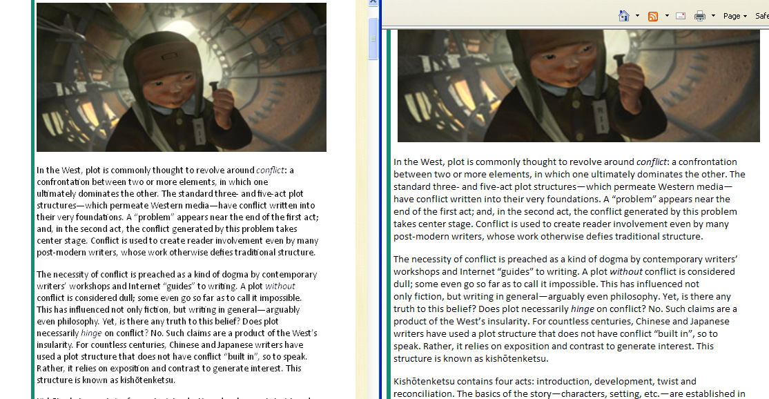
I'd post some screen grabs but I can't see how to do that?? Here's a site where all the text looks wrong -- the buttons, the captions, the text on the right... http://fuckyeahcharacterdevelopment.tumblr.com/post/28177782962/the-significance-of-plot-without-conflict
Soluție aleasă
You did close and restart Firefox after toggling the hardware acceleration setting?
What happens if you select the Calibri font as the default font for a test?
Does that make any difference?
What do you get if you temporarily remove that Calibri font from the Fonts folder?
If ff is spaced closely then that usually means that a font that supports ligatures is used.
Citește acest răspuns în context 👍 1Toate răspunsurile (12)
Not to belabor the obvious, but I hope you've checked Tools>Options>Content>Fonts & Colors>Advanced to be sure that the "Allow pages to choose their own fonts..." box is checked?
You can use this extension to see which fonts are used for text that is selected (right-click context menu: Show fonts in selection).
r3n.. -- yes, That box is checked. If I uncheck it, the problem page switches to my default font (verdana) and looks fine. But then every other page switches to verdana as well, so if I fix that one page then I break everything else.
Cor-el --
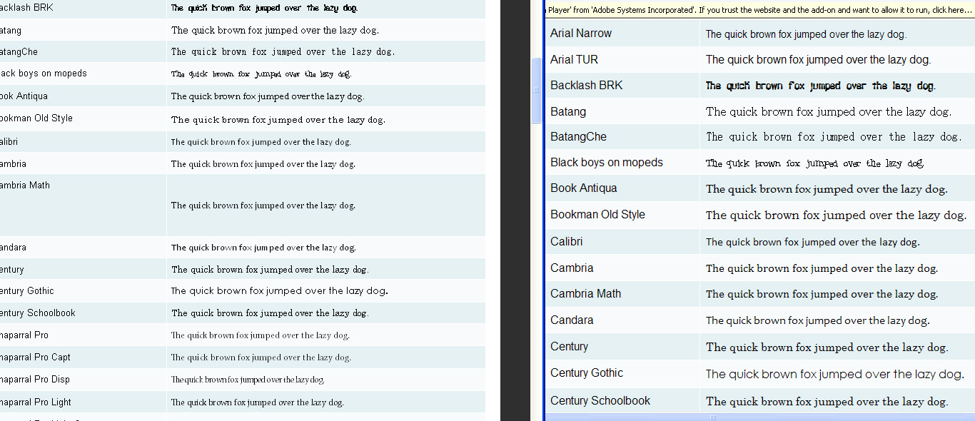
It says calibri. But it doesn't look like the calibri that I'm seeing in explorer. in FF, the letters are dark and blocky and squished together. Especially noticeable are --
'fi' and 'fl' are squished together and touching;
Some letters, eg 'w' 'W' 'A' and 'C', are of a much lighter weight than the other letters.
Here's a screen grab: FF is on the left, Explorer is on the right.
Did you try to select individual letters that look different?
Italic text also looks different.
You can do a font test to see if you can identify corrupted font(s).
Not sure what you're asking me about individual letters looking different -- all the letters look different!
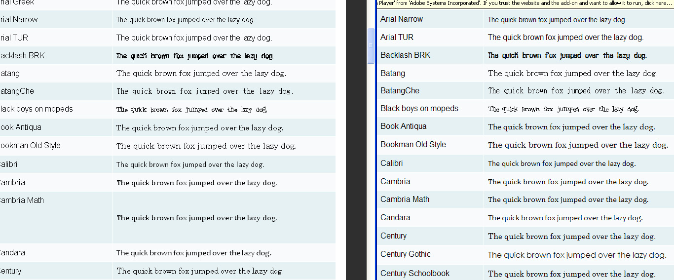
I ran the font detector thing. I didn't see any error messages, but this is how it looks in FF (left) vs Explorer (right).
I also took a second screen grab after hitting 'ctrl plus' twice -- as you can see, even when the fonts are a comparable size in FF, they're still looking wonky.
Try to disable hardware acceleration in Firefox.
- Tools > Options > Advanced > General > Browsing: "Use hardware acceleration when available"
- https://support.mozilla.org/kb/Troubleshooting+extensions+and+themes
You can also try to enable ClearType system wide for all programs to make other programs like Firefox use it.
- http://support.microsoft.com/kb/306527 - HOW TO: Use ClearType to Enhance Screen Fonts in Windows XP
XP: Control Panel > Display > Appearance > Effects: "Use the following method to smooth edges of screen fonts"
Hardware acceleration makes no difference to the appearance whether the box is checked or not.
Cleartype actually does a nice job of fixing the original problem -- but it's not a solution because makes the text on [all?] other sites look heavy and fuzzy.
Are you zooming any of those pages or did you increase the minimum font size?
- Tools > Options > Content : Fonts & Colors > Advanced > Minimum Font Size (none)
Reset the page zoom on pages that cause problems.
- View > Zoom > Reset (Ctrl+0 (zero); Cmd+0 on Mac)
Minimum font size is set to none.
In the font test images above, I zoomed (ctrl +) twice on one screen grab. The other screen grab is unzoomed and exactly how it loads.
So is there anything else I can try that hasn't already been suggested in other, similar threads?
Soluție aleasă
You did close and restart Firefox after toggling the hardware acceleration setting?
What happens if you select the Calibri font as the default font for a test?
Does that make any difference?
What do you get if you temporarily remove that Calibri font from the Fonts folder?
If ff is spaced closely then that usually means that a font that supports ligatures is used.
Restarting after toggling hardware acceleration makes no difference.
Setting Calibri as the default makes no difference on the problem page, but it does mess up some other sites.
I'm not sure what relevance ligatures may or may not have to this problem.
However --
Simply deleting calibri from the fonts forces the problem page to switch to arial -- which looks fine!
AFAIK I don't have any special reason to have calibri on this machine, so as far as I'm concerned, that's problem solved! Thanks!