Firefox Nightly 135.0a1 on Android UX regression in the new menu
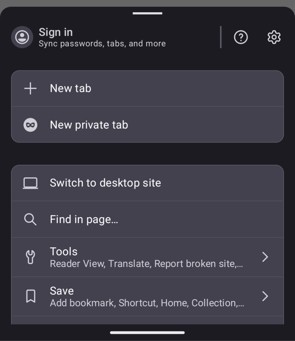
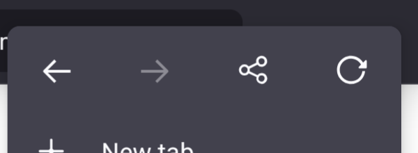
The new menu doesn't contain at least two very requently used actions:
- reload the page - go forward
There is no way to disable the new menu and revert the old behavior.
All Replies (4)
Luckily this can be reverted via the secret settings https://firefox-source-docs.mozilla.org/mobile/android/fenix/Secret-settings-debug-menu-instructions.html
Endret
I just got this new menu as well, and instantly hate it. It takes up WAY more space without actually providing any new functionality In fact, it has taken away functionality!!
It has also put buttons I use very regularly even further away, under even more submenus. I genuinely do not see the point of this new menu...
When I saw it, I immediately looked in the secret settings to see if it could be reverted, but no such luck:
Endret
sergey14 said
The new menu doesn't contain at least two very requently used actions: - reload the page - go forward There is no way to disable the new menu and revert the old behavior.
I have Reload on the top bar (lock, URL, Share, Reload) and Forward on the bottom bar (Back, Forward, New Tab, Tabs, Menu). I'm not in love with two-bar layout.
Oh I see the removed functionality was put into a new bar...
Why.
It was perfectly good as it was! This takes up way too much space!! Sure it disappears when I scroll down, but that doesn't help on websites that have disabled their scroll. And also, it just looks cluttered??
I used to be able to control my browser with just my right thumb. It was great! Perfect UX! But now I have to either shuffle my phone into a different position, or use my other hand.
I have THREE bars now. I don't hate toolbars, but there is just no reason to have them be like this...
Endret


