

The previous New Tab layout setting (browser.newtabpage.activity-stream.newtabLayouts.variant-a) is gone in FF 141!
In a few previous updates, FF keeps messing around with the New Tab layout, ruining its previous good look. I learned to revert it back to its former setting by disabling browser.newtabpage.activity-stream.newtabLayouts.variant-a and also browser.newtabpage.activity-stream.newtabLayouts.variant-b in about:config.
Now in Firefox 141, browser.newtabpage.activity-stream.newtabLayouts.variant-a has completely disappeared, no more allowing the poor user to get the look he wants.
Why? Am I missing something? What is the use of making the product worse or less user friendly?
All Replies (20)
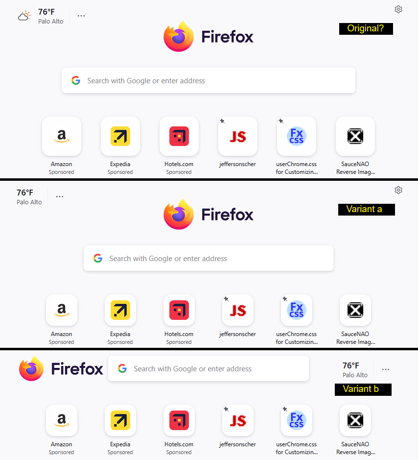
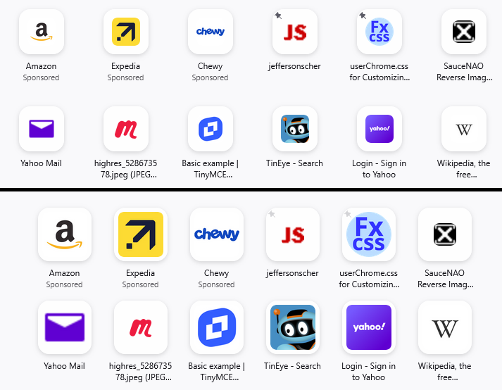
I still have Firefox 140, and this is the difference I see between the original layout (neither variant), variant "a", and variant "b":
I'm not sure what the process was for selecting "b" as the new layout for Firefox 141. But I think I've had this layout for a few months already.
What are the changes that make you prefer something other than variant "b"?
jscher2000 - Support Volunteer said
What are the changes that make you prefer something other than variant "b"?
The tiles or topSites (icons and texts) are smaller and more difficult to read unless zoomed in, they are more spaced out vertically (wasting a lot of screen space), those annoying pins are back there again from FF 138 or 139, there is this unnecessary Firefox logo at the top of the page, etc...
Regardless, even if layout "b" was really the best, leading Firefox team to make it the official one, I can't understand why the other options like the old layout must be removed?! What harm did it do?!
Modified by Alex
Agent virtuel said
Hello Take a look at https://connect.mozilla.org/t5/discussions/feedback-for-the-new-tab-layout-variants-in-the-home-page/m-p/99330/highlight/true#M38642
Hello, I visited your post there. You seem to confirm that it is gone for good.
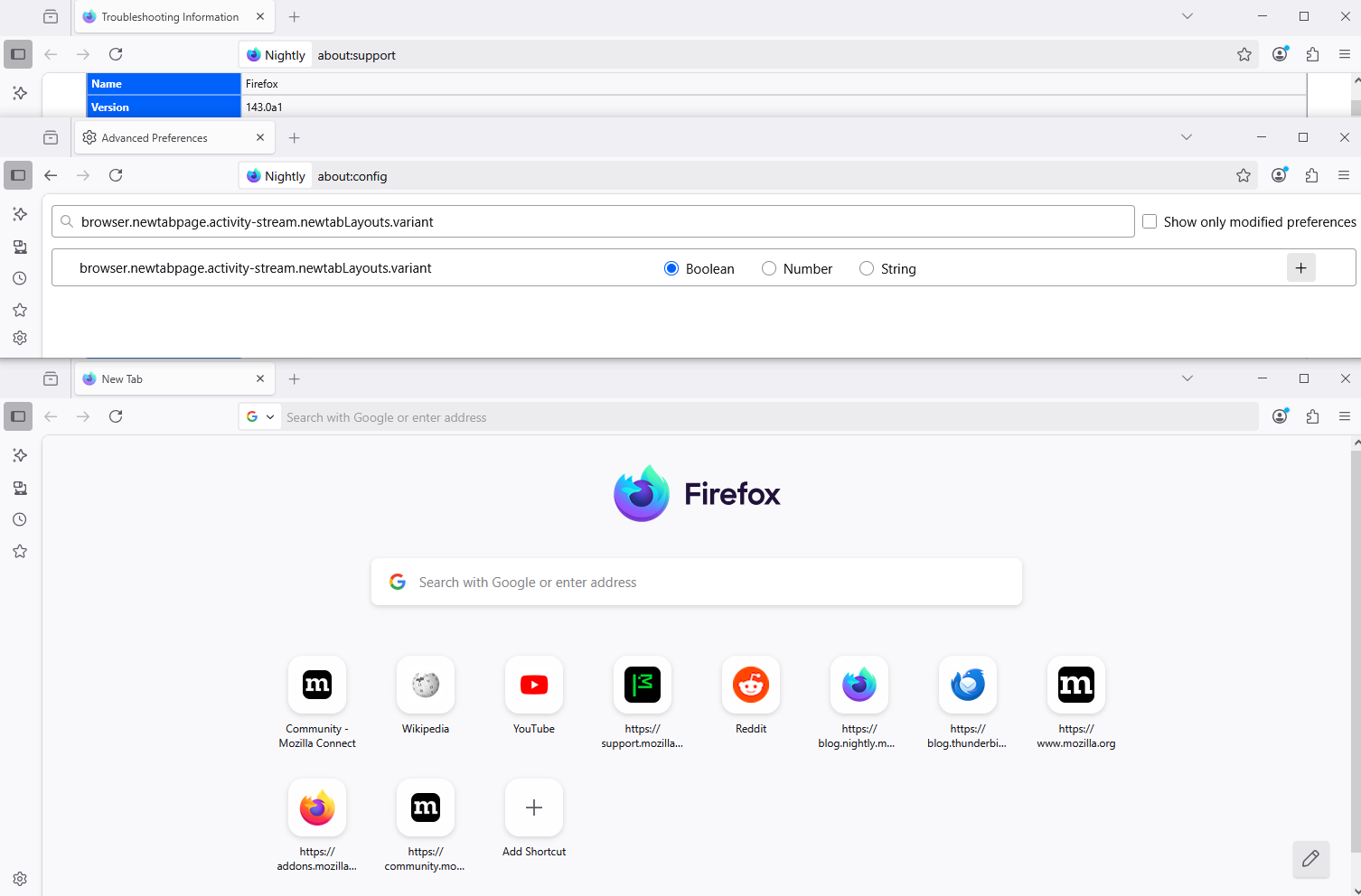
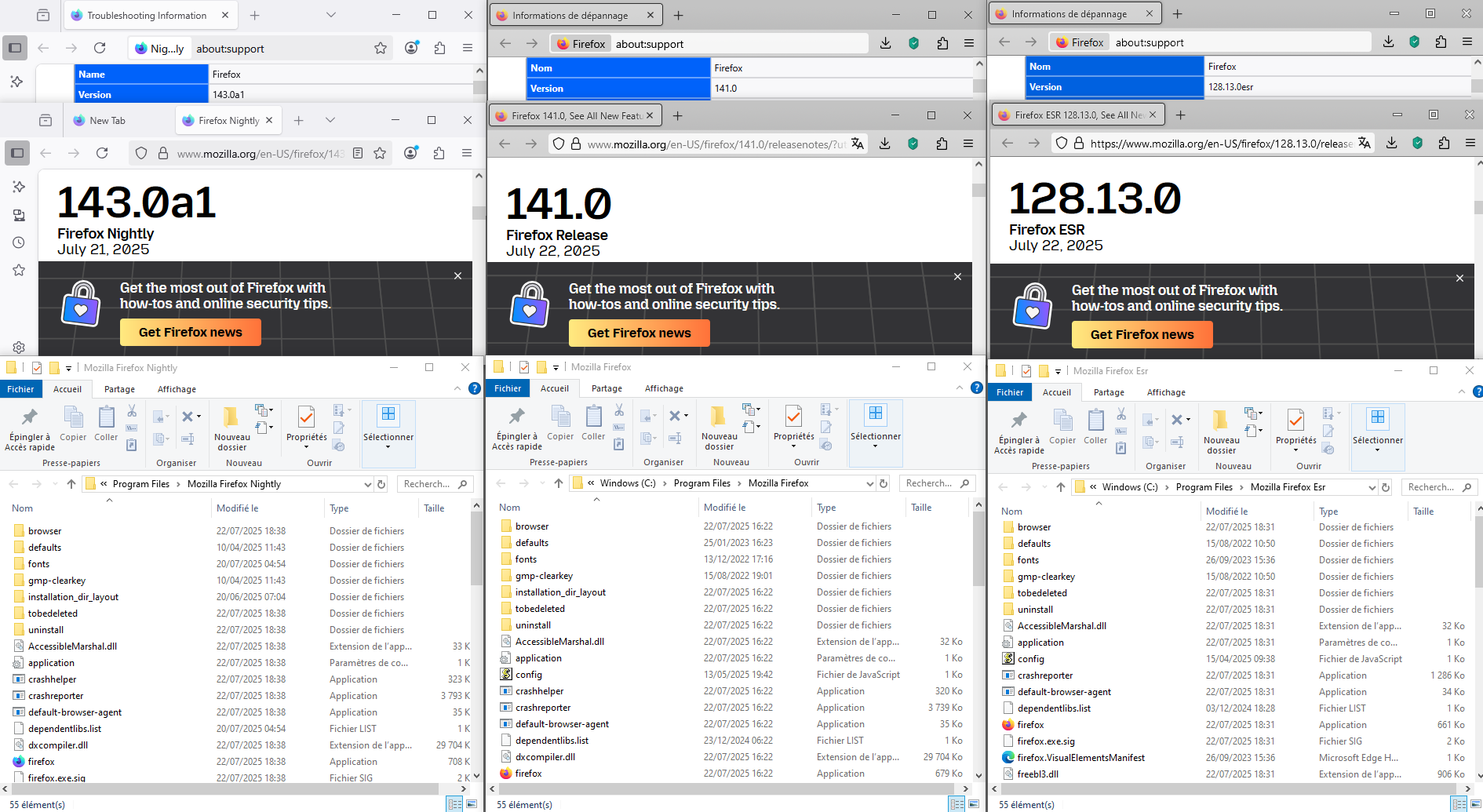
By way of other illustration under Firefox Nightly 143 browser.newtabpage.activity-stream.newtabLayouts.variant, preferences no longer exist.
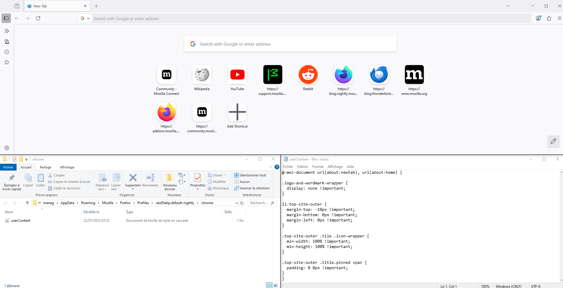
Screenshot3, an experiment, with the help of userContent.css
Of these --
(1) The tiles or topSites (icons and texts) are smaller and more difficult to read unless zoomed in
The icon size was reduced from 48 pixels square to 32 pixels square. Not sure what changed with the text.
(2) they are more spaced out vertically (wasting a lot of screen space),
(3) those annoying pins are back there again from FF 138 or 139
Seems they moved from the text to the image.
(4) there is this unnecessary Firefox logo at the top of the page, etc...
I don't think the Logo is new, but maybe the placement is a bit different?
-- I think most can be addressed with custom style rules in a userContent.css file. A good place to ask for help on that would be this subreddit: https://www.reddit.com/r/FirefoxCSS/
As an example of what you might do, you can open the Style Editor on the new tab page (Shift+F7), above the left column, click the + button to create a new sheet, then in the blank area on the right, paste in these style rules:
/* Enlarge icons from 32px square to 64px square */
.top-site-outer .tile .icon-wrapper,
.shortcuts-refresh .top-site-outer .tile .icon-wrapper {
  height: 64px !important;
  width: 64px !important;
}
/* Enlarge the button so there's still a bit of white space */
.top-site-outer .tile,
.shortcuts-refresh .top-site-outer .tile {
  height: 76px !important;
  width: 76px !important;
}
/* Reduce vertical spacing */
.top-site-outer .top-site-button,
.shortcuts-refresh .top-site-outer .top-site-button {
  padding-block: 4px !important;
}
/* Reduce horizontal spacing */
.top-site-outer,
.shortcuts-refresh .top-site-outer {
  width: 108px !important;
}
/* Fade pin to 75% transparent */
.top-site-outer .icon-pin-small,
.shortcuts-refresh .top-site-outer .icon-pin-small {
  opacity: 0.25 !important;
}
I have attached a sample comparison image of the results of these rules. Helpful, but probably incomplete from your perspective.
jscher2000 - Support Volunteer said
Of these -- (1) The tiles or topSites (icons and texts) are smaller and more difficult to read unless zoomed in The icon size was reduced from 48 pixels square to 32 pixels square. Not sure what changed with the text. (2) they are more spaced out vertically (wasting a lot of screen space), (3) those annoying pins are back there again from FF 138 or 139 Seems they moved from the text to the image. (4) there is this unnecessary Firefox logo at the top of the page, etc... I don't think the Logo is new, but maybe the placement is a bit different? -- I think most can be addressed with custom style rules in a userContent.css file. A good place to ask for help on that would be this subreddit: https://www.reddit.com/r/FirefoxCSS/ As an example of what you might do, you can open the Style Editor on the new tab page (Shift+F7), above the left column, click the + button to create a new sheet, then in the blank area on the right, paste in these style rules:/* Enlarge icons from 32px square to 64px square */ .top-site-outer .tile .icon-wrapper, .shortcuts-refresh .top-site-outer .tile .icon-wrapper { height: 64px !important; width: 64px !important; } /* Enlarge the button so there's still a bit of white space */ .top-site-outer .tile, .shortcuts-refresh .top-site-outer .tile { height: 76px !important; width: 76px !important; } /* Reduce vertical spacing */ .top-site-outer .top-site-button, .shortcuts-refresh .top-site-outer .top-site-button { padding-block: 4px !important; } /* Reduce horizontal spacing */ .top-site-outer, .shortcuts-refresh .top-site-outer { width: 108px !important; } /* Fade pin to 75% transparent */ .top-site-outer .icon-pin-small, .shortcuts-refresh .top-site-outer .icon-pin-small { opacity: 0.25 !important; }I have attached a sample comparison image of the results of these rules. Helpful, but probably incomplete from your perspective.
Thanks a lot for the code and explanations. Sure, I am aware of that css partial solution from my previous research the very first time Firefox introduced this new layout in 135 or so. But it is too much effort for a very straightforward and simple query, that should be solved by a button. As a user, I am not asking even for a GUI button; I am fine with that terrible about:config fix. But css editing?
Now that there remains no other option, I would do it. I don't know whether or not the css would be replaced by the "factory reset version" on each upgrade. Maybe I move to Vivaldi. I am using Firefox since its day 1. I'm sad that they are not as loyal to the user as the user is loyal to them.
Honestly, I can't understand why Firefox is making it more difficult (or even impossible) for the user to get that old layout. If it was harmful, for example a waste of resources (in terms of code creation or maintenance, etc) or a security risk or hard on RAM/CPU, killing it would make sense. But why bother to kill it when it is already there, needs no effort on Firefox's part, is not CPU-intensive, and poses no security risk, and especially when it is loved by many users?
Sorry for my ranting. I hoped someone from Firefox may read my post. The rant was aimed at them.
Or something easier; I will downgrade to Firefox 140 and never update again. I will have a portable Firefox which will be kept updated. I will use the portable version for security-sensitive tasks, while using the 140 for everyday work.
A userContent.css file is applied to the page automatically; the test paste is only good until you reload the page.
For ranting, there is the Connect site (Help menu > Submit Feedback): https://connect.mozilla.org/
It's not recommended to stay on a randomly selected old version, but the Extended Support Release of Firefox 140 will get security updates for about a year: Switch to Firefox Extended Support Release (ESR) for personal use.
jscher2000 - Support Volunteer said
A userContent.css file is applied to the page automatically; the test paste is only good until you reload the page. For ranting, there is the Connect site (Help menu > Submit Feedback): https://connect.mozilla.org/ It's not recommended to stay on a randomly selected old version, but the Extended Support Release of Firefox 140 will get security updates for about a year: Switch to Firefox Extended Support Release (ESR) for personal use.
Thanks for the good info. The ESR version looks what I need (at least for one year until it expires). I might also try to tweak the source code of the latest Firefox and add the old layout from previous versions' codes to it for my own personal use.
Also WaterFox and LibreWolf may be the answer to my need.
Modified by Alex
https://connect.mozilla.org/t5/discussions/using-older-versions/m-p/52750/highlight/true#M18762
Some users have multiple installations of Firefox, each in separate program folders. Firefox uses a dedicated profile for each installation of Firefox, including Nightly, Beta, Developer Edition and Extended Support Release (ESR) installations. This makes Firefox more stable when switching between installations on the same computer, and also allows you to run different Firefox installations at the same time.
As far as I'm concerned, i use different Firefox installations at the same time.
Agent virtuel said
https://connect.mozilla.org/t5/discussions/using-older-versions/m-p/52750/highlight/true#M18762Some users have multiple installations of Firefox, each in separate program folders. Firefox uses a dedicated profile for each installation of Firefox, including Nightly, Beta, Developer Edition and Extended Support Release (ESR) installations. This makes Firefox more stable when switching between installations on the same computer, and also allows you to run different Firefox installations at the same time.As far as I'm concerned, i use different Firefox installations at the same time.
That's good to hear. Thanks for letting me know.
I agree this is a very annoying change that affects the icon sizes on the new tab page.
A similar problem was previously discussed at:
- https://www.reddit.com/r/firefox/comments/1hx412x/new_tab_shortcuts_ff134/
- https://www.reddit.com/r/firefox/comments/1kxhc24/how_do_i_fix_the_shortcuts_on_the_new_tab_page/
- https://connect.mozilla.org/t5/discussions/firefox-134-new-tab/td-p/82999
- https://connect.mozilla.org/t5/discussions/home-page-icon-rows-too-spread-from-each-other/m-p/85668
- https://connect.mozilla.org/t5/discussions/feedback-for-the-new-tab-layout-variants-in-the-home-page/td-p/89334
- https://bugzilla.mozilla.org/show_bug.cgi?id=1937177
An experiment happened with the new tab page around FF 134 that wasn't very well received by some users. And the code was ultimately reworked to allow people to "opt out" of the UI change and get back their regular-size icons.
But then in FF 141 they removed the workaround. Ugh!
Can we please get back the normal home page (new tab) user interface that we had before for many years, with the regular (larger size) icons?
Fundamentally, it seems like this problem arose from the "Variant A/B" study, and a misunderstanding between developers and the user community about what was being changed.
From a developer perspective, they thought they were evaluating between 2 choices (A and B) and ultimately they felt that B was the winner so that made that the new default. See https://bugzilla.mozilla.org/show_bug.cgi?id=1937177
But from a user perspective, there were actually 3 choices during the evaluation period (Original behavior, plus new options A and B). There are a significant number of users who liked neither A nor B, and wanted to retain the original behavior with its larger icons. These people have unfortunately been ignored.
Modified by dglowny
jscher2000 - Support Volunteer said
For ranting, there is the Connect site (Help menu > Submit Feedback): https://connect.mozilla.org/
Do they listen? Is it any useful?
Alex said
jscher2000 - Support Volunteer said
For ranting, there is the Connect site (Help menu > Submit Feedback): https://connect.mozilla.org/Do they listen? Is it any useful?
Sometimes suggestions that get a lot of up votes are added to Firefox, but a lot of suggestions don't get traction.
jscher2000 - Support Volunteer said
Alex said
jscher2000 - Support Volunteer said
For ranting, there is the Connect site (Help menu > Submit Feedback): https://connect.mozilla.org/Do they listen? Is it any useful?
Sometimes suggestions that get a lot of up votes are added to Firefox, but a lot of suggestions don't get traction.
It's truly sad. Thanks for your time.
Modified by Alex
I wanted to delete this post but there was no option to do so. So I just edited it into this remark. If possible, please delete it.

Modified by Alex
jscher2000 - Support Volunteer said
Of these -- (1) The tiles or topSites (icons and texts) are smaller and more difficult to read unless zoomed in The icon size was reduced from 48 pixels square to 32 pixels square. Not sure what changed with the text. (2) they are more spaced out vertically (wasting a lot of screen space), (3) those annoying pins are back there again from FF 138 or 139 Seems they moved from the text to the image. (4) there is this unnecessary Firefox logo at the top of the page, etc... I don't think the Logo is new, but maybe the placement is a bit different? -- I think most can be addressed with custom style rules in a userContent.css file. A good place to ask for help on that would be this subreddit: https://www.reddit.com/r/FirefoxCSS/ As an example of what you might do, you can open the Style Editor on the new tab page (Shift+F7), above the left column, click the + button to create a new sheet, then in the blank area on the right, paste in these style rules:/* Enlarge icons from 32px square to 64px square */ .top-site-outer .tile .icon-wrapper, .shortcuts-refresh .top-site-outer .tile .icon-wrapper { height: 64px !important; width: 64px !important; } /* Enlarge the button so there's still a bit of white space */ .top-site-outer .tile, .shortcuts-refresh .top-site-outer .tile { height: 76px !important; width: 76px !important; } /* Reduce vertical spacing */ .top-site-outer .top-site-button, .shortcuts-refresh .top-site-outer .top-site-button { padding-block: 4px !important; } /* Reduce horizontal spacing */ .top-site-outer, .shortcuts-refresh .top-site-outer { width: 108px !important; } /* Fade pin to 75% transparent */ .top-site-outer .icon-pin-small, .shortcuts-refresh .top-site-outer .icon-pin-small { opacity: 0.25 !important; }I have attached a sample comparison image of the results of these rules. Helpful, but probably incomplete from your perspective.
I applied your code and it worked perfectly. But together with another code of yours (from on Reddit here to increase the number of tiles / topSites), there is now a small glitch.
The new glitch is that the block of all enlarged 12 tiles is not center-aligned. It is aligned to the right: i.e., It begins from its original place, but extends to the far right, beyond and outside the screen; I will need to scroll to the right to get the tiles outside the frame. The list of 12 enlarged icons begin not from the far left side of the New Tab layout, but from its original place (that is for when there are only 6 icons). Please see the attached images.
If I reduce the zoom to 80%, the list of tiles get aligned in the center with equal spaces from left and right sides. But at 100% zoom, the list of tiles align to the right; they begin from where they used to begin in Firefox's factory format, while the right side of the list of tiles exits the window and I need to scroll to the right to access them (or zoom out). In the attached image, you can see that there remains an empty space on the left. I need the whole block of all tiles to be center-aligned.
Can you please give an additional code that forces the list of tiles to become center-aligned and begin from the far left side of the empty space on the New Tab layout? The code need to force the block of all tiles to become center-aligned. I mean there should be an equal space from both the left and right sides. Currently, there is a lot of empty space on the left; but on the right side, the icons go beyond the standard width of the screen and exit the frame (see my attached image). Of course, I can reduce their number to 11 or 10 so that they all fit within the page, but I prefer the block to be aligned centrally for the sake of looking clean and perfect.
Currently, my userContent.css is as follows:
/* Enlarge icons from 32px square to 64px square */
.top-site-outer .tile .icon-wrapper,
.shortcuts-refresh .top-site-outer .tile .icon-wrapper {
  height: 64px !important;
  width: 64px !important;
}
/* Enlarge the button so there's still a bit of white space */
.top-site-outer .tile,
.shortcuts-refresh .top-site-outer .tile {
  height: 76px !important;
  width: 76px !important;
}
/* Reduce vertical spacing */
.top-site-outer .top-site-button,
.shortcuts-refresh .top-site-outer .top-site-button {
  padding-block: 4px !important;
}
/* Reduce horizontal spacing */
.top-site-outer,
.shortcuts-refresh .top-site-outer {
  width: 108px !important;
}
/* Fade pin to 75% transparent */
.top-site-outer .icon-pin-small,
.shortcuts-refresh .top-site-outer .icon-pin-small {
  opacity: 0.25 !important;
}
@-moz-document url("about:newtab"), url("about:home") {
.logo-and-wordmark {
display:none !important;
}
.top-sites-list .top-site-outer .top-site-button {
transform: scale(1.1,1.1) !important;
}
}
/** Grid column count Override Fx141 **/
.top-sites-list {
  grid-template-columns: repeat(4, 1fr) !important;
}
@media (min-width: 680px) {
  .top-sites-list {
    grid-template-columns: repeat(6, 1fr) !important;
  }
}
@media (min-width: 920px) {
  .top-sites-list {
    grid-template-columns: repeat(8, 1fr) !important;
  }
}
@media (min-width: 1080px) {
  .top-sites-list {
    grid-template-columns: repeat(10, 1fr) !important;
  }
}
@media (min-width: 1360px) {
  .top-sites-list {
    grid-template-columns: repeat(12, 1fr) !important;
  }
}
(Above, you can see that I have also added yet another good code to remove the Firefox logo but it doesn't affect and is not relevant to the above-mentioned glitch of right-aligned block of tiles / topSites).
Modified by Alex
Hi Alex,
I've unmarked both of your latest answers, but since they look similar, could you please consider deleting one of them?
If you don't mind, surround your CSS with <pre> and </pre> tags to aid formatting.
Alex said
The new glitch is that: The list of 12 enlarged icons begin not from the far left side of the New Tab layout, but from its original place (that is for when there are only 6 icons). Please see the attached images. If I reduce the zoom to 80%, the list of tiles get aligned in the center with equal spaces from left and right sides.
I'm not sure why that is happening. I created the different width break points in the @media statements to fit everything on my screen, which is Full HD at 100% / 96ppi zoom (not enlarged). You might need to adjust the min-width points if they are too low, or reduce the number of columns.
For reference, not fixed:
/** Grid column count Override Fx141 **/
.top-sites-list {
grid-template-columns: repeat(4, 1fr) !important;
}
@media (min-width: 680px) {
.top-sites-list {
grid-template-columns: repeat(6, 1fr) !important;
}
}
@media (min-width: 920px) {
.top-sites-list {
grid-template-columns: repeat(8, 1fr) !important;
}
}
@media (min-width: 1080px) {
.top-sites-list {
grid-template-columns: repeat(10, 1fr) !important;
}
}
@media (min-width: 1360px) {
.top-sites-list {
grid-template-columns: repeat(12, 1fr) !important;
}
}