

Youtube layout
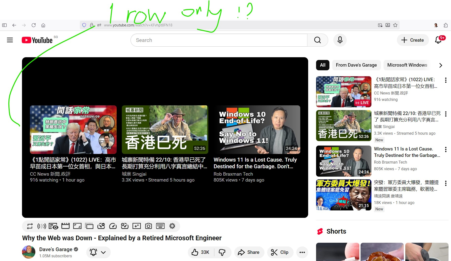
The layout of YouTube was different from before. In the past, after the YouTube video was over. The MAIN WINDOW within YouTube page would showed two rows of recommendations. Now there is only one row with great amount of black-out space at top and bottom. Any suggestion to tune it to the usual two rows?
The layout of YouTube was different from before. In the past, after the YouTube video was over. The MAIN WINDOW within YouTube page would showed two rows of recommendations. Now there is only one row with great amount of black-out space at top and bottom. Any suggestion to tune it to the usual two rows?
Todas las respuestas (1)
Hi,
This forum is intended to help users with Mozilla products, such as Firefox, while your question seems to be related to YouTube UI changes (introduced by Google). You can submit your feedback to YouTube here.
As a moderator, I'm going to mark this thread as off-topic and lock the thread since it is not a subject covered in the support forum. Please see Mozilla Support rules and guidelines.