

Firefox mobile appearance on iOS
Why does Firefox mobile for iOS look different on my iPhone 13 pro max vs my wife's iPhone 12 pro max? both UTD on iOS version. I suspect that I must be missing something in settings, but cannot figure this out. See images below.
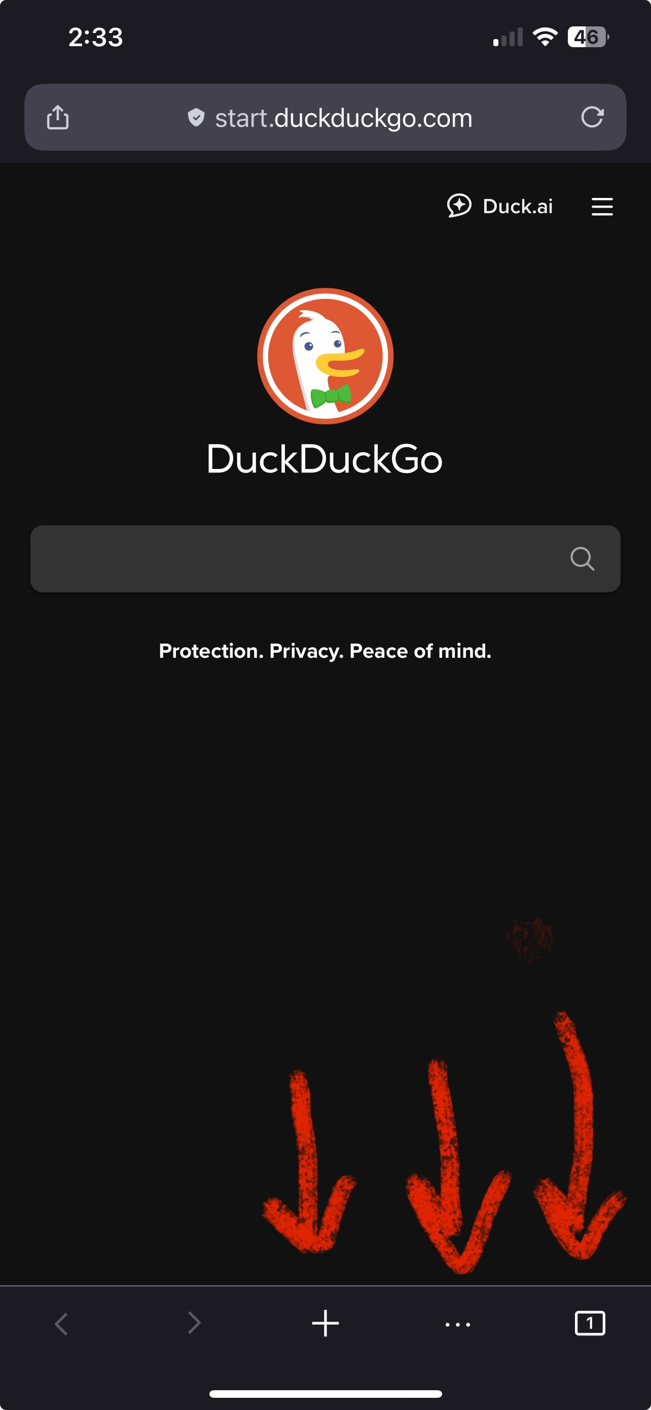
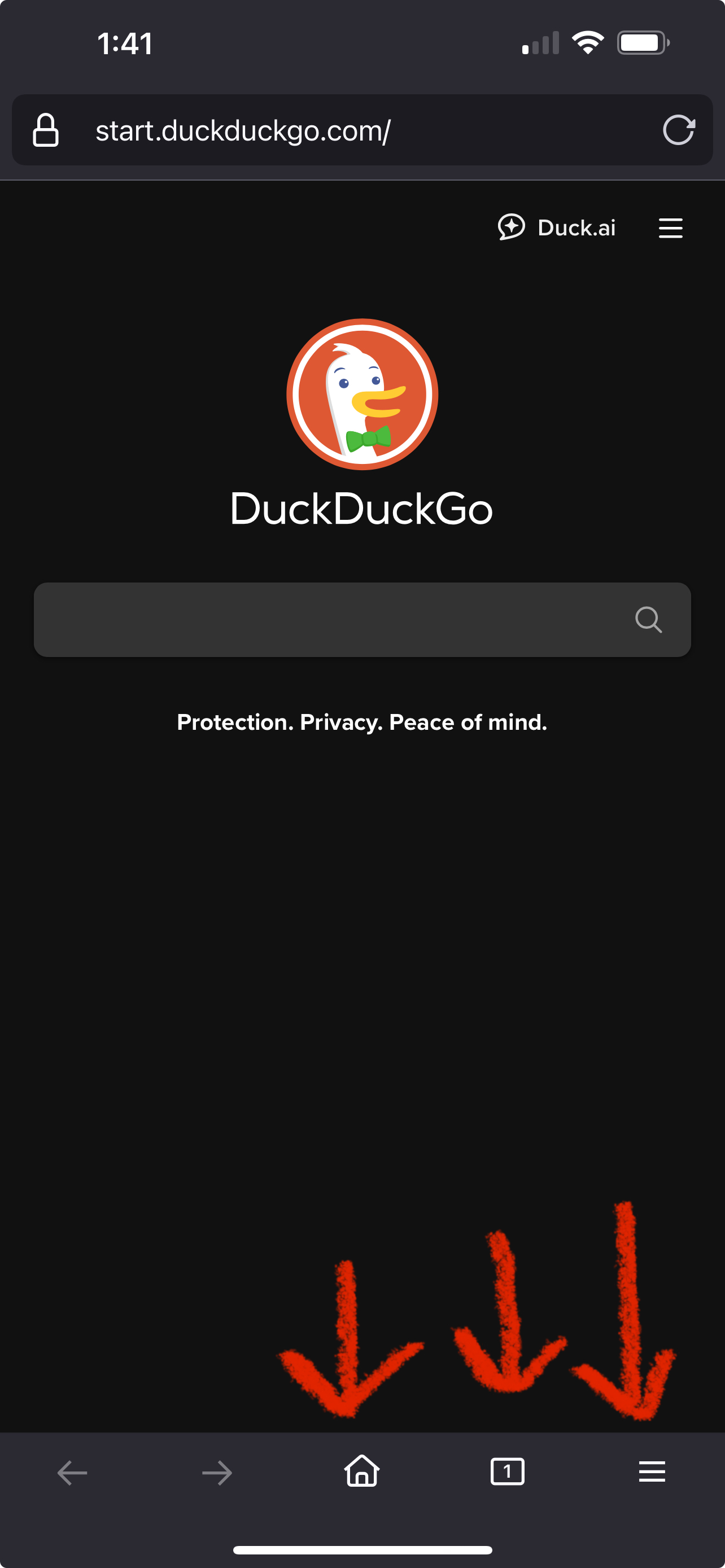
On my iPhone 13 Pro Max, the Firefox app has the nice home button, tab button, and hamburger menu button on the bottom (address bar on top both cases). On my wife's iPhone 12 Pro Max, it has the "+" for new tab, the 3 dots instead of hamburger menu, and then the tab button. I much prefer the layout on my phone, as does my wife, but I cannot figure out how to change her layout to match mine.
Any help would be much appreciated!
منتخب شدہ حل
I ran into the exact same thing recently — I have a 13 Pro Max and my wife has the 12 Pro Max, both on the latest iOS and Firefox versions. On my phone, I get the home, tab switcher, and hamburger menu at the bottom, but on hers it’s the plus sign, tab switcher, and the three dots. Super weird at first.
After digging into it, I found out that Firefox sometimes rolls out UI experiments (A/B testing) to different users, even if everything else — device, OS, app version — is the same. It's frustrating because there’s no setting to switch between the layouts manually.
We tried checking all the settings side-by-side, and we even uninstalled and reinstalled the app on her phone. That actually helped — after reinstalling, her layout changed to match mine. Not sure if it’ll work for everyone, but it’s worth a shot.
I only noticed this because I was doing some browser testing for my own business site. Hopefully, Firefox adds a setting to choose the layout soon, because these silent UI changes are kind of annoying.
Hope that helps!
اس جواب کو سیاق و سباق میں پڑھیں 👍 1تمام جوابات (4)
منتخب شدہ حل
I ran into the exact same thing recently — I have a 13 Pro Max and my wife has the 12 Pro Max, both on the latest iOS and Firefox versions. On my phone, I get the home, tab switcher, and hamburger menu at the bottom, but on hers it’s the plus sign, tab switcher, and the three dots. Super weird at first.
After digging into it, I found out that Firefox sometimes rolls out UI experiments (A/B testing) to different users, even if everything else — device, OS, app version — is the same. It's frustrating because there’s no setting to switch between the layouts manually.
We tried checking all the settings side-by-side, and we even uninstalled and reinstalled the app on her phone. That actually helped — after reinstalling, her layout changed to match mine. Not sure if it’ll work for everyone, but it’s worth a shot.
I only noticed this because I was doing some browser testing for my own business site. Hopefully, Firefox adds a setting to choose the layout soon, because these silent UI changes are kind of annoying.
Hope that helps!
Very interesting--thank you so much for the reply/answer. I'll give this a try (reinstalling the app). I'm not sure how Mozilla is getting feedback re: these different UI's if not everyone is aware of the 2 different versions. I much prefer our version with the hamburger menu :)
I’ve noticed that too — Firefox on iOS sometimes looks different even on similar devices. It turns out Firefox runs A/B tests or gradual feature rollouts, so things like button placement, tab view, or menu icons can vary slightly depending on user groups or settings.
I use Firefox Mobile daily for managing web-based tools in my medical billing work, and so far it’s been reliable across devices. For anyone juggling healthcare tasks on mobile, especially secure platforms like https://ebillingworks.com/, having a consistent browser experience really makes a difference. Hopefully Firefox eventually gives more layout control options in settings!