

Why might Responsive Design View disagree with the Box Model for the HTML element?
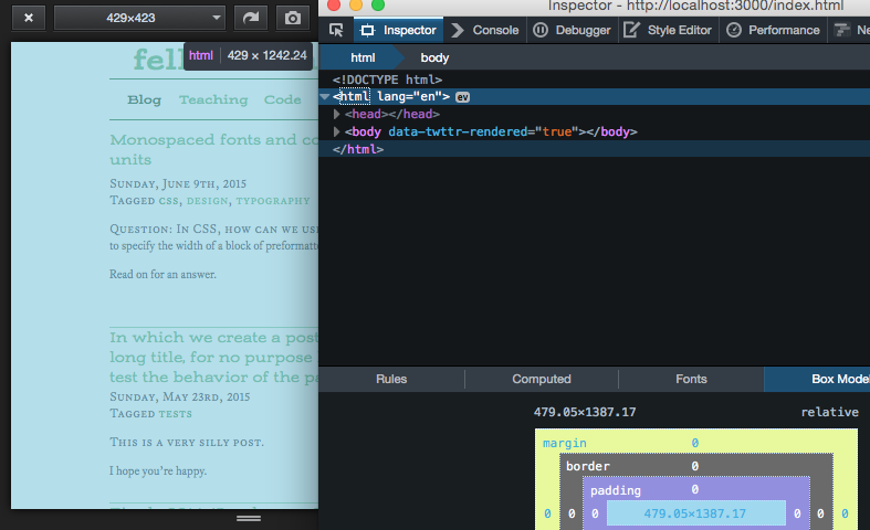
In the web page I'm writing right now, the Responsive Design View's width number doesn't match the width shown in the Box Model view (which means my media queries don't appear to be triggered at the correct width breakpoints). See the attached screenshot, which shows the page in RDV, the Box Model view, and a tooltip with the HTML element's dimensions.
I've not yet managed to reproduce this in a simpler page, though I'm still trying. I've ruled out the possible influence of inner iframes and the meta viewport tag.
So, I'd like to know what might cause the two tools to report different width figures.
Cheers, Jordan
วิธีแก้ปัญหาที่เลือก
jscher2000 said
Ah, I tested using 38.0.5. Could this be a zoom glitch?
D'oh! That was it! I was slightly zoomed-out, and after a Cmd+0, RDV now agrees exactly with the Box Model, and the media queries are behaving as they should.
Side note: The zoom was causing a second problem, since it was scaling a width of 430px to a number between 480px and 481px, triggering neither of my media queries (one of which had max-width: 480px, the other min-width: 481px). That was almost as puzzling as the numbers not matching in the first place.
Thanks again!
อ่านคำตอบนี้ในบริบท 👍 1การตอบกลับทั้งหมด (5)
jxxmxxj said
See the attached screenshot, which shows the page in RDV, the Box Model view, and a tooltip with the HTML element's dimensions.
Whoops, seems the screenshot didn't attach. Let's try that again...
If the body element is wider than html element, it can indicate a min-width or some other impediment to narrowing the body.
I'm not sure whether choosing a responsive design preset fires the resize event. If you drag the resizing handle on the right side one way or the other, does that make any difference?
Thanks for your quick reply!
jscher2000 said
If the body element is wider than html element, it can indicate a min-width or some other impediment to narrowing the body.
Good idea. I suspect that something like that is going on, but I haven't nailed it down yet; the immediate sub-elements all have width specified either as a pixel count well below the window width, or as 100% (with zero padding, margin, and side border).
And I haven't set an element's min-width anywhere, period.
The width reported by the Inspector is consistently very close to 1.11667 times the width shown in Responsive Design View.
FWIW, I also just noticed that the little SVG logo (loaded via an IMG tag) I have in my navbar is similarly miscalculated; RDV shows 28.2388 and Inspector shows 31.5317 for its width (which is calculated by a preprocessor and specified in px in the resulting stylesheet).
I'm not sure whether choosing a responsive design preset fires the resize event. If you drag the resizing handle on the right side one way or the other, does that make any difference?
Yes, it's behaving consistently across all these ways of setting the width:
- choosing presets
- typing new widths in the preset box
- dragging the right-hand resize handle
- typing "resize to <W> <H>" in the Developer Toolbar
However, if I open the document in a new window via window.open() and then manipulate the resulting window via .resizeTo(), the breakpoints are all correct.
And, thoroughly confounding things, I just now tried it in my ordinary (non-Developer) install of Firefox (v38.0.5), and RDV behaves correctly there.
Any other thoughts?
เปลี่ยนแปลงโดย jxxmxxj เมื่อ
Ah, I tested using 38.0.5.
Could this be a zoom glitch?
วิธีแก้ปัญหาที่เลือก
jscher2000 said
Ah, I tested using 38.0.5. Could this be a zoom glitch?
D'oh! That was it! I was slightly zoomed-out, and after a Cmd+0, RDV now agrees exactly with the Box Model, and the media queries are behaving as they should.
Side note: The zoom was causing a second problem, since it was scaling a width of 430px to a number between 480px and 481px, triggering neither of my media queries (one of which had max-width: 480px, the other min-width: 481px). That was almost as puzzling as the numbers not matching in the first place.
Thanks again!
เปลี่ยนแปลงโดย jxxmxxj เมื่อ