

Hotkeys for rotating between different screens when responsive design mode is on
Is there any way to rotate between different screen sizes option using shortcuts keymaps which appear during "responsive design mode" is on. I found extensions which resizes whole browser & they helps. but it also causes developer tool to resize along with browser which hinders me to see different css properties. so i am looking for a way to rotate only screens.
"Responsive Design mode" is what turns on when we press ctrl+shift+m.
I Love using firefox more than Chrome. This is my go to browser.
Vybrané riešenie
You would have to open multiple windows and use "Alt+~" (backtick/tilde) to cycle through all Firefox windows.
Čítať túto odpoveď v kontexte 👍 1Všetky odpovede (7)
rajesh kumar chaurasiya said
but it also causes developer tool to resize along with browser which hinders me to see different css properties.
You can pop out the devtools into a separate window so it isn't affected by the window size.
zeroknight said
rajesh kumar chaurasiya said
but it also causes developer tool to resize along with browser which hinders me to see different css properties.You can pop out the devtools into a separate window so it isn't affected by the window size.
i can, but I only have a single screen setup, my laptop only. upon popping out devtool, it or the main window gets hidden. that would work btw. plus having a single screen makes it really tedious to switch between different apps already.
Upravil(a) rajesh kumar chaurasiya dňa
You can put the two windows in a separate virtual desktop workspace for easy context switching.
@zeroknight I appreciate your help. This is what i do. But my questions still remains same. how to set keymaps for switching between different screens while in responsive design mode. Pl tell if it is even possible. if not then why so. I would like to discuss possible solutions regarding that.
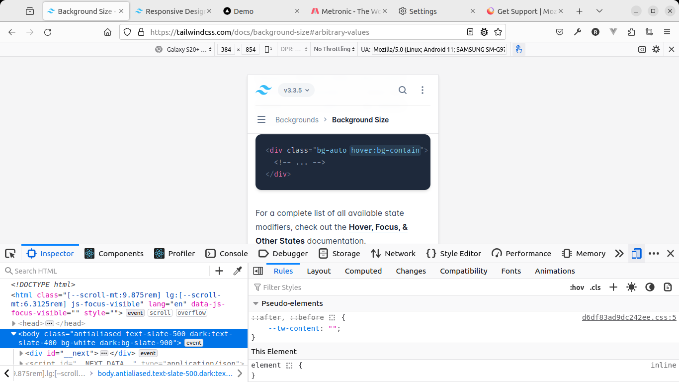
Your screenshot shows the devtools placed below the RDM window. Why don't you resize the browsing window and place a resizes separate devtools panel at the same position as in the screenshot?
@cor-el I ended up doing just that. This will do for now.. Looks like there is no straight forward way to just rotate between different screens for various devices option in the responsive design mode feature. otherwise it would have been pointed out.
@cor-el @zeroknight. thanks for all help all of you provided.
Vybrané riešenie
You would have to open multiple windows and use "Alt+~" (backtick/tilde) to cycle through all Firefox windows.