

version 102 issues i found so far
im sure all have been written somewhere before but its hard to track 15+ posts
what i found so far: 1. the spaces side bar with alt-1 etc is tiny..not useful. 2. im using a dark font and the folders pane is now way to colored and flashy 3. when a new email appears a get starlike - low res symbol? 4. adding to contacts does not work. when pressing the name, i have to manually add the contact. if i press the round symbol only, it doesnt show it added the email. i have to select another email and then come back to the previous to visually see the icon turn blue. previous versions, we just pressed the star and it was ok. 5. the contacts tab is very well thought out for the ones who are crazy organised but for a quick add, its way to difficult. why should the whole contacts tab open every time i add a name? 6. the bottom right save all is way to small. last but no least and the very very worst, is the 7. autocorrect. i type emails in 3 languages 4 in the future, so i have 3 dictionaries installed check before i send. if im ok its fine. if it finds minor errors i get 4-5 recommendations. if i am writing something weird like technical notes the suggested list of corrections gets so long it forces the dialogue box off screen. the top is ok, but the cancel, send etc buttons on the bottom are out of reach and i cannot resize the window to see them.
(Issues have been numbered for sanity)
Zmodyfikowany przez Wayne Mery w dniu
Wszystkie odpowiedzi (6)
1. the spaces side bar with alt-1 etc is tiny..not useful.
I suppose it depends upon your screen resolution and size and your eyesight, but mine is 10 millimeters in width, so easy to eg: click on icons if I want a quicklink to eg: Address book or Calendar. Or if I have a load of tabs open, I use it as a quicklink to the Inbox.
2. im using a dark font and the folders pane is now way to colored and flashy
Tons of people objected to the monochrome so it was given a bit of colour although still not as colourful as the original set of folders. Suggest you change the colour of the folder icons to whatever you prefer. Nothing has changed in that respect the option is still available. Right click on folder and select 'Properties' and use the colour icon to set whatever you want.
3. when a new email appears a get starlike - low res symbol?
Yes, this was used for ages and then removed. Plenty of people objected because the star alerted them visually to the folder much better. Thunderbird does consider all usability aspects and decided the overwheming request to put it back was required. People have different abilities and needs.
You say it is 'low res' symbol but on my display it is loud and clear. So maybe it is your colour set up on the monitor.
Perhaps it would help if you could post an image as it may help to explain the issue.
4. adding to contacts does not work. when pressing the name, i have to manually add the contact. if i press the round symbol only, it doesnt show it added the email. i have to select another email and then come back to the previous to visually see the icon turn blue. previous versions, we just pressed the star and it was ok.
Working ok for me. It's instantaneous. Click on 'From' email address or round people icon - it turns blue and email address is in the default address book.
5. the contacts tab is very well thought out for the ones who are crazy organised but for a quick add, its way to difficult. why should the whole contacts tab open every time i add a name?
Because whether you are adding just a name or a whole set of data, opening adding and saving once is best for everyone - it is more inclusive. You do not have to fill in every field. The 'Save' and choice of address book are both visible at all times, so if you enter only a few fields at the top or need to add a lot more, at any point in time you can 'Save' without scrolling to locate it.
I often just add names and email address and save - same as you and there is no difference. There is only a difference if you need to add more data - it's quicker to keyboard tab through the items to move the cursor as you do not have to click through all the various tabs. It is basically quicker and smoother and easier for all people with different abilitiies.
6. the bottom right save all is way to small.
I presume you are refrering to the 'Attachments'. It is the same size - In my case it is 20 mm wide. The icon and the text are all the one same button, you do not have to try and just click on the icon part. Only the downward pointing chevron on far right is a separate clickable icon to show more options.
As this is a similar comment to the left spaces bar, it really makes me wonder what OS you use and screen resolution.
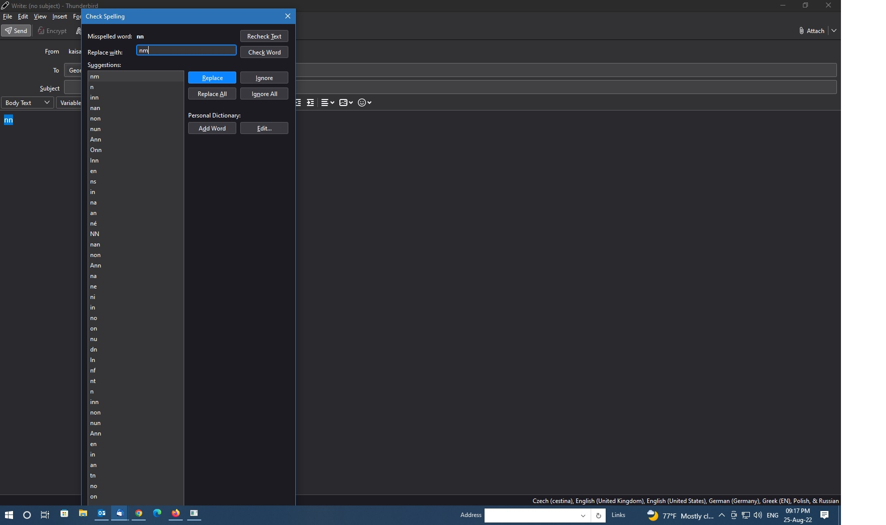
7. autocorrect. i type emails in 3 languages 4 in the future, so i have 3 dictionaries installed check before i send. if im ok its fine. if it finds minor errors i get 4-5 recommendations. if i am writing something weird like technical notes the suggested list of corrections gets so long it forces the dialogue box off screen. the top is ok, but the cancel, send etc buttons on the bottom are out of reach and i cannot resize the window to see them.
OK, this is one I cannot replicate as I'm only using one language.
regarding this specific issue - if i am writing something weird like technical notes - The obvious answer at this point is in the 'Write' window, click on 'Options' and deselect the 'spellcheck as you type' option.
regarding - list of corrections gets so long it forces the dialogue box off screen. the top is ok, but the cancel, send etc buttons on the bottom are out of reach and i cannot resize the window to see them. It would really help if you could post an image showing this problem as obviously that is not satisfactory. It may need to get reported as a bug.
read the response and i will come back to it, but really really fast, i checked a few languages just to make sure this happens..
- reattached the pic to hide an email....
edit n2 uploaded an additional pic to show theme and icons (sensitive mails edited out)
Zmodyfikowany przez george w dniu
re: first image showing oversized spellcheck.
Definitely an issue. It could do with a scrollbar. But if you know you are going to write a load of tech stuff. I would use Options to switch off the auto check spelling as you type as it is likely you are getting aload of unnecessary prompts.
The 'Close' button is clearly out of sight. It looks as if you can only close by using the top 'x' of window.
I will file this as a bug. Thanks for your help with this.
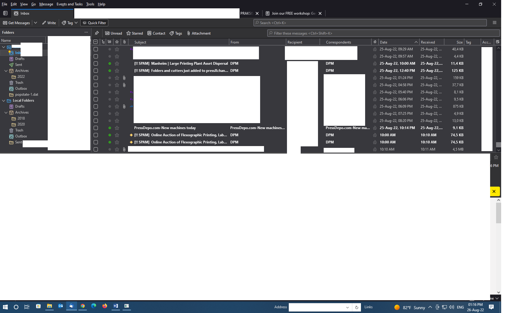
re: Folder Pane
The top left icon is the short form for the 'Spaces Toolbar'. Click on it and select 'Show Spaces Toolbar' This expands the Toolbar to full length. It means you do not need to click on it just to see the drop down menu it contains. It is provided as a means of a quick click access to items it contains. But if width is a problem because your screen is a smaller size then the option to shrink to what you currently see helps those situations.
The Yellow star on 'Inbox' tells you there's new mail since last selected. The yellow stars in the email list show which is new and unread. This was always used a while back, but has been reinstated so people can quickly see when the folder has received new mail as opposed to just having unread mail which is not new since folder was last selected.
The 'popstate.dat' folder is a separate issue, but it can be fixed. This would have to be done by accessing the profile folders. I can provide help on that if you wish. I'm also surprised you have an Outbox in the Pop mail account. You should only have one Outbox in 'Local Folders' which gets used by all mail accounts.
Zmodyfikowany przez Toad-Hall w dniu
The image you posted of your General view of Folder Pane etc, seems very clear to me.
Do you find the general font size is too small in Menus, Folder names, emails in list etc ?
What screen resolution are you using? What size is the screen from top left corner to bottom right corner ?
Have you tried altering the brightness of your screen to see if this helps? https://support.microsoft.com/en-us/windows/change-screen-brightness-in-windows-3f67a2f2-5c65-ceca-778b-5858fc007041#Category=Windows_10
I have now created a bug report. For reference this is a link to the bug report: https://bugzilla.mozilla.org/show_bug.cgi?id=1787448
Toad-Hall said
The image you posted of your General view of Folder Pane etc, seems very clear to me. Do you find the general font size is too small in Menus, Folder names, emails in list etc ? What screen resolution are you using? What size is the screen from top left corner to bottom right corner ? Have you tried altering the brightness of your screen to see if this helps? https://support.microsoft.com/en-us/windows/change-screen-brightness-in-windows-3f67a2f2-5c65-ceca-778b-5858fc007041#Category=Windows_10
now using a 20inch display. still seems kinda "stuffed". yes its a bit annoying but with heavier fonts maybe its better. the contacts tab is now by far the worst for me....