Restore "onscreen tabs" display bar in dropdown tab list
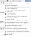
The tab dropdown menu normally has a bar down the side which shows which tabs are onscreen at the moment. With the latest update this has disappeared, to be replaced by a single bar marking the currently open tab.
It seems silly, but that bar made it easier to control and limit my number of open tabs (which is quite anxiety-inducing, at least for me).
Is there a skin to restore the old appearance, or (even better) an option to restore the setting?
선택된 해결법
Is that what that bar was? People sometimes asked here why that "scroll bar" wasn't working.
To back up for a second, I think we are talking about the list that drops from the All Tabs button, which used to have a gray bar along some of the tabs on the right side:
<center> </center>
While I can't think of an obvious way to flag tabs as being currently visible on the Tabs bar, there are a lot of tab-related extensions. Nothing popped out at me in a search that seemed to be highly similar; maybe I'll have to look into how difficult it would be to create one.
Tech note: Firefox 52 ESR marked the currrently visible tabs on that list with tabIsVisible="true" as a style rule hook. I don't see that in Firefox 62.
모든 댓글 (6)
선택된 해결법
Is that what that bar was? People sometimes asked here why that "scroll bar" wasn't working.
To back up for a second, I think we are talking about the list that drops from the All Tabs button, which used to have a gray bar along some of the tabs on the right side:
<center> </center>
While I can't think of an obvious way to flag tabs as being currently visible on the Tabs bar, there are a lot of tab-related extensions. Nothing popped out at me in a search that seemed to be highly similar; maybe I'll have to look into how difficult it would be to create one.
Tech note: Firefox 52 ESR marked the currrently visible tabs on that list with tabIsVisible="true" as a style rule hook. I don't see that in Firefox 62.
jscher2000 said
Is that what that bar was? People sometimes asked here why that "scroll bar" wasn't working. To back up for a second, I think we are talking about the list that drops from the All Tabs button, which used to have a gray bar along some of the tabs on the right side:
Yep, that's it! Yeah, I imagine most people didn't have much use for it, which is probably why it's been removed. For me it was a pretty good, non-cluttery early warning that I have too many tabs - as opposed to scrolling sideways along the tabs one day and HOLY SHIT WHEN DID I OPEN ALL THESE AND HOW DO I ESCAPE.
...Hmm, I wonder if it's still buried in the advanced settings somewhere.
글쓴이 EmeraldBoa 수정일시
I don't currently use any extensions that let you tick off a list of tabs you want to move to a new window and do that in one step, which would be much faster than manually moving them one-by-one. That's probably my main pain point in dealing with too many tabs in a window, because most times I don't want to close them, just put a bunch of them aside for later (and I don't trust hiding them like the old tab groups feature).
I regret to find that tabIsVisible="true" doesn't work in the latest incarnation of Firefox. How Mozilla thinks we're going to review the tabs we have loaded, I don't know. Do they work with their own browser? Currently, we seem to have to run our mouse cursor over each tab in turn and read the tiny text of the tab's title. Madness. Vivaldi, Chrome-based, has a left-side panel 'Window' that shows a list of open tabs (double-click(!) on one to reveal it). OPERA, however, has a beautiful dropdown that show LARGE half-sized, centre, images of loaded tabs. I'm tempted to drop Firefox in favour of Opera because of this, especially after Mozilla killed all the wonderful add-ons Firefox used to have. I'm trying to find Ffx's remaining USP.
BTW, if you want to persist with tab discrimination, use profiles. "C:\Program Files\Mozilla Firefox\firefox.exe" -no-remote -P eMails ..in a shortcut. Use "C:\Program Files\Mozilla Firefox\firefox.exe" -Manage ..first.
PS Firefox isn't particularly happy with its profiles, often mucking them up when switching between, but they're usable.
7th March, 2019
글쓴이 PhredE 수정일시
Hi PhredE, this thread is about the line that used to run down the right side of the all tabs list indicating which tabs are currently visible vs. which were in the scrolled area.
You wrote:
Currently, we seem to have to run our mouse cursor over each tab in turn and read the tiny text of the tab's title. Madness.
However, I don't understand why that is necessary. If you want to access a tab from the "all tabs" drop list, just click the tab on that list. What am I missing?
If the problem is that you don't have enough tabs open to generate that list, you can use a style rule hack to force the list to appear even when you only have a few tabs open. There's another thread on that:
https://support.mozilla.org/questions/1229979#answer-1144132
Or you could consider an add-on if you want a list with more/different features.
As an aside:
jscher2000 said
I don't currently use any extensions that let you tick off a list of tabs you want to move to a new window and do that in one step, which would be much faster than manually moving them one-by-one.
Now that we have tab multi-selection (starting in Firefox 64), this has become possible.

