

New look in ver 89
Is there any way I can restore the look of firefox 88.0.1? In my humble opinion it does not look good anymore.
כל התגובות (13)
I have the some problem - and other question for new look: Main problem - how I can change a spacing in menu and bookmark? Second - how I can change lenght of bookmark?
Hi,
Sorry to hear that you don't like the new Firefox 89 design. We've redesign and modernized the core browser experience to be cleaner and easier to use with cohesive design and more consistent styling throughout.
Is there anything particular that you don't like about it? Anything we can improve on or fix?
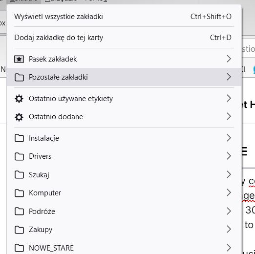
As I use Firefox on my computer and not a phone, I don't need a LOT of space between menu items. I use the mouse and not my fingers - and I can hit them! Actual view with only 30 bookmarcs, menu items, etc, instead of all of them (because of the GIGANTIC gaps between them, equal to the height of the letters!) and the necessity to constantly scroll through them is very depressing :( Basically - instead of using Firefox comfortably, I spend my time constantly scrolling.
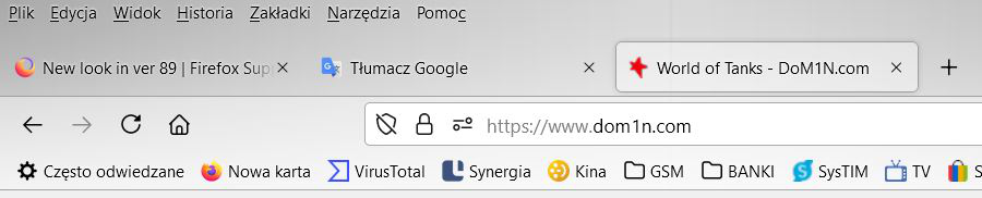
Second, with many tabs, their large width means that a smaller number of them is visible. It also degrades the quality of the work. High tab height, geared only for effect and not productivity, reduces the amount of screen space for pages.
All these things made me use Firefox, because it WAS more compact and cleaner than Edge or Chrome. Now it is like new Edge - only ribbons that take up half the screen are missing (although this is probably the next stage of work, already in version 91 :( )
Add an option to reduce these nonsensical space between menu items and tabs or adjust them - and it'll be great :)
Not really a complaint so much as curiosity: why does the whole window gray up when bookmarking something? Previously we just got the little window and that was it.
My personal problem is the tab bar - it's now just a list of buttons, and I find it very difficult to differentiate the tabs. I much preferred the previous style, where they are actually tabs.
I also really dislike having multiple lines that are closely spaced - it draws the eye and is actually pretty distracting. I've attached a screenshot with the lines I'm talking about highlighted. A simple straight line between the top of the window and the top of the URL bar is much less distracting. Adding an extra set of lines just so you can round the corners on all four sides of the button is a bad idea.
For now, I've just fixed it with userChrome, but I'm hoping that a theme or addon can fix it at some point.
I am also trying to find a way to adjust the spacing between lines on menu items, my bookmarks menu now requires a lot of scrolling where it previously fitted easily in the screen. Is it possible to add a line spacing adjustment on menus?
Rounded Tabs in 89 are a must have, new UI/tabs look like garbage.
Danny Colin powiedział
Hi, Sorry to hear that you don't like the new Firefox 89 design. We've redesign and modernized the core browser experience to be cleaner and easier to use with cohesive design and more consistent styling throughout. Is there anything particular that you don't like about it? Anything we can improve on or fix?
Hello, I thought mainly about tabs beeing now round instead of rectangular. They are also quite tall. I think previous height was better. For reference Windows 10 explorer's title bar's height (photo).

Marios 7272 said
I thought mainly about tabs beeing now round instead of rectangular. They are also quite tall. I think previous height was better. For reference Windows 10 explorer's title bar's height (photo).
Yes. Proton is taller and the developers decided to remove support for the compact mode. They're also aware this seems to be an issue for some users. Hopefully, after gathering more data, they will reconsider this decision. For the time being, there's no officially supported workaround for this.
However, you could at your own risk (meaning it can stop working at anytime), re-enable the compact mode by following the instructions in https://support.mozilla.org/en-US/kb/compact-mode-workaround-firefox
"Hopefully, after gathering more data, they will reconsider this decision. For the time being, there's no officially supported workaround for this."
Someone needs to do some powerful reconsidering. And, given the number of comments on how horrible the layout is, it's surprising there needs to be more data gathered to get that reconsideration is necessary. Your user community is up in arms - how much more evidence do you need?
Agree with Marios 7272: The tabs are HUGE!
Hi, thanks for your feedback on the new Firefox, it will help us to improve the browser even more. If you have any more feedback you would like to add, please comment below before the topic is disabled.
Att: SUMO team
Samuel Santos said
Hi, thanks for your feedback on the new Firefox, it will help us to improve the browser even more. If you have any more feedback you would like to add, please comment below before the topic is disabled. Att: SUMO team
Color scheme's terrible and 1,000s of options to sift through are a huge waste of most people's time (e.g., I'm now writing you instead of finishing my dissertation). Tabs are too tall and spaced too wide (lots of "dead" space that greys out around the edges and gets lost in the theme initially unleashed). The bubbly look just comes across as bloated (tabs, shortcut link tiles in new tabs, etc.). The spacing on drop-down lists is also huge. No defined borders between tabs. Back/forward arrows too fine to ascertain if they're black or grey.
ajohn050 said
Samuel Santos said
Hi, thanks for your feedback on the new Firefox, it will help us to improve the browser even more. If you have any more feedback you would like to add, please comment below before the topic is disabled. Att: SUMO teamColor scheme's terrible and 1,000s of options to sift through are a huge waste of most people's time (e.g., I'm now writing you instead of finishing my dissertation). Tabs are too tall and spaced too wide (lots of "dead" space that greys out around the edges and gets lost in the theme initially unleashed). The bubbly look just comes across as bloated (tabs, shortcut link tiles in new tabs, etc.). The spacing on drop-down lists is also huge. No defined borders between tabs. Back/forward arrows too fine to ascertain if they're black or grey.
Thanks for your feedback, Mozilla is already aware of your opinion on the matter and will use it to improve your Firefox experience in future releases. If you still need our support, don't forget to ask a new question, we are here to help you in the best possible way.
#SUMO Team
השתנתה ב־ על־ידי Samuel Santos