Font is hard to read at certain sizes
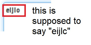
I've been noticing that on some websites, certain fonts are hard to read. For example, the letter "e" being too bold or "i" looking like an "l", and "c" sometimes looking like an "o". Those are just a couple of cases. I've attached an annotated screenshot to show this issue.
I've been noticing that on some websites, certain fonts are hard to read. For example, the letter "e" being too bold or "i" looking like an "l", and "c" sometimes looking like an "o". Those are just a couple of cases. I've attached an annotated screenshot to show this issue.