Click around and make sure everything looks good to you.
Report any issues you see in this thread (please note: issues are things that are explicitly broken or not working the way they should - please do not post about personal font, colour or layout preferences - we have locked that part of the design down a while ago).
Above all, have a good weekend and stay tuned for the roll out next week!
Thank you for your help, for being there for the users, and for representing Mozilla!
Keep rocking the helpful web!
Michał
Hey everyone,
As you may have already heard, we have been working on a visual refresh and redesign of the site, to make it more up-to-date with mozilla.org.
We are 99% ready to roll things out early next week, but we still want you to take a look at what's coming, so...
* Please visit [https://dev.sumo.moz.works]
* Click around and make sure everything looks good to you.
* Report any issues you see in this thread (please note: issues are things that are explicitly broken or not working the way they should - please do not post about personal font, colour or layout preferences - we have locked that part of the design down a while ago).
* Above all, have a good weekend and stay tuned for the roll out next week!
Thank you for your help, for being there for the users, and for representing Mozilla!
Keep rocking the helpful web!
Michał
Wow, this is exciting! Great work by those involved.
Issues/queries (sorry!):
Icons are squashed at https://dev.sumo.moz.works/en-US/questions/new
On the same page, I am not sure about the icons for Webmaker and FxOS. Should those sections even be there?
Is there any way to log in and see the question answering experiance? I am sure it will be okay, just am keen to see what it will be like.
Wow, this is exciting! Great work by those involved.
Issues/queries (sorry!):
* Icons are squashed at https://dev.sumo.moz.works/en-US/questions/new
* On the same page, I am not sure about the icons for Webmaker and FxOS. Should those sections even be there?
* Is there any way to log in and see the question ''answering'' experiance? I am sure it will be okay, just am keen to see what it will be like.
So the Questions forum is going to look even more white now?
https://dev.sumo.moz.works/en-US/questions/all?show=all
There is the mozilla_dark.css on https://github.com/overdodactyl/Mozilla-Dark/ to make this black but it needs work on layout with saidebars and such.
We had already been informed that several emissions suddenly came along.
They certainly were testing.
The previous one was nice too.
But that has been a while ago.
Well done.
Hello there....
We saw Youre message.
yes, it looks good!
We had already been informed that several emissions suddenly came along.
They certainly were testing.
The previous one was nice too.
But that has been a while ago.
Well done.
Good calls Seburo and the edmeister, I have reported them.
Seburo, I'm not sure about the question answering experience as we cannot test that. We didn't do any design work on the forum as it was out of scope for this project, so some parts might be looking weird. The fact that our platform has so many sections doesn't really help :/
If there are going to be issues, I don't expect anything big, just small things like items being misaligned here and there that I hope we can fix quickly.
Please make sure all strings are covered with regard to localization, and before pushing to prod. Some are not at this point, such as Find help…, Volunteer, Firefox Quantum for Business(_es?), and perhaps more.
Please make sure ''all'' strings are covered with regard to localization, and before pushing to prod. Some are not at this point, such as ''Find help…'', ''Volunteer'', ''Firefox Quantum for Business(_es?)'', and perhaps more.
It looks very nice! I don't see any technical issues that haven't already been reported.
My only issue with it is a minor design issue with the buttons, but that's design-related. It's just that the blue buttons from the current design do not fit the flat design of the new forum. But that's design related, so...
Thank you for all your feedback, we have worked this week to solve the issues reported. You can follow all the work that has been happening here.
We now should have a good baseline for launching on Monday. As we needed to prioritize, there's a bunch of items that we're going to finalize after the launch (so don't be surprised if you see some glitches here and there). These are as follows:
That's it! On Monday we will be monitoring the site after the launch and report on any new issues that might appear. If you see anything new (outside of what's already captured here) just comment on this thread and we will add it to the list.
Thank you so much for your patience and help with this whole process and let me know if you have any questions!
Also big thanks to Jon (SUMO webdev) and George (UX Designer) for all their work on this.
Hi everyone,
Thank you for all your feedback, we have worked this week to solve the issues reported. You can follow all the work that has been happening [https://github.com/mozilla/kitsune/labels/may-2018-redesign here].
We now should have a good baseline for [https://dev.sumo.moz.works/en-US/ launching on Monday.] As we needed to prioritize, there's a bunch of items that we're going to finalize after the launch (so don't be surprised if you see some glitches here and there). These are as follows:
* [https://github.com/mozilla/kitsune/issues/3281 Issue 3281 - Firefox download button]. This is being worked on now and should be finished on Monday after the launch
*[https://github.com/mozilla/kitsune/issues/3316 Issue 3316 - Replace "?" with product logo]. We have the new logos done so we also expect this to be completed immediately after launch
*[https://github.com/mozilla/kitsune/issues/3326 Issue 3326 - Localization: re-assest font].
*[https://github.com/mozilla/kitsune/issues/3321 Issue 3321 - Background contrast on the support forum]. We have new designs that should solve the contrast issue, we're currently assessing them (we'll share them in the GitHub issue)
That's it! On Monday we will be monitoring the site after the launch and report on any new issues that might appear. If you see anything new (outside of what's already captured [https://github.com/mozilla/kitsune/labels/may-2018-redesign here)] just comment on this thread and we will add it to the list.
Thank you so much for your patience and help with this whole process and let me know if you have any questions!
Also big thanks to Jon (SUMO webdev) and George (UX Designer) for all their work on this.
I tried to login to the dev.sumo.moz.works site to see how the site looks when you are logged in, but didn't manage.
My username does exist, but the password isn't recognized.
Is this possible at all?
I tried to login to the dev.sumo.moz.works site to see how the site looks when you are logged in, but didn't manage.
My username does exist, but the password isn't recognized.
Is this possible at all?
There aren't enough borders for me -- I find the lack of spacial differentiation disorienting. But maybe people who aren't used to reading it for hours a week won't find it that strange.
There aren't enough borders for me -- I find the lack of spacial differentiation disorienting. But maybe people who aren't used to reading it for hours a week won't find it that strange.
Agreed on the lack of borders, we're going to address that for the support forum hopefully this week, so it's going to look much better.
We should probably do the same for the contributors forum I'll see if we can get some help from our designer.
Please report if you see any other issues!
Agreed on the lack of borders, we're going to address that for the support forum hopefully this week, so it's going to look much better.
We should probably do the same for the contributors forum I'll see if we can get some help from our designer.
Please report if you see any other issues!
We are aware of the outstanding l10n issues (missing translations due to the strings not appearing in Pontoon) - and will be fixing them ASAP.
Thanks for your patience!
I, for one, welcome our new borderless overlords ;)
Hey everyone!
We are aware of the outstanding l10n issues (missing translations due to the strings not appearing in Pontoon) - and will be fixing them ASAP.
Thanks for your patience!
I, for one, welcome our new borderless overlords ;)
If you see anything new (outside of what's already captured here) just comment on this thread and we will add it to the list.
Search results don't use a different colour for visited links.
''Madasan [[#post-74743|said]]''
<blockquote>
If you see anything new (outside of what's already captured [https://github.com/mozilla/kitsune/labels/may-2018-redesign here)] just comment on this thread and we will add it to the list.
</blockquote>
* Search results don't use a different colour for visited links.
My first thoughts after having a look around the newly dressed SUMO:
When I open a page and the black header/footer on white page appears, I can't help myself but automatically think that some CSS disappeared by accident and thrust the site into black and white.
...
Oh, sorry, I'm not supposed to comment on my personal colour preferences.
...
The help articles have become narrower: their width went from 640 px to some 592 px. What's the reason? Article pages, especially the longer ones, now look a bit weird on bigger screens (a plain of white containing a narrow strip of content). Moreover, screenshots of large screen portions have become even less legible.
The difference in font sizes is IMO too big (compare the article text to the "Editing Tools" sidebar).
Why the "Volunteer for Mozilla Support" button at the bottom of article pages, if I'm logged in?
I apologise if any of these is already reported or having been discussed.
My first thoughts after having a look around the newly dressed SUMO:
When I open a page and the black header/footer on white page appears, I can't help myself but automatically think that some CSS disappeared by accident and thrust the site into black and white.
...
Oh, sorry, I'm not supposed to comment on my personal colour preferences.
...
#The help articles have become narrower: their width went from 640 px to some 592 px. What's the reason? Article pages, especially the longer ones, now look a bit weird on bigger screens (a plain of white containing a narrow strip of content). Moreover, screenshots of large screen portions have become even less legible.
#The difference in font sizes is IMO too big (compare the article text to the "Editing Tools" sidebar).
#Why the "Volunteer for Mozilla Support" button at the bottom of article pages, if I'm logged in?
I apologise if any of these is already reported or having been discussed.
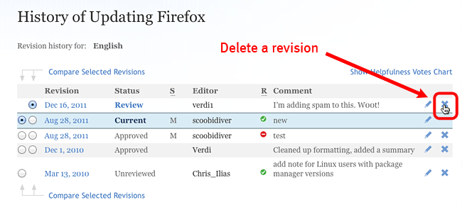
The "X" to delete a revision is no longer on the same line as the "edit" icon. Here's how it's supposed to look (image is from Article review and approval guidelines) :
The "'''X'''" to delete a revision is no longer on the same line as the "edit" icon. Here's how it's supposed to look (image is from [[Article Review Guidelines]]) :
;[[Image:Delete Spam]]
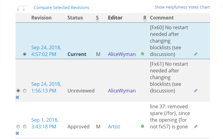
Here's how it looks now in <sup>en-US</sup> article History pages, for example, https://support.mozilla.org/en-US/kb/tracking-protection/history
;[[Image:UIredesign-KBhistory]]
The "'''X'''" has moved to the next line.
<sub>EDIT: I only see this in en-US article History pages. On localized article History pages such as https://support.mozilla.org/nl/kb/bescherming-tegen-volgen/history the "'''x'''" is in its proper place, next to the "edit" icon.</sub>
AliceWyman said
The "X" has moved to the next line.
Hm. I don't have KB reviewer rights so I can't check in en-us, but in the history of the sl articles, the x is still where it used to be.
<blockquote>
''AliceWyman [[#post-74763|said]]''
The "'''X'''" has moved to the next line.
</blockquote>
Hm. I don't have KB reviewer rights so I can't check in en-us, but in the history of the '''sl''' articles, the '''x''' is still where it used to be.
AliceWyman said
The "X" has moved to the next line.
Hm. I don't have KB reviewer rights so I can't check in en-us, but in the history of the sl articles, the x is still where it used to be.
I can confirm for the history of it articles. The x is still where it used to be ;-)
''Lan [[#post-74764|said]]''
<blockquote>
<blockquote>
''AliceWyman [[#post-74763|said]]''
The "'''X'''" has moved to the next line.
</blockquote>
Hm. I don't have KB reviewer rights so I can't check in en-us, but in the history of the '''sl''' articles, the '''x''' is still where it used to be.
</blockquote>
I can confirm for the history of '''it''' articles. The '''x''' is still where it used to be ;-)

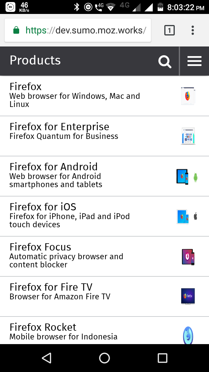 is there anything wrong with the icons in the mobile view.