

How do I disable the floating tabs that come with the 89.0 update
The floating tabs are awful. They all mix together and look like one giant tab which makes it infinitely harder to find what I'm doing when I have many tabs open. The proton design is disappointing all around but these tabs are unacceptable.
Ausgewählte Lösung
Sage said
The floating tabs are awful. They all mix together and look like one giant tab which makes it infinitely harder to find what I'm doing when I have many tabs open. The proton design is disappointing all around but these tabs are unacceptable.
The button/bubble style tab isn't to everyone's taste. You can tell where each tab begins because the site icon is there, but I understand that many users prefer a line.
I can give you a short-term workaround, but a more durable solution will require more work.
Temporary Fix -- for Firefox 89-90 ONLY (mostly ineffective in Firefox 91)
For testing purposes, there is a preference to switch the tab bar and address bar between new style and old style. This is not expected to continue in Firefox 90, but maybe you want to use it for now.
(1) In a new tab, type or paste about:config in the address bar and press Enter/Return. Click the button accepting the risk.
(2) In the search box in the page, type or paste browser.proton.enabled and pause while the list is filtered
(3) Double-click the preference to switch between true (new style) and false (old style)
Longer Term Community Workaround
This involves setting up a userChrome.css file. I have a rules builder that will get more features throughout the month. By the time the above preference is removed, it should be mature. If you want to take a sneak peek now:
- https://www.userchrome.org/firefox-89-styling-proton-ui.html#tabstyler
- https://www.userchrome.org/how-create-userchrome-css.html
Full steps: https://support.mozilla.org/en-US/questions/1338866#answer-1434676
Diese Antwort im Kontext lesen 👍 4Alle Antworten (20)
Hi,
We bring a modernized and differentiated look to tabs since Firefox 89 in order to create a signature Firefox look and experience. This major redesign will help us enable more use cases and features in the future.
Well that's disappointing. I guess I'm moving back to chrome if you're committing to making your browser worse.
The "signature" experience is now complete crap. Switching to another browser now too, after 10 years.
Apparently they're fully committed.
Ausgewählte Lösung
Sage said
The floating tabs are awful. They all mix together and look like one giant tab which makes it infinitely harder to find what I'm doing when I have many tabs open. The proton design is disappointing all around but these tabs are unacceptable.
The button/bubble style tab isn't to everyone's taste. You can tell where each tab begins because the site icon is there, but I understand that many users prefer a line.
I can give you a short-term workaround, but a more durable solution will require more work.
Temporary Fix -- for Firefox 89-90 ONLY (mostly ineffective in Firefox 91)
For testing purposes, there is a preference to switch the tab bar and address bar between new style and old style. This is not expected to continue in Firefox 90, but maybe you want to use it for now.
(1) In a new tab, type or paste about:config in the address bar and press Enter/Return. Click the button accepting the risk.
(2) In the search box in the page, type or paste browser.proton.enabled and pause while the list is filtered
(3) Double-click the preference to switch between true (new style) and false (old style)
Longer Term Community Workaround
This involves setting up a userChrome.css file. I have a rules builder that will get more features throughout the month. By the time the above preference is removed, it should be mature. If you want to take a sneak peek now:
- https://www.userchrome.org/firefox-89-styling-proton-ui.html#tabstyler
- https://www.userchrome.org/how-create-userchrome-css.html
Full steps: https://support.mozilla.org/en-US/questions/1338866#answer-1434676
Geändert am von jscher2000 - Support Volunteer
I have been a loyal FF user for a long.. long.. time. I tried to leave feedback via the feedback tool, which has conveniently been disabled/broken for months now. No, I don't post here and I feel bad I'm even compelled to do so in this way.
I know nobody will really care, but the Proton UI switch this morning was jarring and unwelcome. I really truly dislike this UI/UX decision. I disabled it for now, but I know at some point that option will disappear. As such, I will unfortunately be switching to another web browser due to this.
I'm sorry, but I'm not going to sit here and waste time building a .css to paper over a bad UI/UX decision.
Geändert am von ashinn
Agree with ashinn - been with FF since I moved away from Opera because they kept changing the UI/UX requiring me to hunt down obscure skins and style sheets to retain the same experience......maybe that sounds familiar to some... I have applied the temporary fix because I want my browser to work, I am not looking for new and enlightened experiences. I choose to use FF for many reasons, security being one of them but there is a significant level of frustration hunting down yet another fix to retain the status quo at the user interface.
I would suggest a major dose of product management to control and manage some of the changes and maybe some focus on some other points that never seem to go away like memory consumption and CPU use.
Rant over, but seriously, seriously unimpressed with 89.0
I agree with others here. I'm a UI design expert in a former life. The new "tabs" are awful. Truly AWFUL.
It's not about "modernising". That's silly. It's about USABILITY. Logically, each page is a TAB in the interface. Now the control for the tab is a BUTTON, not a TAB. This is nuts. [Like the modern fashion of making buttons look like ordinary flat text so it's harder to actually mentally find the buttons on a page.]
The new "tabs" are also a LOT harder to differentiate amongst (distinguish one from another) than the old tabs, making working between lots of tabs (which I do daily) really hard.
I've been a fan of Firefox since its inception, but if the reversion option to switch those awful buttons back to proper tabs is removed, I'll be immediately moving to another browser. The "new" Firefox is unusable.
Please stop making silly updates just because you can or it's "fashionable".
The floating tabs are actively confusing. I had to switch back, even if temporarily, because I kept closing the wrong tab. Were people clamoring for this change?
"We bring a modernized and differentiated look to tabs since Firefox 89 in order to create a signature Firefox look and experience. This major redesign will help us enable more use cases and features in the future."
This change is one of the worst things I've seen since I started using computers (late 80s). It is like being put into a tank full of raw sewage which is then lit on fire, while someone throws live turkeys on top. Then, swamp lava monsters grab me by the legs and start pulling me down, while I'm still trying to bat flaming excrement-covered turkeys off.
I mean seriously. The "big address bar" change - I had to eventually accept - AFTER I tried to change browsers and realized FF was still offering the best mix of things (security to a reasonable degree, certain plugins I use). I'm not going to go so far as to have custom css to fix this stuff.
I'm a web developer, with a heavy interest in UI/UX. The new tab bar is so seriously flawed in terms of BASIC UI/UX considerations (ease of use, rapid target acquisition, quick differentiation visually etc) that it's like a bunch of people that have no idea about any of this decided stuff would be a good idea. Absolutely wrong.
The fact that FF just rolls out these changes is insane. If you want to make this big a change, how about putting it out there and GAUGING THE RESPONSE first? Like, offer a "don't like this, switch back" POPUP and see HOW MANY OPT FOR IT? Maybe if they check that ask for feedback! Don't make me go looking for YET ANOTHER DEVELOPER SETTING THAT WILL SOON GO AWAY - as this user, this time, most certainly will.
I mean I am here to tell you. I tried messing with the custom CSS option just to see how that works. It's a big pain, even with some tweaks the tabs are still too tall. The contrast with inactive tabs is insufficient. And who knows when you guys will quit supporting the custom CSS hacks anyway.
How on earth do you expect users to keep using this stupid thing if you do things like this?
Hint: Make EVERYONE involved with ANY aspect of design read "The Design of Everyday Things." Ponder the significance of affordances. The tab UI paradigm is what it is because REASONS.
Hint 2: Before you do anything like this, do some hallway usability testing.
Hint 3: Again. Give people the OPTION. And if response is anything like what we're seeing here, ABANDON THE CHANGE.
Hint 4: I was super annoyed with the "expanding address box" thing - I got used to it though. This is 1000x worse though and when it's made permanent and without a classic setting, you're going to lose me and lots of other users.
CHOOSE WISELY.
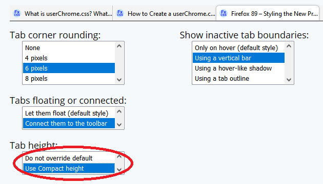
TimC2k said
I tried messing with the custom CSS option just to see how that works. It's a big pain, even with some tweaks the tabs are still too tall. The contrast with inactive tabs is insufficient.
Did you select the option to make the tabs "Compact" height?

My rules generator doesn't cover color scheme, you can use themes or the Firefox Color extension for that. For example, if you prefer the colors of the "Default" theme from Firefox 57-88, someone created an add-on theme that emulates it. You can give it a try here:
https://addons.mozilla.org/firefox/addon/photon-colors/

If that color doesn't suit you, the Firefox Color extension lets you create your own theme:
https://addons.mozilla.org/firefox/addon/firefox-color/
P.S. I'm not saying whether you should be happy or not, just pointing out options.
I did but I realized also part of the problem is that WINDOWS color scheme isn't used anymore either. To quote my least-favorite potato, "COME ON, Man!"
No offense to you, but this whole set of changes is awful. I'm downloading an alternative to try out as we speak.
Plus I get the feeling you kind of focused on one remark vs my SEVERAL REPLIES ABOUT JUST HOW TERRIBLE THIS IS.
TimC2k said
Plus I get the feeling you kind of focused on one remark vs my SEVERAL REPLIES ABOUT JUST HOW TERRIBLE THIS IS.
Support forum volunteers can provide information on features, settings, and workarounds, but we don't design the interface. Other people review and collect that information. We're just that "customer service" person you yell at when you're unhappy with the business. ;-)
Really. OK then, thanks for volunteering etc. Now, does Mozilla listen to its users? I saw an article that said these changes are based on "where people click the most" - uh, so the process is "track clicks, generate theory, break the UI totally based on this"?
And another angle now that I think about it - I use several browsers for work. Every time I switch into Firefox (once this dreadful change can't be turned off) my brain will have to adjust to this stupid non-paradigm. Such insanity.
The article I read also covered how they think this will help them regain some market share. HA HA HA HA HA HA that's probably been the best part of all this.
Lo and behold, this entire totally asinine situation has resulted in a new browser that I'm actually happy with (unlike when I looked after the "expanding address bar change."
Bye Firefox. It's been real...something.
Firefox really needs an easy way for users to make suggestions and please, please, please do not fall into that inane mind-set that one must always change things, specifically related to UI design. One thing about UI design is that it is supposed to be user friendly. If it changes the user has to learn a whole new system and get accustomed to a whole new layout. That is not user friendly. And these floating tabs make it hard for many people to distinguish between tabs. Again, not user friendly.
I appreciate that you wanted to let some users know that they can move their tabs around, but I don't see how floating tabs accomplish that and, guess what, some of us have been moving our tabs around long before these floating tabs came into being. Why don't you just have a suggestion to move tabs show up on the home page when people open the browser like you used to do. Those suggestions were informative.
The problem now is trying to figure out what tab I'm on and where one begins and the next one ends. This is actually slowing me down when I work because now I have to spend more time looking carefully at the tabs when I want to switch between them -- and that is something I do a lot. I often have over 100 tabs open; I need to be able to distinguish one from the other easily.
On top of that I have an aesthetics consideration. I LIKE the distinction between tabs to show. They make them look like tabs on manila folders, which helps me organize my thought processes. Besides, floating tabs remind me of the so popular open floor plans in houses today which I personally find atrocious.
If you want to try new interface designs, don't force all users to use the new one and don't get rid of the old one.
"We here at Firefox have decided that you are no longer allowed to make decisions about how your browser looks." k. Edit: this guy fixed it for you. mostly. https://github.com/black7375/Firefox-UI-Fix/tree/photon-style
Geändert am von shinichineko
Agree this is so unlike every other browser.... You might get used to this when you try very hard, but there are other browsers that use tabs as umm.. tabs. Can't explain this unfortunate decision and now that you can no longer disable it, will be switching to something else. The new Edge is looking surprisingly good. Thank you Firefox for being a great browser for several years, hope to meet again some time in the future!