

Ugly Firefox styling for buttons, input fields and dropdown selection
I have rediscovered Firefox and its excellent privacy features. I have been a longtime Firefox user but switched to Safari. One thing that still bugs me is Firefox default styling. What I really miss is Safari great button design.
a) Why does Firefox by default still ships with those tiny and ugly styling for dropdown selection, buttons and form input fields? It still feels like 1999. How can I use Safari's button styling in Firefox instead?
b) Moreover why does Mozilla applications still use the dotted outline as accessibility feature. Most Webdesigner always want to get rid of it.


الحل المُختار
Do you want to file a bug? You can include a link to that page or the following more specific one and upload a screenshot showing the problem on Mac (it's not very dramatic on Windows 10):
https://www.jeffersonscher.com/res/select-button.html
Bugzilla:
- https://bugzilla.mozilla.org/enter_bug.cgi
- https://developer.mozilla.org/docs/Mozilla/QA/Bug_writing_guidelines
All Replies (12)
Hi howdytom:
a) Firefox tries to theme form controls and scroll bars according to your OS, so usually on Mac it should be similar to the OS controls in system dialogs.
Is that not working normally on yours? Your first screenshot looks more like Windows.
b) It's normal to see a dotted outline around links/controls selected when you use Tab to navigate in the page. Is there somewhere else that you see it?
On some of my pages, I use element.blur() to remove the focus from a button after it is clicked to remove the outline (MDN).
jscher2000, thank you for your reply.
a) Yes, the scroll bar matches the macOS System UI. But I am referring to Firefox buttons, input fields and dropdown selection in general. All screenshots are taken on macOS running the latest Firefox.
Th first screenshot is taken from http://www.zdnet.com site footer. 2nd and 3rd screenshot uses the default button styling without any CSS customisation. These "old" dropdown selections show up any web page. I would love to use Safari (macOS) form field design instead.
b) I know the dotted outline is Firefox default behaviour around links/controls. If you also use element.blur() to remove the focus, why does Mozilla still ships it. It doesn't makes sense to me. It totally kills any button styling.
Modified by user1693610
Hi howdytom, the ZDnet page has particularly hideous styling, even on Windows. However, if you don't get Mac-style select controls even on dead simple pages like my page here --
https://www.jeffersonscher.com/res/googletime.php
-- then it sounds like a bug.
For the active element outline, I think it is there for accessibility reasons. It might be possible to modify its appearance a bit, but I don't think it's a good idea to remove it. I use blur() after running whatever the function of the button is to remove focus from the button back to the page (if it doesn't submit the form).
jscher2000, I did some comparison and I have to correct myself. You are right. Most sites using the correct macOS System UI.
So, it is NOT a bug.
Your "dead simple Google Search Plugin pages shows identical in Safari and Firefox (see attached screenshot). Dropdown menu shows up beautifully. There are slight differences in terms of button padding in Firefox and Safari. Firefox uses button::-moz-focus-inner to add extra padding.
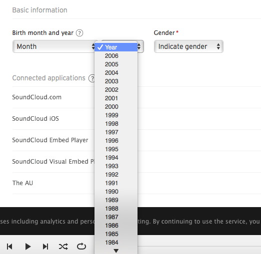
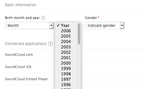
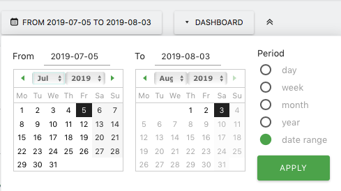
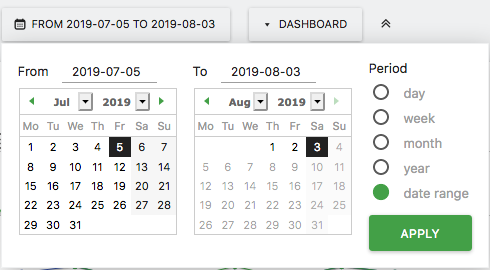
I am not happy how Firefox shows long dropdown menu like ZDNet. Sometimes Firefox adds a terrible arrow selection button style. Especially forms used to look ugly in Firefox. I haven't lookup the CSS on all pages. I guess it's caused by CSS reset or custom CSS style. Another examples:
Example 1: Matomo Analytics preferences Dropdown selection in Safari and Firefox Example 2: Soundcloud Dropdown selection in Safari and Firefox
Modified by user1693610
Hmm, I'm not sure why Firefox would show only the "down" triangle and not the "up down" triangles. I wonder whether it could be related to page style rules changing the height of the control, or the font-size, where Firefox thinks that the "up down" character won't fit anymore??
I'm at a disadvantage here because I don't have a Mac to test on. Maybe they'll let me install Firefox on one of their computers at the Apple store (ha ha).
I really appreciate your reply. Yes, that is why I share some screenshots. :-)
I am not sure about site related style rules, because the "down" triangle shows up on a lot of sites. It is somehow related to CSS frameworks or CSS override settings.
I don't understand why this ugly "down" triangle button could be overlooked. I wish this could fixed by a software update.
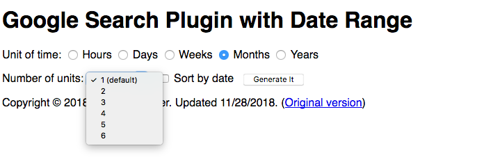
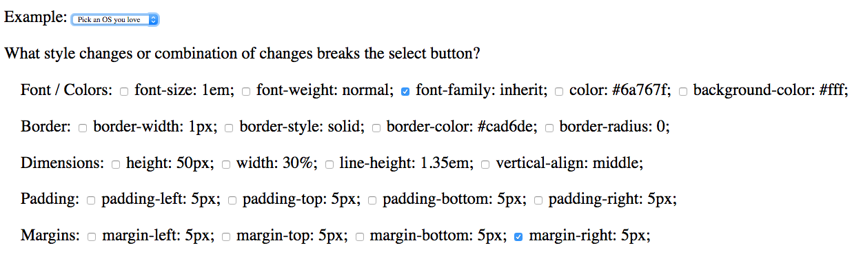
I made a page that lets you individually turn on and off some of the style rules from the ZD Net page. Can you see which ones trigger the problem on your Firefox?
https://www.jeffersonscher.com/res/select.html
On Windows, any of the border changes individually has an effect on the button appearance, as does changing the background-color. Some of the changes seem to "stick" and if they don't go away after changing a different property, you might need to reload the page (Command+r) to keep testing.
Modified by jscher2000 - Support Volunteer
jscher2000, wow, thank you so much. This is really useful.
It turns out the border property breaks the select button. When I enable the following checkbox one by one it shows the ugly the "down" triangle. I have attached some screenshots. All remaining properties show the macOS "up down" triangles.
border-width: 1px; border-style: solid; border-color: #cad6de;
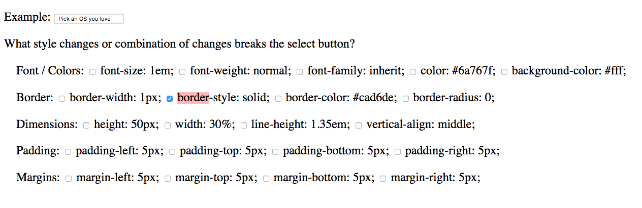
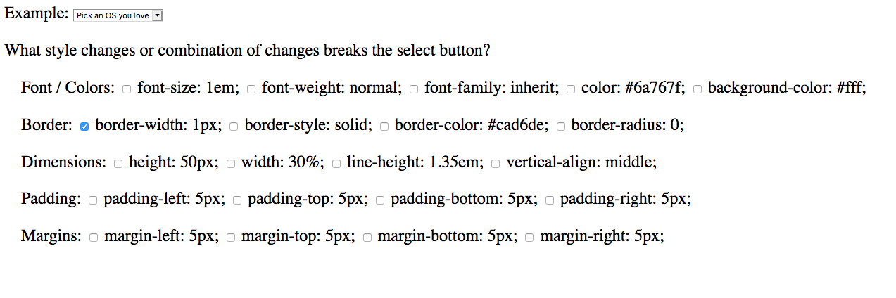
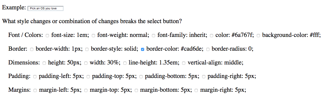
Modified by user1693610
Also, font-family: inherit; adjusts the font size within the dropdown menu.
Modified by user1693610
الحل المُختار
Do you want to file a bug? You can include a link to that page or the following more specific one and upload a screenshot showing the problem on Mac (it's not very dramatic on Windows 10):
https://www.jeffersonscher.com/res/select-button.html
Bugzilla:
The Inspector shows that the nice drop-down marker is within the border right, so setting the borders to 1px will make this impossible and you get the ugly drop markers
There are extra rules for select with a size attribute (select[size])
See also:
jscher2000 said
Do you want to file a bug?
Yes, I have created a bug report #1571386. I also added your test pages. I hope it is okay for you and it doesn't generate too much traffic. Thanks again for taking the time to narrow things down. Hopefully this UI bug will be addressed.
cor-el said
The Inspector shows that the nice drop-down marker is within the border right, so setting the borders to 1px will make this impossible and you get the ugly drop markers
Thanks pointing that out. As we saw it is not limited to border right only, but also border styles in general. Manually overriding styles is not a solution. This UI should be addressed with a software update.