

Font is unpleasant to read.
With my new computer and new Firefox download, the font looks like draft printing: it is uneven in boldness and many of the letters are spindly and not-smooth, at best. The size of the font is fine. I tried changing the font but this did not help. Thanks for help with this problem.
All Replies (4)
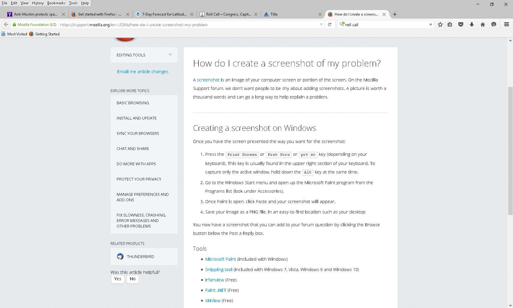
Can you attach a screenshot?
- http://en.wikipedia.org/wiki/Screenshot
- https://support.mozilla.org/kb/how-do-i-create-screenshot-my-problem
- Use a compressed image type like PNG or JPG to save the screenshot
- Make sure that you do not exceed the maximum size of 1 MB
You can try to disable hardware acceleration in Firefox.
- Tools > Options > Advanced > General > Browsing: "Use hardware acceleration when available"
You need to close and restart Firefox after toggling this setting.
You can check if there is an update for your graphics display driver and check for hardware acceleration related issues.
I attempted to upload a screenshot but am unsure whether it succeeded. Please let me know if the attempt was successful. Actually, the screenshot looked better than the raw text.
Thanks.
Does disabling hardware acceleration has any effect?
Yes, cor-el, it does seem somewhat better after I un-checked "use hardware acceleration when available." I also noticed that on some web sites, the font is much easier to read. There is still some unevenness in the appearance of the letters but I am going to use it as is for now. Thank you for your help. Phil