Make better use of screen realestate on tablets
Is it possible to make Thunderbird make better use of screen realestate on large devices such as tablets?
In my opinion it should be possible to get a view that is more similar to the desktop version, where the content is laid out in 3 columns:
- List of accounts and mailboxes
- List of messages in the selected folder/mailbox
- The email/message that has been selected.
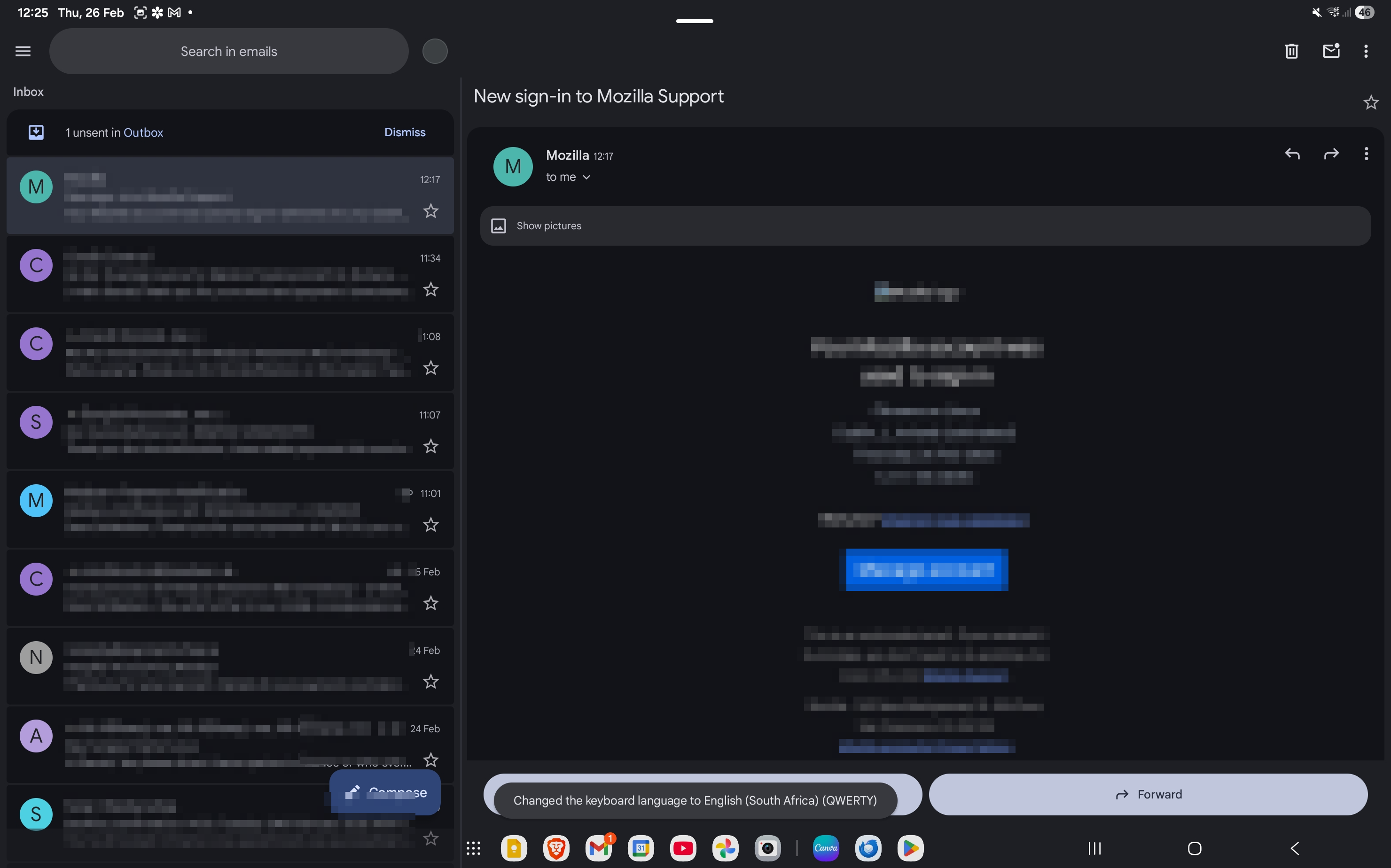
See attached for what it looks like in the gmail app, for comparison. On Gmail they only have two columns, but even on there it's making effective use of the space.
Is it possible to make Thunderbird make better use of screen realestate on large devices such as tablets?
In my opinion it should be possible to get a view that is more similar to the desktop version, where the content is laid out in 3 columns:
# List of accounts and mailboxes
# List of messages in the selected folder/mailbox
# The email/message that has been selected.
See attached for what it looks like in the gmail app, for comparison. On Gmail they only have two columns, but even on there it's making effective use of the space.