How do i get the line between addresses back?
The address bar used to show a line between search / auto-complete results. Now the line is gone and it's very hard to see the grouping of description and URL and find what I'm looking for, they all blend together. I want the line back! I really wish FF wouldn't make these changes - make them available as an option, not forced.
Alle Antworten (1)
I am not familiar with the reason for the change, but you can insert some separators in a few minutes by creating a custom style rule.
(1) Install the Stylish extension: https://addons.mozilla.org/firefox/addon/stylish/
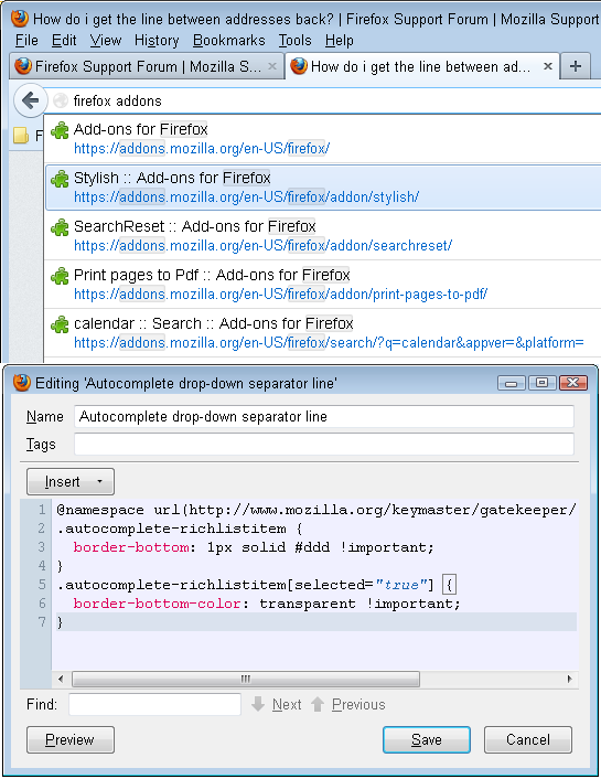
(2) After restarting Firefox, click the Stylish "S" icon on the Add-on bar > Write new style > Blank Style
(If you do not usually display the Add-on bar, press Ctrl+/ to display it. If the "S" icon is not there, drag it from the Customize dialog, which you can show using Alt+v > Toolbars > Customize)
(3) In the editor, paste this:
@namespace url(http://www.mozilla.org/keymaster/gatekeeper/there.is.only.xul);
.autocomplete-richlistitem {
  border-bottom: 1px solid #ddd !important;
}
.autocomplete-richlistitem[selected="true"] {
  border-bottom-color: transparent !important;
}
(4) Give it a name, and click Save.
The color #ddd is a shade of gray. #000 is blank and #fff is white, so you can make it lighter with #eee or darker with #ccc. If you mix different letters, you get colors instead of shades of gray.
There probably is a more elegant way to style this drop-down, but that's all I could figure out.