new ui update
Okay FIREFOX, update 2/29/2026
1) making complaints to this browser is a nightmare, you guys need to actually do something about making it easier to contact actual support.
2) Firstly, this latest UI update is literally a scam. If you're going to make such a change after years of the same UI being around, users should be well aware of that before the update rolls in.
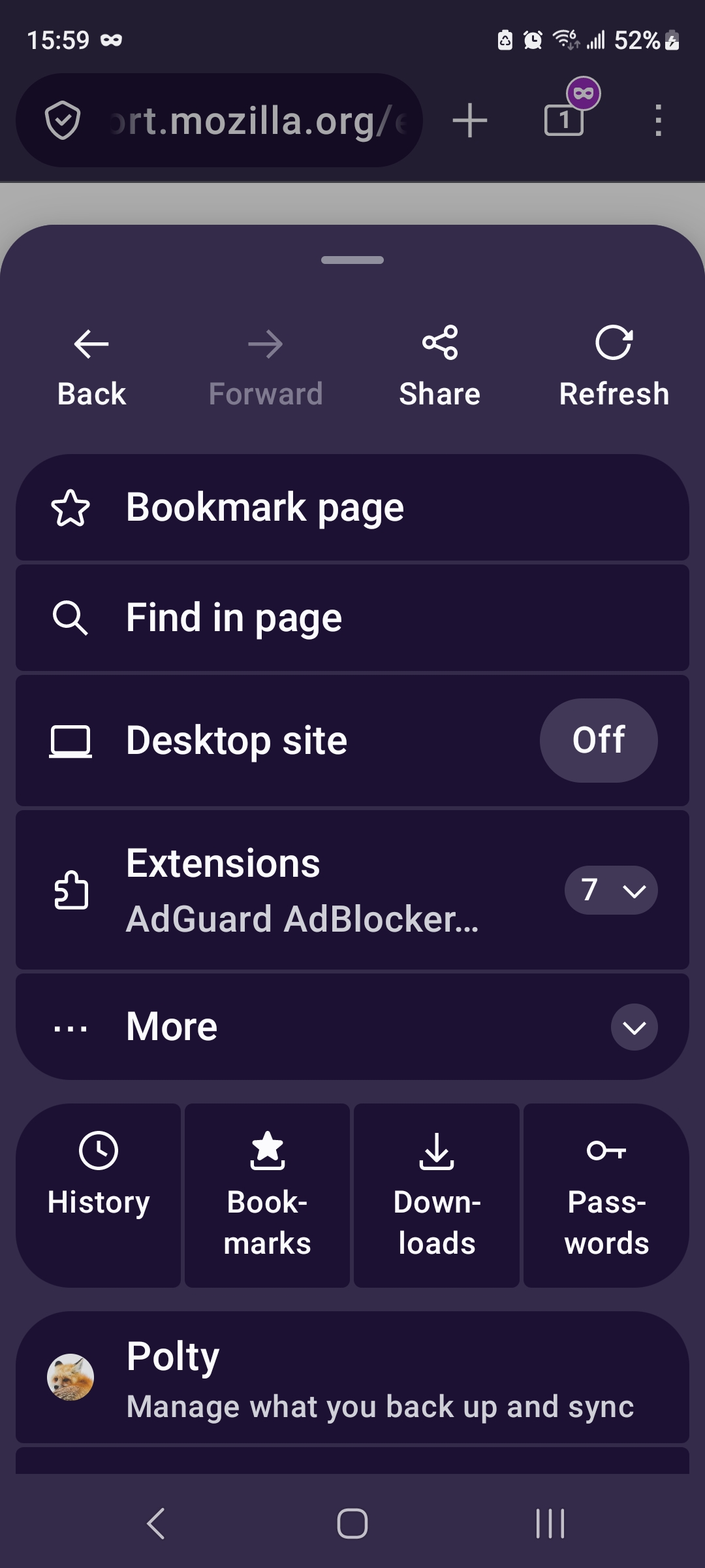
Secondly, this menu UI should have been an opt-in/out service, NOT DEFAULT. Users should have the option to not use a feature that is actively hostile to a MOBILE experience. That means less button pushing required to speedily access saved content. The current way this menu pops up puts nonsense on top before the actually important parts, namely bookmarks access.
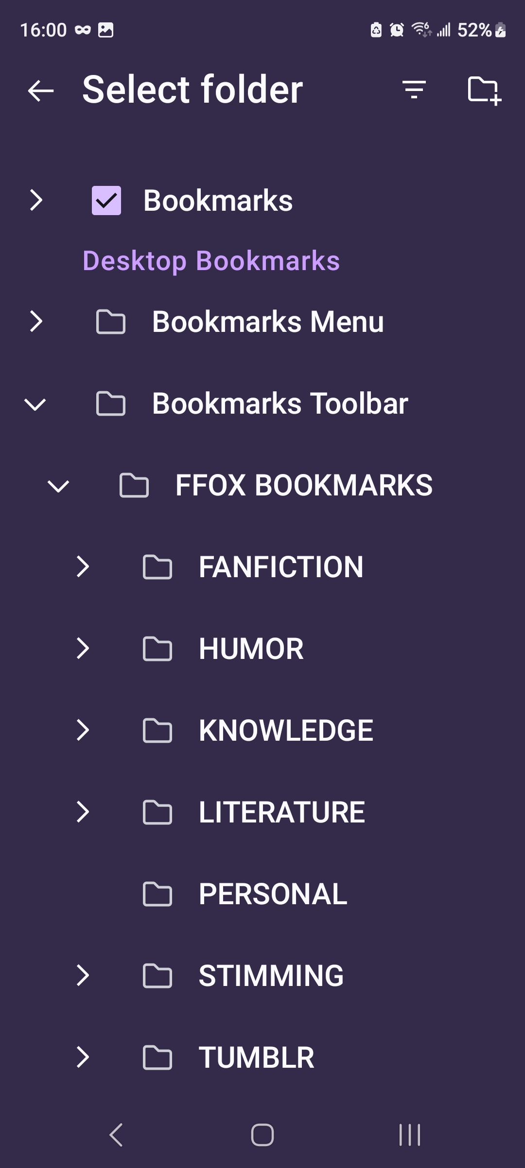
3) bookmarks (specifically CREATING BOOKMARKS). While normal bookmarks access looks the same, creating them is a monster in this app.
This newest iteration sucks, to put it frankly. Where before, the process was simply running down the list to choose the right folder (all those folders & subfolders were already extended), now it requires us to extend and extend and extend and extend. In what world did you guys think this was useful for a mobile phone? Mobile does not lend itself to multiple presses, that's by design.
You guys are making this app look more and more like desktop, and that's a bad design and worse feature for mobile experiences.
Please either update this UI to allow for the legacy design (opt-in/out), or change it back entirely. Right now this app is trudging downwards to an experience people do not want to use.
Attached are screenshots of the current 3dot menu drop-down and the creation/editing of bookmarks. Too much noise for what was actually useful design on the legacy UI.