

What is the "bar" where all the extra functions are shown called, and how do I make it "wider" (as in two lines instead of one)?
Folks,
It isn't that I want to be difficult, but just now I am at wit's end trying to work out what is going on.
I have FF on two machine I use a lot. PC (Main desk top type) and my lappy which has "wide screen" 16:9 aspect rather than the usual 4:3.
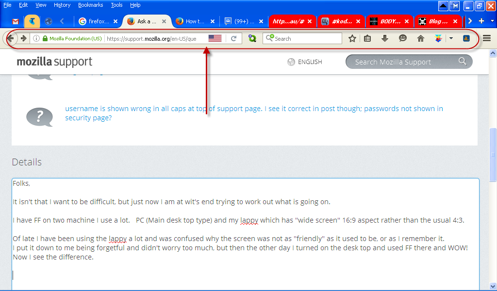
Of late I have been using the lappy a lot and was confused why the screen was not as "friendly" as it used to be, or as I remember it. I put it down to me being forgetful and didn't worry too much, but then the other day I turned on the desk top and used FF there and WOW! Now I see the difference. See attached picture.
On my desktop the area in red is two lines "thick" (wide/what ever) and here it is only one.
Not too much of a problem, but I am totally at a loss how to make it like the desktop machine.
Also, though a WHOLE other problem, but while I am here: I can kind of guess that when a web page is "designed" fonts, sizes of fonts and stuff like that are chose to make it "look nice", but here, I am on THIS page, entering TEXT..........
As I am "old school" with things, and have adapted to the newer keyboards, though I really didn't know the OLDER style, I know there are some very specific keys which MUST be used in the right situations.
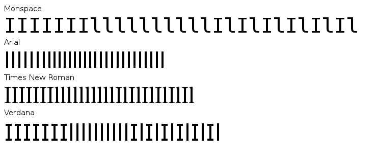
Example: Typewriters did not have the nubmers 1 and 0. Lower case L was used for the number 1, and the letter o was used for 0. I get that, and they ARE different things to the computer.
But I really dispise these fonts where lower case L, capitol i and the number 1 are SO SIMILAR that they can hardly be told apart. Though I have to admit, the 1 at least is different.
Here is an example:
IIIIIIIllllllllllIlIlIlIlIlIl
OK, there is a SUBTLE height difference.
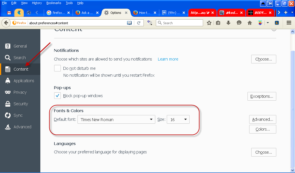
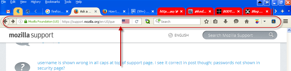
I went into the options/content screen and set a different font. See second picture.
I am perplexed why there is a FONT SETTINGS option and when I set it, it is overwritten and this font is used.
Could someone explain to me where I am really going off the tracks?
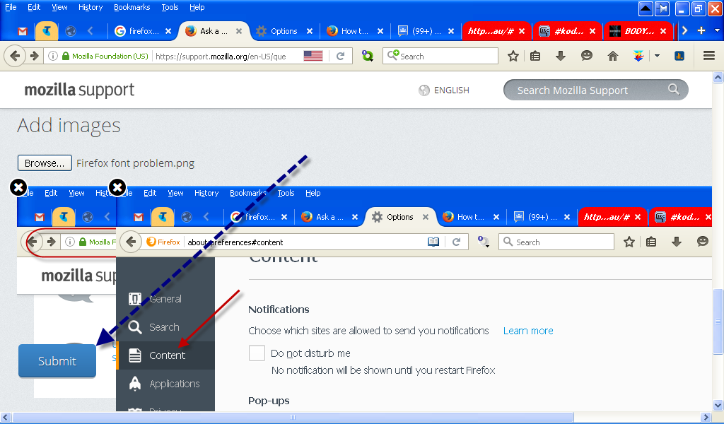
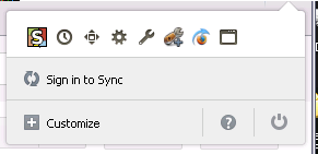
(oh, and now I am stuck after adding the two pictures to where the "SUBMIT" button is.
Ah, found it! (See third picture) What can I say?
Všetky odpovede (12)
I agree that some font make it hard or impossible to distinguish between some characters. This website uses the Open Sans font. I prefer a monospace font in cases like this. Arial is even worse for me with no difference at all.
A possibility is to check the text in the Inspector that should show the text in monospace font. You can right-click and select "Inspect Element" to open the Inspector ("3-bar" menu button or Tools > Web Developer) with this element selected. You can check the font used for selected text in the Font tab in the right pane of the Inspector.
- https://developer.mozilla.org/Tools/Page_Inspector
- https://developer.mozilla.org/Tools/Page_Inspector/How_to/View_fonts
Data URI used for the screenshot that shows your "IIIIIIIllllllllllIlIlIlIlIlIl" text in a few fonts.
data:text/html;charset=utf-8;base64,TW9uc3BhY2U8YnI+PGZvbnQgZmFjZT0ibW9ub3NwYWNlIiBzaXplPSIyNSI+SUlJSUlJSWxsbGxsbGxsbGxJbElsSWxJbElsSWw8L2ZvbnQ+PGJyPgpBcmlhbDxicj48Zm9udCBmYWNlPSJBcmlhbCIgc2l6ZT0iMjUiPklJSUlJSUlsbGxsbGxsbGxsSWxJbElsSWxJbElsPC9mb250Pjxicj5UaW1lcyBOZXcgUm9tYW48YnI+PGZvbnQgZmFjZT0iVGltZXMgTmV3IFJvbWFuIiBzaXplPSIyNSI+SUlJSUlJSWxsbGxsbGxsbGxJbElsSWxJbElsSWw8L2ZvbnQ+PGJyPgpWZXJkYW5hPGJyPjxmb250IGZhY2U9IlZlcmRhbmEiIHNpemU9IjI1Ij5JSUlJSUlJbGxsbGxsbGxsbElsSWxJbElsSWxJbDwvZm9udD4=
Upravil(a) cor-el dňa
The toolbar you circled is called the Navigation Toolbar. That may be hard to discover because unlike the old days, you can't hide it, so it isn't shown on the toolbar list with the other bars.
I'm not sure I understand what you're wanting to do with the bar because in the first and second screenshots it looks basically the same to me.
Note that the screenshot shows that you have placed a toolbar button between the location/address bar and the search bar. When you do that then the Navigation Toolbar may behave differently.
My original question is about the address bar.
Picture 1 shows the problem Picture 2 shows a new question about fonts. The arrows kind of gave that way, I thought. The question is: Why allow the user to set fonts if they are not used on pages and the fonts used are CONFUSING. Picture 3 was a problem I then found after attaching the two pictures. WHERE IS THE SUBMIT button? Oh! It is hidden in the pictures I attached. That's not exactly smart.
The two new pictures are: Of my DESKTOP machine running FF. My laptop running FF.
Can you see the differences?
I am at a total loss how to make the laptop one similar to the desktop's one.
No, not with which things I have installed, but look at the SIZE of it. Size, depth, I don't know. The picture pretty well says it all if you ask me.
Sorry folks, I am really fighting a few very big black dogs just now and am not exactly winning.
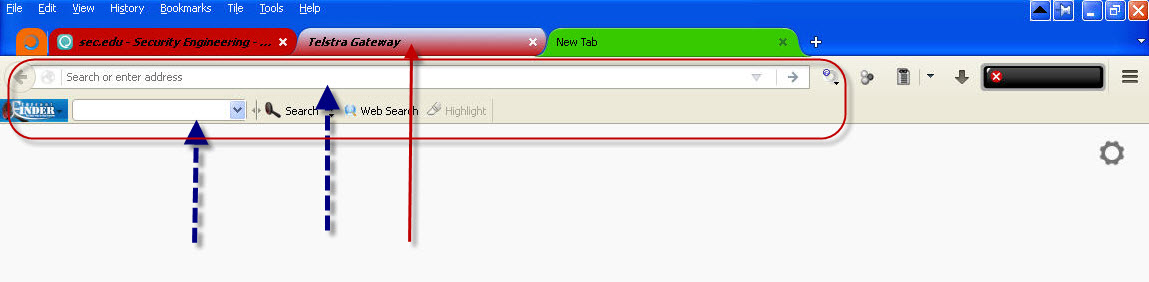
Hi teeny_weeny, the desktop system has an extra toolbar, most likely displayed by an add-on.
What is the wording in the blue button above "Finder"? It's too small to read. If you can't read it either, what does the bar do? You also might be able to learn what it is by viewing the Toolbar list. Either:
- right-click a blank spot on the tab bar (or the "+" button)
- tap the Alt key to activate the classic menu bar > View > Toolbars
- in Customize mode > Show/Hide Toolbars (see: Customize Firefox controls, buttons and toolbars)
Recognize anything that isn't built-in?
Last thing to check would be your extensions, as extra toolbars usually are generated by an extension. Open the Add-ons page using either:
- Ctrl+Shift+a
- "3-bar" menu button (or Tools menu) > Add-ons
In the left column, click Extensions. Then you can review the list on the right to see whether any might be search-related.
Regarding fonts:
When you set one or more preferred fonts, Firefox uses those fonts when the page does not specify a preferred font. However, if the page specifies a preferred font, then Firefox uses the page's choice. If you want to override the page's choice, there is a setting for that. It may wreck the layout on some pages, but you can try it and see whether it works for you.
"3-bar" menu button (or Tools menu) > Options
In the left column, click Content, then on the right side, click the Advanced button.
Uncheck the box for "Allow pages to choose their own fonts, instead of my selections above" and OK the change. Then you can reload pages that render poorly and see whether they look better.
As far as Problem 1:
Since Firefox 29 was released, there is no feature inside of Firefox for the user to add an entire empty toolbar for their use as they see fit; the new Australis UI eliminated that feature, as was present in the the Firefox 28 and earlier versions.
Your first most recent screenshot shows an Add-on Toolbar - Finder; that is about the only method of adding a Toolbar, via an Add-on. But the current situation with Add-on Toolbars is that very, very few of those Add-ons allow the user to 'add' any toolbar buttons. Yes, and add-on developer can allow the user "access", but typically {based upon what I have seen with Toolbar add-ons}' it takes a lot of work and like 4 times the coding for an add-on to make that feature available for then user; plus, those add-ons tend to be 'flaky' and not work consistently correct depending upon "what" the user places on those Toolbars.
As cor-el already mentioned - when a Toolbar button is placed between the Location Bar (aka URL Bar) and the Search Bar the UI may not be be consistently displayed correctly. Switching between a Maximized window and Minimized window (close to but not actually the full screen) the UI might display a double-ellipsis >>. I usually place an unnamed folder with the "Bookmark Toolbar Items" between the URL Bat and the Search Bar, which contains a couple of hundred Bookmarklets
The wider the screen and the more chance of that happening from my own experience. I didn't have this problem with a 16x9, but when I got a 16x10 extra wide screen monitor last year it was happening all the time as I switched from Maximized to Minimized; then had to Restart Firefox to "fix" it.
If you want more room for toolbar buttons, see the screenshot of "my solution". Smaller buttons and no text in the Menu Panel drop-down. https://userstyles.org/styles/107442/fx29-menu-panel-horizontal-icons Problems occur when Add-on buttons are displayed in the Menu Panel; some buttons are too large or take up too much space. 2nd screenshot - where the Greasemonkey button takes up a double-space and three on the top row are too tall
You could also look that this User Style. https://userstyles.org/styles/104419/firefox-australis-menu-panel-fix Not quite as compact as what I did, but it overcomes faults that are present in my User Style, as far as poor spacing of some Add-on "buttons".
Anyone know where I can buy a new brain, as mine if obviously not working.
The two pictures I gave were of my desktop and my laptop. Given. I am one of those people who "live for multiple tabs being opened" Sorta obvious, but not relevant. Both versions of FF are pretty well up to date. The search bar on one can b e dragged around so it is UNDER where I enter the URL, as clearly show. Yes, it is my problem and I am stupid as I can't resolve which "add on" is "helping" me.
Something I just noticed: When I posted the original message I am 99.9% certain that I ticked the "include extra information" box, so the version of FF and all the add ons would be listed. Probably not helping, but I see it isn't there. My fault, I think. Or at least I shall have to accept blame as I can't really check, and as it isn't there, well.........
To now help, I HOPE this is what will be helpful:
Oh, great: I saved the file (text) and don't know how to include it as I can only attach IMAGES!....
Help.
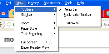
Hi teeny_weeny, please take a look at your toolbar list. Either:
- right-click a blank spot on the tab bar (or the "+" button)
- tap the Alt key to activate the classic menu bar > View > Toolbars
- in Customize mode > Show/Hide Toolbars (see: Customize Firefox controls, buttons and toolbars)
There should be a checkmark next to each displayed bar. What have you got checked besides Menu Bar?
See attached.
Opening the "CUSTOMISE" option does not allow me to make the bar any fatter (as on the desktop example)
As I am stuck on how to attach the file showing FF stats, I am kinda stuck in how to give more information.
In the two screen shots you were asking about "what is in the tab above the searchbar...." or something.
That is a TAB and it is a URL. Nothing really to do with the problem about which I am asking.
I seem to be unable to explain myself in an articulate way
Believe me, I am not being difficult on purpose. I just want to work out how to make the laptop version the same as the desktop version in that I can move some of the icons onto another line.
I guess it is like that thing on windoze at the bottom (usually)
See second and third pictures.
If I have "too many" icons, I simply drag it "up" and make it bigger.
Although microslop can't write to save their lives - just look at their OS and the ...... what ever. At least they allow a simple customisation.
FF seem to have taken the idea that such a simple thing is now no longer possible.


Could you please look at the toolbar list on the computer that is displaying the extra toolbar.
Firefox moves icons that do not fit on the Navigation Toolbar to an overflow area with a chevron icon.
You can consider to use the Classic Theme Restorer extension to add the feature to create extra toolbars.