

font size unpredictable
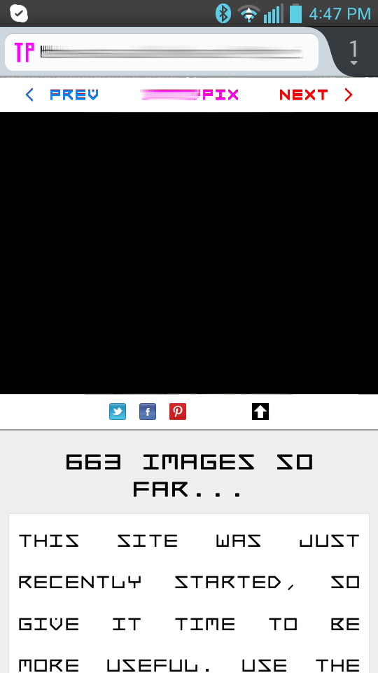
if viewing the website in landscape mode, the text on the page is as specified in the css - 12px; but, when viewing the same page in portrait mode, the text is HUMONGOUS, and defies the CSS. i am currently using firefox 22, but this has been happening since version 20.
it seems that firefox is doing this automatically, but, i have already crafted the css to read well in both layout modes, and this firefox behaviour is defeating my css - it's taking control from the webauthors. i have screenshots of this, but, i don't see an option to share them.
is there any thing we can do to tell firefox on android to make the text 12px regardless of layout mode - via CSS or HTML markup??? we can not rely on visitors ALREADY KNOWING how to do this - this makes our websites inconvenient for visistors, and takes control from content creators, which, i'm sure, is not what mozilla ever intended by this functionality.
thanks in advance for any advice.
Выбранное решение
thanks man. it seems you are one of very few people who know how this works.
i've been using a viewport tag for quite a while, and noticed that it is difficult to estimate the outcome given any parameters, and that i have to play with it a bit. i also had been using the "handheldfriendly" meta tag, but never noticed any effect.
all my sites are intended to be viewable and readable and usable on mobiles in LANDSCAPE mode (and 1 of them looks good even in portrait mode). all of my sites are 720px wide, in css, with a 16x16px padding on both sides, giving 752px of screen space, including padding.
for my viewport tag, i had used 720 for "width", 1.5 for "max-zoom", 0.5 for "min-zoom", and 1.0 for "initial zoom". so i tried applying what you talked about in your article, and, it appears that i have fixed it by setting width="760", initial-zoom="0.8", min-zoom="0.4", max-zoom="1.5".
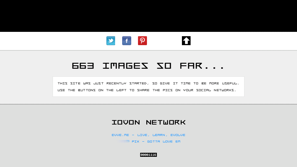
see http://tittypix.com/ or http://evve.me/ or http://carcrash.me/ for examples of the layout vs usability vs readability.
Прочитайте этот ответ в контексте 👍 0Все ответы (3)
bump...
Firefox is detecting that the site is not a mobile site. When it encounters a desktop website it uses a common method of mobile browser to increase the text size to a readable level.
If you want to design your site to be detected as a mobile site read http://www.jwir3.com/blog/2012/07/30/font-inflation-fennec-and-you/ the "Mobile Sites" section is the most relevant part.
Выбранное решение
thanks man. it seems you are one of very few people who know how this works.
i've been using a viewport tag for quite a while, and noticed that it is difficult to estimate the outcome given any parameters, and that i have to play with it a bit. i also had been using the "handheldfriendly" meta tag, but never noticed any effect.
all my sites are intended to be viewable and readable and usable on mobiles in LANDSCAPE mode (and 1 of them looks good even in portrait mode). all of my sites are 720px wide, in css, with a 16x16px padding on both sides, giving 752px of screen space, including padding.
for my viewport tag, i had used 720 for "width", 1.5 for "max-zoom", 0.5 for "min-zoom", and 1.0 for "initial zoom". so i tried applying what you talked about in your article, and, it appears that i have fixed it by setting width="760", initial-zoom="0.8", min-zoom="0.4", max-zoom="1.5".
see http://tittypix.com/ or http://evve.me/ or http://carcrash.me/ for examples of the layout vs usability vs readability.
Изменено sentientsystem