

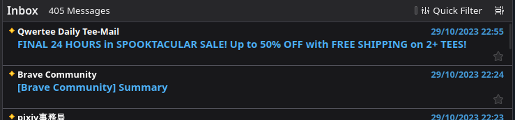
The display of mail cards suddenly went from 2 lines to 3
Hello! Before I updated Thunderbird yesterday, the card view of emails took 2 lines: - one line for sender and date - one line for the text preview and a star
But since I updated yesterday, the cards now take approximately 3 lines, the star and text being at different levels. I did not find any setting to revert that change. It kinda feels like a CSS bug since I don't understand why someone would want to lose that much space. Any way to fix it?
Thanks in advance
Все ответы (4)
Almost forgot, sorry, I have Version 120.0b1
It was a deliberate change in 120: https://bugzilla.mozilla.org/show_bug.cgi?id=1859036
I guess there are plans to add something in the 3rd row. Now, it looks worse than the 2 rows in 115.
So it won't change? That's kind of a bummer
It has been created because there are plans to put a lot more data into that 'new' line. A mock up idea of potential options was posted, but obviously this is not the end result, it's just a work in progress which is likey to be modified, but it gives you an idea of what that new space will get used to display. https://mzla-thunderbird.invisionapp.com/console/share/4VJSQKFY7Z9/986757505
I have asked for the designer to consider putting in an option to Customise, thus allowing a more 'simplified' less cluttered, less multi-coloured, option over two lines. Whether it is considered and dismissed or adopted is unknown at this point.