

How to get classic view in new update 78.4.0?
Thunderbird 78.4.0 updated but the view has changed making it difficult for some Seniors particularly those with visibility issue. The new view has little contrast.
Is there a way to revert the view back to the classic view setup with things like yellow file folder which are in contrast to white background and easy to see for those with visibility issues?
Все ответы (12)
Unfortunately you can't change back to the old look, unless you downgrade to 68 and disable updates.
What a shame as there are going to seniors and visibility impaired individuals that are not going to be happy with the new interface and its poor contrast. Hopefully the developers will reconsider this and give them a good option
The Phoenity Icons add-on is an easy way to restore icons similar to those of earlier versions.
https://addons.thunderbird.net/en-us/thunderbird/addon/phoenity-icons/
https://support.mozilla.org/en-US/kb/installing-addon-thunderbird
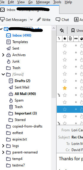
My folder pane is black folders and lettering ON white background, like this screen shot. Edit - actually I guess it is slightly shaded?
Your folder pane is shaded? Is the lettering perhaps too small?
Изменено Wayne Mery
My folders are the same as yours blue/black on white background ... the icons are filled with white giving them less contrast that yellow filled icons against white background as in the classic view
Thanks for that info. I'm going to ask some questions so that we can determine what might help other users in your situation, and pass on to developers.
We start with the premise that Thunderbird deliberately no longer has colored icons, for technical reasons which are out of scope.
1. You are on windows 10. Have you ever tried increasing the font size in the operating system settings? This would increase the readability of every application on your computer. (DPI is the technical term)
2. Do you have trouble reading the folder names (letters), in addition to differentiating the icons?
3. Do you have a specific eyesight medical condition?
Yes - I am using Windows 10. I don't have visibility issue but someone in my family does and so do a couple of people I worked with so I am sensitive to these issues - they also use Windows.
While increasing font size (DPI) can be useful it also can change the layout of the presented view which can be somewhat avoided by using proper contrast as discussed in most web visibility studies like those discussed in the W3.org document in the section "Provide sufficient contrast between foreground and background"
https://www.w3.org/WAI/tips/designing/#provide-sufficient-contrast-between-foreground-and-background
Hopefully this information is helpful. It sure would be nice if visibility issues were considered during new developments perhaps with feedback from users with visibility issues.
Wayne - I tried posting a response but it is not showing up - I will try again later - looks like it doesn't like a URL to the W3 accessibility recommendations document
Изменено selfsimilar01
Hi, I too have this problem. I do not have vision issues, not color blind, corrected to 20/20, however, my 77 year old eyes certainly do not like this update. I spend quite a bit of time on screen and noticed the difference immediately. Everything in Thunderbird is now much more difficult to read. I would not be interested in changing the dpi for my entire system when it is only Thunderbird that presents problems. I've been a Thunderbird user since about 2006, really liked most improvements until TODAY. We need a way to get out of this!!
All the pane and menu fonts, and message fonts, can be zoomed by changing a single preference in Config. editor:
I totally agree with this, there really need to be some sort of option to get the contrast back in the list of mail accounts I have. The difference between black and dark blue is nowhere near as easy to see as the old bold and normal black text at least not quickly, and that is rather the point of email, that it should be easy to use? Perhaps the developers like to work with large high definition screens where perhaps the subtle difference they have forced here is easier to spot?
As someone with vision issues the contrast and color differentiation is very important to me. I get wanting stuff to look streamlined and sleek and all that but just leave people the option to have it another way too!