

New layout/format for Thunderbird after update
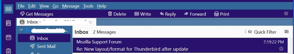
Three or four weeks ago I got an auto update. After that update the layout of Thunderbird changed. The Write button became New Message, and the Get Messages button, previously next to Write, now is in the upper-right corner. These changes don't bother me too much. The worst part is the message list in the upper pane. There is now less space between lines, and when I scroll one click of the scroll wheel on my mouse moves the list about 6 messages up or down, while previously it moved only 3 messages. Also, in the past few days I've gotten 3 additional updates, but the format/layout is still the same.
Is there any way to get back to the old format?
All Replies (12)
Have you tried View > Density > Relaxed? Have you tried adjusting your mouse settings?
Thank you Wisewiz for your response. However I tired Relaxed and Default densities and they both put too much space between lines, much more than I had previously. As for the mouse scrolling, it's set to 3 lines, which works for me on most applications.
Do you happen know why an update had this effect? I've had numerous updates in the past without any change in the layout.
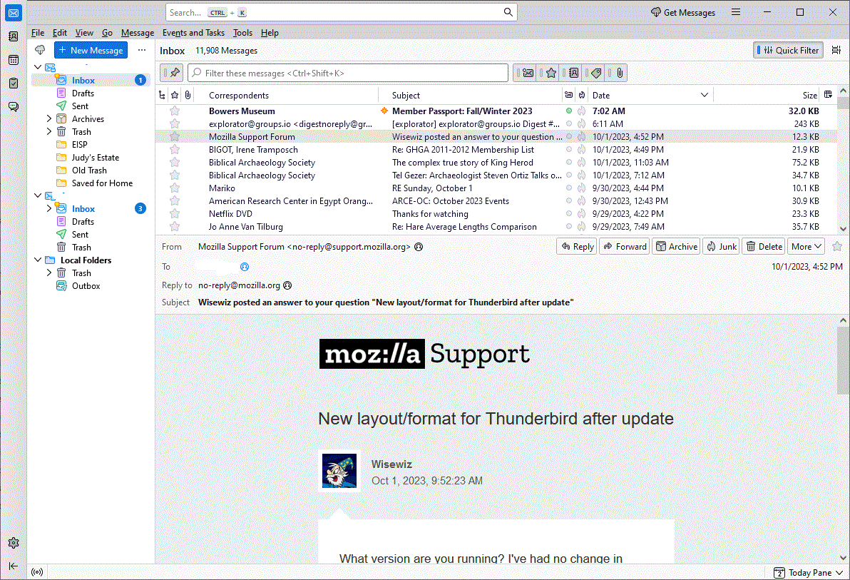
What version are you running? I've had no change in layout that can't be changed in the View menu with Layout and Density. As for the Write button, my Write still says Write, though I see that it's New Message in the Menu Bar's Message menu. And the Get Messages button can be anywhere you want it, using the Customize function in that toolbar. Just drag and drop and add spacers as needed. As you see from my screenshot, Get Messages is on the far left. I put it there. (Click to expand screenshot.)
Maybe give View > Layout > Vertical a try?
I'm running v. 115.3.1 (32-bit) in windows 10. As I mentioned originally, I've had 3 updates since this problem surfaced. I tried Vertical layout and don't care for it. Default and Relaxed densities leave too much space between lines.
Your layout doesn't looked at all like mine.
Hi, dad,
First, I make extensive use of CSS in my profile. That's responsible for the colours and a number of other things you see in my shot. Second, I get rid of that huge Search space-hog by going to Settings > General > way down to Indexing > uncheck Enable Global Search. Third (still taking things one at a time), If you right-click beside Get Messages and choose Customize and slide a Flexible Space up to the right of Get Messages, that should move Get Messages back to where you want it. If not, try (in that Customize window) moving Get Messages all the way to the left.
Fourth, I use Cards view instead of the Table view you're using, and I don't use the Message Pane, because I have my TBird set to open messages in a new Tab, not at the bottom of the message list. That means, of course, that I can't see the message list when I have an open message, but I'm fine with that.
I haven't ventured into a discussion of the use of CSS here, but if you are curious about any element of what you see in my screenshot, please just ask, and I'll do my best to answer as clearly as possible. It's not complicated, but it's complex -- by which I mean that it's not difficult (complicated) to use CSS, but it has many different bits and pieces (it's complex); it ain't a one-switch (simple) thing.
Please come back with a report on what you've done, if anything, in my first four points above, and post an "After" shot if you wish. No hurry.
Wisewiz,
My view recently changed and is similar to diegodad's screen. Can you tell me what the search field at the top of the page is called? I would like to remove that and include the bar that includes the delete, write, reply and print like you have. Would you be able to tell me how to do that?
Much thanks, 4gevfam
The Search bar at the top is called Global Search and Indexer, I think. Go to Settings > General > waaaay down to Indexing, and UNcheck Enable. That should remove the big white bar blob. In order to have the Unified Toolbar on a line of its own, without the minimize, maximize, and Exit buttons in that line, you have to have the Title bar. Go to Settings > General > Language & Appearance, Window Layout, and UNcheck Hide system title bar. Finally, in order to fill out the Unified Toolbar (Delete, Write, Reply, etc.), right-click next to Get Messages, choose Customize and drag the elements you want up into that bar in the order you want and with optional flexible spaces between items as you wish. I use a flexible space between Get Messages and Write, and another to the right of Print to keep the other buttons more or less centered. Give all that a try, and please come back and report your successes and problems, if any. Oh, and screenshots are always a big help when you have probs.
Modified by Wisewiz
Hi Wisewiz
I appreciate your help, but nothing I do can get me back to something resembling the layout I had prior to the recent update. I did play around some, and learned one thing. To the left of the new blue New Message button there is a tiny icon that looks like a cloud with a down arrow. This a Get Messages button. Previously the New Message and Get Messages were not only next to one another, they both had the same (non-blue) look.
I give up.
Well, you can display the icons without the words, so Get M would just have the cloud, and Write would just have the envelope with a + sign, and you can put them side-by-side.
Why give up so easily? You have not yet begun to fight.
> when I scroll one click of the scroll wheel on my mouse moves the list about 6 messages up or down, while previously it moved only 3 messages.
Please file a bug report. Thanks.
I'd like to do that. How do I file a bug report?