Bookmark Menus Inconsitent colors and options in 29.0.1
I can almost live with the recent Firefox update, obviously someone wants to make it look more like Chrome, but I have some issues with the inconsistency of the bookmark “menus.” If I activate the Menu toolbar and show my bookmarks, when the “expand” from a folder it uses my system colors which are white font on a black background, there is also the option to “See all Bookmarks.”
When I use the bookmark “menu” icon next to the “Star” icon, which are apparently integrated, when I expand a folder they show as white font on a white background. There is also not the option to “see all bookmarks,” which I find important if I want to back up my bookmarks or save them. So as you can see, that “icon” is rather redundant.
I can go to the bookmark toolbar, which I rarely use because I find it redundant, considering I have therr other ways to access my bookmarks. However, there is a fourth way, which is to view the bookmark sidebar, but you can only access it through from the drop down menu from the bookmark “icon” next to the “star” icon and NOT from the Menu toolbar.
Accordingly, I can hide and unhide the Menu toolbar simply by right-clicking over the area, the point is—what is the point of having four different ways to access your bookmarks if none of them work consistently? I would be happy with the bookmark menu icon next to the star icon if the colors were the same as the bookmark menu in the Menu toolbar, but they aren’t. I have set and reset my colors to system colors as well as invert the font and background colors overall and it has no effect on the expanded folders in the star/bookmark menu icon.
I don’t know how else to day this except—come on guys. It makes no sense. You should at least, except for the bookmark toolbar which I think is pointless, have the same options in the other three areas that you can access your bookmarks—the Menu toolbar, the sidebar, and the star/bookmark menu icon.
As far as the overall layout, I can live with hit. I don’t much care for some of the aspects and placements of some of the icons that are now virtually uncuctomizable, but I can live with it.
What I can’t live with is the inconsistent way I now have to access my bookmarks, you have all but done away with the feature to back them up. So what’s next?
I don’t want to get a different theme, in fact I like the colors of the default them, it’s only the white on white of expanded bookmarks on the integrated star/bookmark menu that bothers me, that and the option to “see all bookmarks” where I can save and back them up isn’t available except from the Menu toolbar.
Can you feel me?
Thank you.
Kiválasztott megoldás
You can look at the Classic Theme Restorer extension to restore some functionality that was lost with the arrival of the Australis style in Firefox 29.
- Classic Theme Restorer: https://addons.mozilla.org/firefox/addon/classicthemerestorer/
You can check the settings of the CTR extension via its Options/Preferences button on the "Firefox/Tools > Add-ons > Extensions" page.
The CTR extension adds toolbar buttons to open the bookmarks sidebar and the history sidebar to the Customize palette.
See also:
- https://support.mozilla.org/kb/common-questions-after-updating-to-new-firefox
- https://support.mozilla.org/kb/learn-more-about-the-design-of-new-firefox
Összes válasz (6)
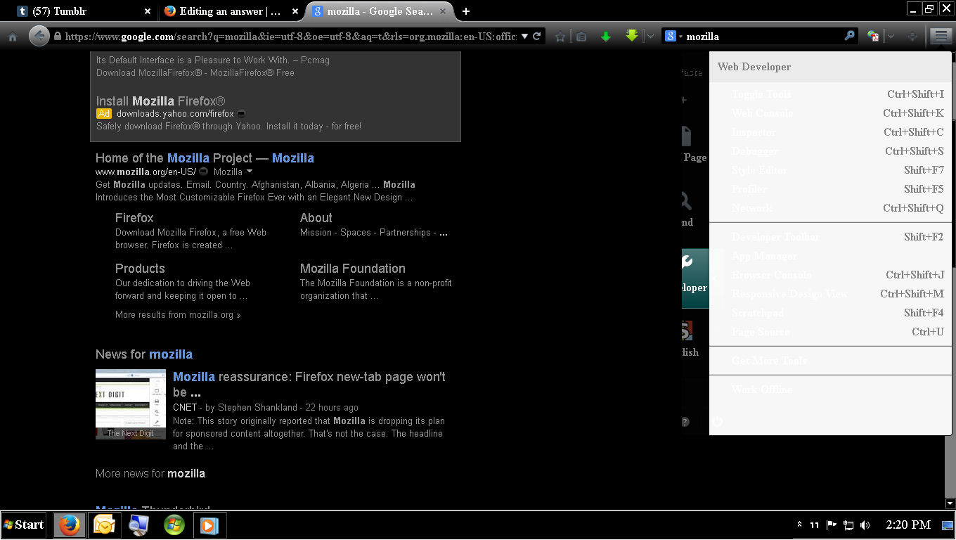
Adding screenshots.
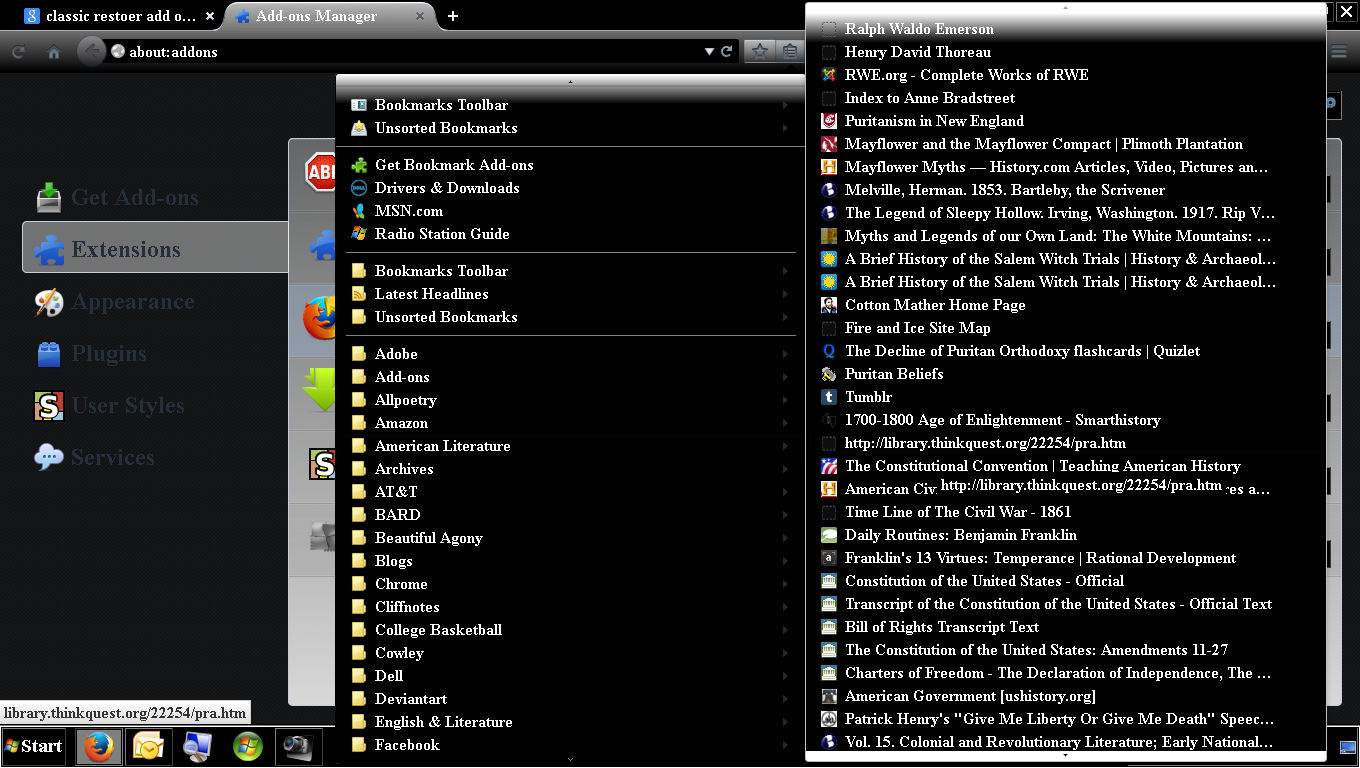
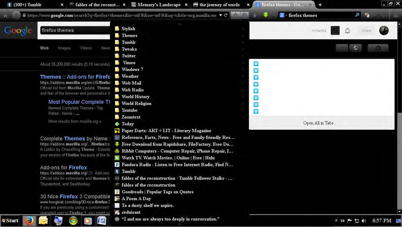
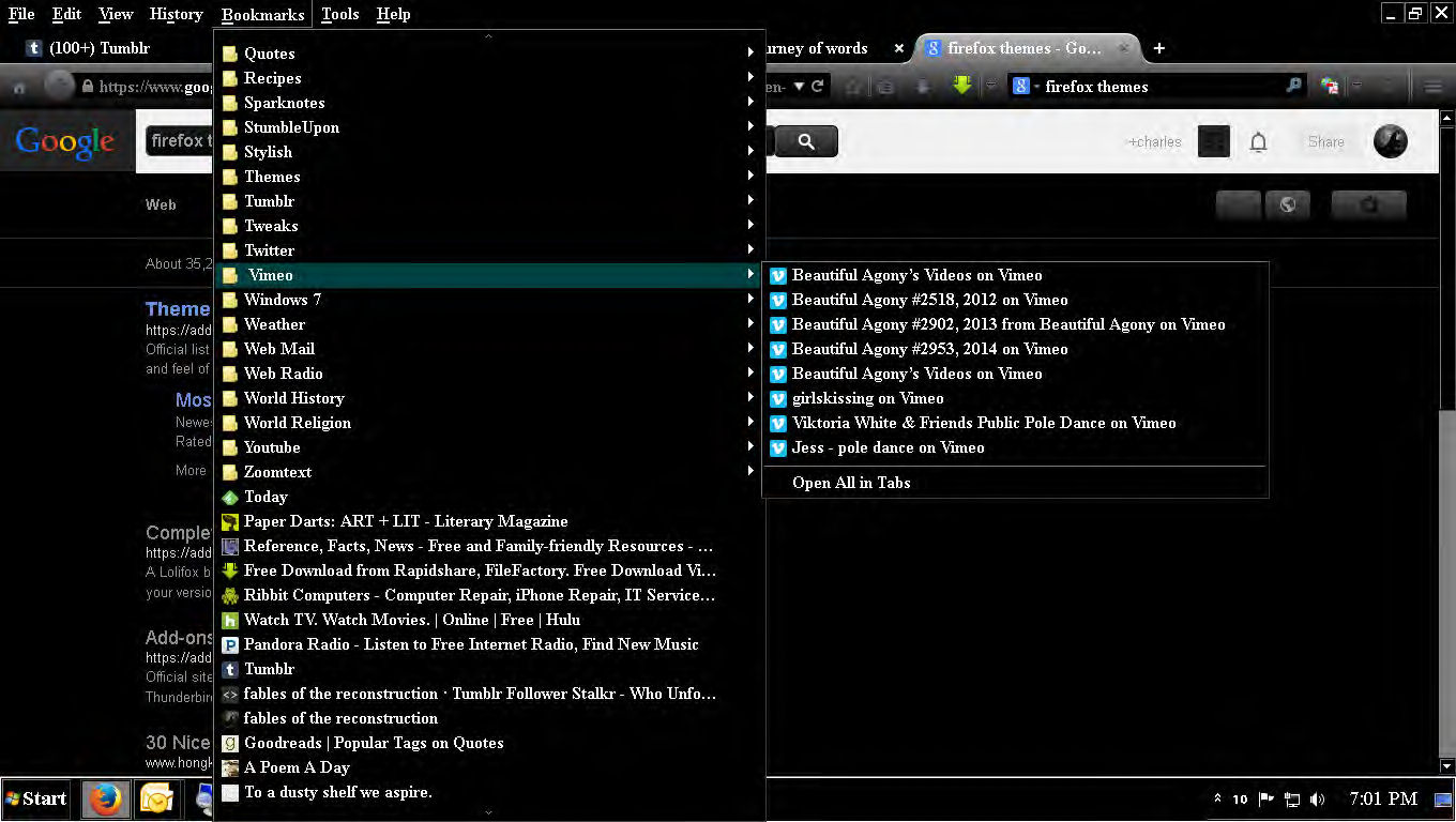
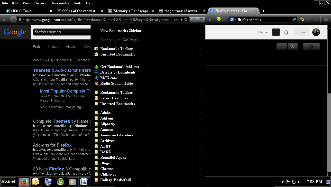
Adding screenshot. From the top left, the first to show the different color contrasts of expanded folders.
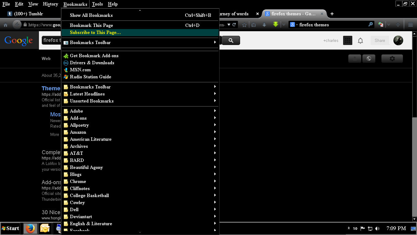
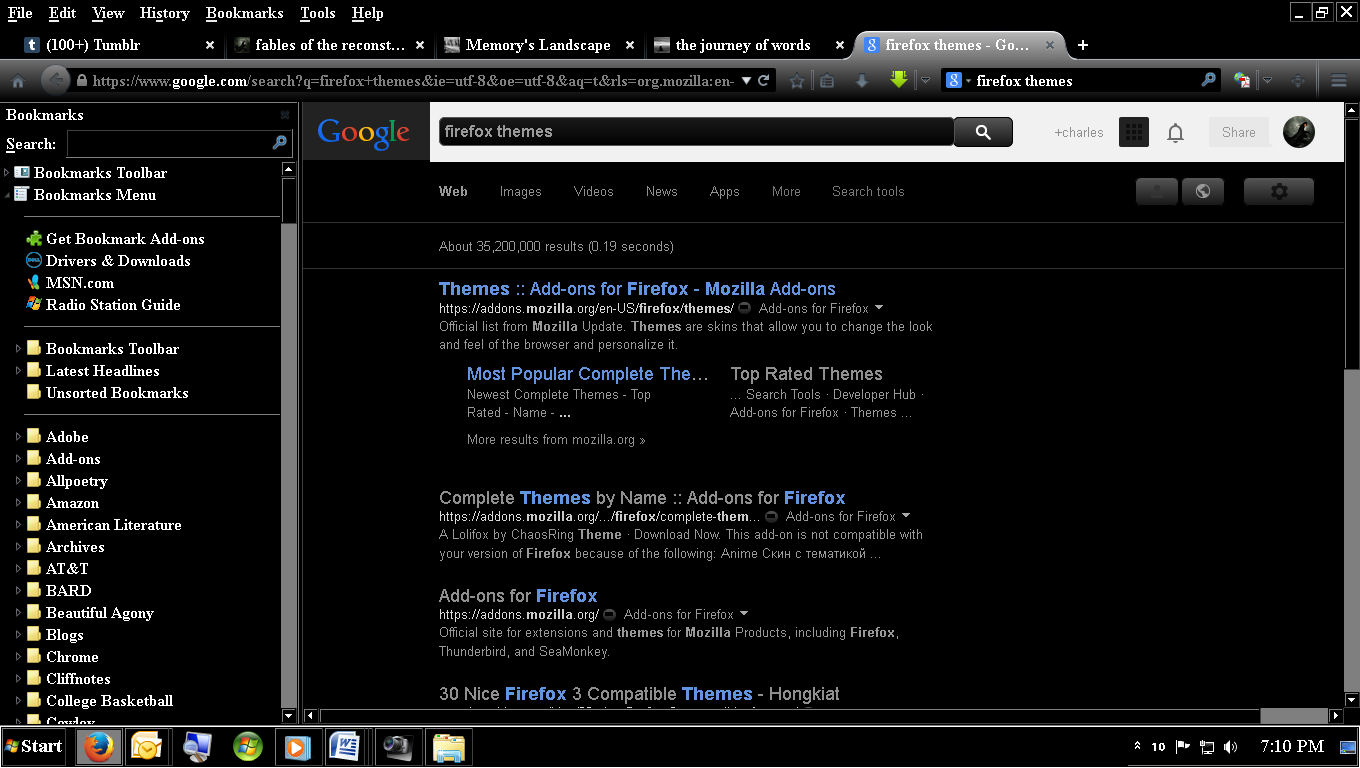
The third and fourth show the inability to “see” all bookmarks from the star/bookmark menu icon as compared to the view from accessing bookmarks from the Menu toolbar. Also notice that I can only access the bookmark sidebar from the star/bookmark menu icon and not from the Menu.
However, I can access the bookmark toolbar from the Menu in both bookmarks and View/Toolbar as well as the star/bookmark menu icon.
Which in my opinion the most redundant way to access bookmarks at all and yet I can access it from every other location, including the bookmark sidebar, the final view.
However, I cannot “see all bookmarks” and back them up in the sidebar, or the star/bookmark menu icon. I can Only do this by accessing my bookmarks from the Menu, which I simply hide except when I Need to access it, or I Need to view expanded folders in proper contrasting colors, that or I have to go to the bookmark sideaber and expand them there.
How crazy is that? Can someone please get on the same page with the ability to access bookmarks & back them up, consistently, or show me how to change the color contrasts in the star/bookmark menu icon.
I was looking at themes, I don’t think that will help. They apparently only change the “letterhead,” which ironically, isn’t to unlike a person can change their mail headers in Gmail and Outlook/Hotmail or in Chrome.
So the option to change one’s “theme” is purely aesthetic and has no functional value except to make your header look “purty.”
After that though, I can deal with the upgrades even though I will never figure out what makes the placement of the Home, Back/Forward, and Refresh icons make them more functional.
It looks sleek though. I’ll give you that—but this bookmark thing is an issue.
Thank you.

Make sure that you haven't enabled a High Contrast theme in the Windows/Mac Accessibility settings.
Make sure that you allow pages to choose their own colors.
- Tools > Options > Content : Fonts & Colors > Colors : [X] "Allow pages to choose their own colors, instead of my selections above"
Note that these settings affect background images.
See also:
Thank you for the response, but mind you, this is not affecting the way I view web pages, it’s an issue with the browser theme itself. So the link you posted isn’t really of any help. Unless you can show me where in msconfig I can go in and edit the color scheme.
There is no high contrast option in Accessibility , at least in the browser options. Pages are set to choose their own colors, but again, this is not a page view issue. Although, running Windows 7, I use the Basic theme and Not the high contrast theme. I am visually handicapped and so I am more than aware of contrasts and needs, but I choose to keep it simple.
One more thing about the bookmark/bookmark menu icon, is that they are integrated, you cannot romove one without removing theother. Thtas not very functional either. Although the contrasts when expanding the bookmark folder from that particular icon’s drop-down are frustrating and impossible to read you cannot even highlight them nor does the folder highlight itself as it does when you use the Bookmark menu from the Menu toolbar, but the inconsistencies from all areas of which one can access their bookmarks is, in my opinion—unacceptable.
I feel, in the very least, the same options should be available in all three areas of which one can access their bookmarks, and also feel you could do away with the bookmark toolbar altogether, that’s a throwback to Netscape and whetere anyone else uses it or not I don’t know, but I think it’s redundant when apparently we are wanting to move forward.
The booknmark/bookmark menu icon also needs to be “un-integrated,” there should be the option to have one or the other or both. Overall, even though I do and feel of the theme, it has slowed my surfing down considerably because I have “too many” options to access my bookmarks and yet none of them are consistent. Thus, if I need to expand a folder, I either have to go to the Menu toolbar and access my bookmarks there, or open the Bookmark sidebar and expand them there, because they are only readable in those to areas. However, I do like having the bookmark menu icon on the theme, were it not integrated with the bookmarker itself, and would, in the very least use my system colors or the colors I choose, but it does not, it uses what seem to be “default” colors of the theme itself.
Thank you.
Módosította: springheel,
I might also add, that when you access History and Developer from the drop-down of the Menu icon, they display as white font on a white background as well. The error is in make-up of the theme itself, everything else accepts my system colors but the theme, or at least these aspects of it.
Módosította: springheel,
Kiválasztott megoldás
You can look at the Classic Theme Restorer extension to restore some functionality that was lost with the arrival of the Australis style in Firefox 29.
- Classic Theme Restorer: https://addons.mozilla.org/firefox/addon/classicthemerestorer/
You can check the settings of the CTR extension via its Options/Preferences button on the "Firefox/Tools > Add-ons > Extensions" page.
The CTR extension adds toolbar buttons to open the bookmarks sidebar and the history sidebar to the Customize palette.
See also:
Thank you Corel.
I had seen the Classic Theme Restorer extension on another post but I’m always a little leary about these things and how long they will continue to work through future updates.
To be perfectly honest with you—I like the Australis theme, and I rather hope you don’t change the look and functionality of it too much more. (Just don’t remove the ability to backup and save bookmarks.) I think it’s sleek & simple, and I don’t mind the arrangement of the icons, even though I’m not entirely sure about the integration of the bookmarker/bookmark menu icon.
My only issue, being visually handicapped, was the color contrast of expanded folders. It seems to be a staple, and has been for years among web developers, that white should be a default background. There are many people like me who will disagree with that assumption and tell you it is far easier to read, and easier on your eyesight overall, to have a dark backgraound with a light font.
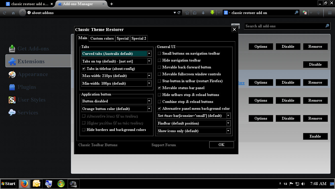
Neverthless, I made a couple of screenshots to show you exactly what I did in the options of the extension to achieve what I needed.
On the first screen of the options, all I did was check the box “Alternative panel background.”
After that, I went to the Application button and disabled it so it would be hidden. It really only served the purpose of the Menu toolbar and I can hide and unhide it at will, which I feel is a better alternative.
That is all I did because honestly—I’m okay with the rest of the new look.
Once again, thank you.