

userChrome.css - Help With Customizing Tabs (part 2)
Hi All,
I would like the content area of my tabs moved up so that the box is filled with the actual tab color, without the white background, and also the text will be vertically centered. Right now, the text is dropping too close to the bottom of the tab.
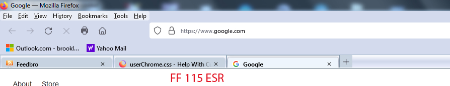
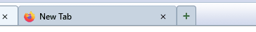
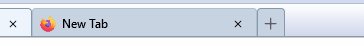
Had this looking very nice in FF 88 with the same code, as you can see in the attached images, but it seems to render differently in FF 115 ESR and FF 125.
Below is some code I used to style the tabs, but the problem exists without this code as well.
I've also included some "tabs on bottom" code I'm using as well at the very bottom.
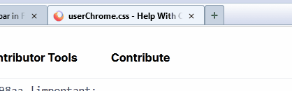
Would sure like to get those Classic Toolbar Buttons working again too (shown in the second image), but that will be a later request :)
Any help is appreciated.
Thanks!
/* Highlight non-selected tabs on mouseover */ .tabbrowser-tab:not([selected]):hover .tab-content {
background-color: #dbe3eb !important;
}
- TabsToolbar {
 -moz-box-ordinal-group: 3 !important;
 padding-top: 0 !important;
 padding-bottom: 0 !important;
 height: 25px !important;
 background-image: url("bkmr_back.gif") !important;
 border-top: 1px solid #afc0d2 !important;
 border-bottom: 1px solid #8698aa !important;
}
/* Background color of selected tab */ .tab-background[selected="true"] {
   background-attachment: none!important;
   background-image: none!important;
   background-color: #eef5fc !important;
}
/* Background color of non-selected tab */ tab-background:not([selected]) {
   color: #000000 !important;
   background-color: #c7d3e0 !important;
}
/* Border color & bold text for selected tab */
- TabsToolbar .tabbrowser-tab[selected] {
   font-weight: 700 !important;
   color: #000 !important;
   border-top: 1px solid #8698aa !important;
   border-left: 1px solid #8698aa !important;
   border-right: 1px solid #8698aa !important;
}
/* Border color & normal text for non-selected tab */
- TabsToolbar .tabbrowser-tab:not([selected]) {
   font-weight: 600 !important;
   color: #000 !important;
   border-top: 1px solid #afc0d2 !important;
   border-left: 1px solid #afc0d2 !important;
   border-right: 1px solid #afc0d2 !important;
}
/* -------------- TABS ON BOTTOM --------------- */ /* TABS: below nav-bar - updated for 89+ | 108+ | 113+ */
- |*:root {
 --tab-toolbar-navbar-overlap: 0px !important;
 --tab-min-height: 25px !important; /* adjust */
 --tab-min-width:  80px !important; /* adjust */
}
- navigator-toolbox #TabsToolbar {
 position: absolute !important;
 bottom: 0;
 /* height: 27px !important; */
 height: 28px !important;
 width: 100vw !important;
}
/* navigator-toolbox - padding */
- |*:root:not([chromehidden*="toolbar"]) #navigator-toolbox {
 position: relative !important; /*89+*/
 padding-bottom: calc(var(--tab-min-height) + 1px) !important; /*adjust*/
 background-color: var(--toolbar-bgcolor) !important;
}
/* TABS: HEIGHT */
- tabbrowser-tabs,
- tabbrowser-arrowscrollbox,
- tabbrowser-tabs .tabbrowser-tab {
 min-height: var(--tab-min-height) !important;
 max-height: var(--tab-min-height) !important;
}
.tab-stack {
height: var(--tab-min-height) !important;
}
- TabsToolbar {
 height: var(--tab-min-height) !important;
 margin-bottom: 0px !important;
 /* box-shadow: ThreeDShadow 0 -1px inset, -moz-dialog 0 1px !important; /*optional*/
 /* background-color: var(--toolbar-bgcolor) !important; */
 color: var(--toolbar-color) !important;
}
/* drag space */ .titlebar-spacer[type="pre-tabs"], .titlebar-spacer[type="post-tabs"] {
width: 40px;
}
/* Override vertical shifts when moving a tab */
- navigator-toolbox[movingtab] > #titlebar > #TabsToolbar {
padding-bottom: unset !important;
}
- navigator-toolbox[movingtab] #tabbrowser-tabs {
 padding-bottom: unset !important;
 margin-bottom: unset !important;
}
- navigator-toolbox[movingtab] > #nav-bar {
margin-top: unset !important;
}
/* hide indicators and caption buttons */
- TabsToolbar .private-browsing-indicator {display: none !important;}
- TabsToolbar .accessibility-indicator {display: none !important;}
- TabsToolbar .titlebar-buttonbox-container {display: none !important;}
- TabsToolbar #window-controls {display: none !important;}
/* -------------- TABS ON BOTTOM --------------- */

Izmjenjeno od Slouch
Izabrano rješenje
I found a solution for highlighting my "newtab" button on hover.
The problem was only the button itself was being highlighted, not the '+' SVG image inside the button, or in my case the custom .PNG image of the green '+' sign.
It appears I needed the 2 statements at the bottom of this code to handle the task. I don't think it was so complex to do in FF 88, but apparently lots of things have changed.
If there is a better way to do this, I welcome comments.
#tabs-newtab-button {
   padding: 4px !important;
   list-style-image: url("newtab_18x18.png") !important;
   background-color: #c7d3e0 !important;
   border-top-left-radius: 3px !important;
   border-top-right-radius: 3px !important;
   border-top: 1px solid #8698aa !important;
   border-left: 1px solid #8698aa !important;
   border-right: 1px solid #8698aa !important;
   margin-top: 4px !important;
   margin-bottom: -3px !important;
}
#tabs-newtab-button:hover { background-color: #dbe3eb !important }
#tabs-newtab-button:hover > .toolbarbutton-icon { background-color: #dbe3eb !important }
Pročitaj ovaj odgovor u kontekstu
👍 0
Svi odgovori (20)
I made a .GIF animation (attached below) of the newtab button, to further illustrate what I'm seeing.
If I remove all extra code in the hover section (as shown below) and only leave the line to change the background color, then the background color changes, and the '+' image icon remains intact, but I lose my border formatting and the button seems to grow a bit larger.
I've attached an animated gif to show this phenomenon as well.
/* New Tab Button */
- new-tab-button, #tabs-newtab-button
{
list-style-image: url("newtabff1.png") !important;
background-color: #c7d3e0 !important;
border-top-left-radius: 4px !important;
border-top-right-radius: 4px !important;
border-top: 1px solid #8698aa !important;
border-left: 1px solid #8698aa !important;
border-right: 1px solid #8698aa !important;
max-width: 28px !important;
margin-block: 4px 0px !important;
}
- new-tab-button:hover,
- tabs-newtab-button:hover .toolbarbutton-icon {
background-color: #dbe3eb !important;
}

I have another strange problem now. When the tab bar fills up with tabs, it shakes wildly when moving the mouse over it. Please see attached animated gif. This shaking is apparently related to my newtab button code, because when I remove it the tabs act normal again.

Izmjenjeno od Slouch
/* New Tab Button */
#new-tab-button, #tabs-newtab-button {
   background-color: #c7d3e0 !important;
   border-top-left-radius: 2px !important;
   border-top-right-radius: 2px !important;
   border-top: 1px solid #8698aa !important;
   border-left: 1px solid #8698aa !important;
   border-right: 1px solid #8698aa !important;
   height: calc( var(--tab-min-height) - 4px) !important;
   margin-top: 4px !important;
}

#new-tab-button:hover, #tabs-newtab-button:hover {
  /* fill: white !important; */
   background-color: #dbe3eb !important;
}
Thank you for that. The only problem is, on hover, I lose the border colors. See first animation below.
And if I repeat the 3 border color statements in the hover section the button gets larger by 1 pixel all around and the '+' image gets compressed . See second animation below.
Current newtab code...
- new-tab-button, #tabs-newtab-button
{
list-style-image: url("newtabff1.png") !important;
background-color: #c7d3e0 !important;
border-top-left-radius: 4px !important;
border-top-right-radius: 4px !important;
border-top: 1px solid #8698aa !important;
border-left: 1px solid #8698aa !important;
border-right: 1px solid #8698aa !important;
max-width: 28px !important;
height: calc( var(--tab-min-height) - 4px) !important;
margin-block: 4px 0px !important;
}
- new-tab-button:hover,
- tabs-newtab-button:hover .toolbarbutton-icon {
background-color: #dbe3eb !important;
border-top: 1px solid #8698aa !important;
border-left: 1px solid #8698aa !important;
border-right: 1px solid #8698aa !important;
}
Izmjenjeno od Slouch
Does it make a difference if you remove ".toolbarbutton-icon" in #tabs-newtab-button:hover ? If you use the default SVG image, does this still happen ? What are the dimensions of newtabff1.png ?
If I remove "toolbarbutton-icon" then the hover color displays incorrectly, and the borders get fuzzy. It's like something is being overlayed onto the button. Could it be the overflow tab button overlaying? See attached animation.
The background color on hover should be the same hover color as the regular tab to the left of this button (see animation), yet the color is different, slightly more red.
Dimensions of newtabff1.png are 16 width, 18 height.
Default SVG image has the same overlay issue (incorrect color and fuzzy borders) when ".toolbarbutton-icon" is removed.
Default SVG image has the same issue with button getting larger by 1 pixel and '+' sign getting compressed when ".toolbarbutton-icon" is put back.
So it makes no difference if a custom image is used or not.
See attached animations. I've also attached newtabff1.png

Izmjenjeno od Slouch
Any improvement?
/* New Tab Button */
#new-tab-button, #tabs-newtab-button {
   background-color: #c7d3e0 !important;
   border-top-left-radius: 2px !important;
   border-top-right-radius: 2px !important;
   border-top: 1px solid #8698aa !important;
   border-left: 1px solid #8698aa !important;
   border-right: 1px solid #8698aa !important;
   height: calc( var(--tab-min-height) - 4px) !important;
   margin-top: 4px !important;
}

:is(#new-tab-button, #tabs-newtab-button):hover {
   fill: black !important;
   --toolbarbutton-hover-background: #dbe3eb !important;
}
Slight improvement. The hover color is correct. The '+' sign remains intact. But there is some smaller button overlaying the main button when hovering. The smaller overlay has less width and no border colors.
I've moved the CSS vars to the main section and let Firefox do the rest.
/* New Tab Button */
#new-tab-button, #tabs-newtab-button {
   background-color: #c7d3e0 !important;
   border-top-left-radius: 2px !important;
   border-top-right-radius: 2px !important;
   border-top: 1px solid #8698aa !important;
   border-left: 1px solid #8698aa !important;
   border-right: 1px solid #8698aa !important;
   margin-top: 4px !important;
   --toolbarbutton-inner-padding: 3px !important;
   --toolbarbutton-hover-background: #dbe3eb !important;
}Getting better. The highlight color doesn't fill the entire button like with regular tabs, it only fills an area in the center immediately around the '+' sign. And the sides of the button don't meet the baseline now like the regular tabs (looks like there's one pixel missing at the bottom), but that's ok, I'll live with it. I guess this version of Firefox doesn't render things the same as 88 did.

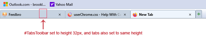
Is there any way to remove the space on top of the tabs, so top of tabs is flush with top of #TabsToolbar? Right now, #TabsToolbar is set to height of 32px, and tabs are set to the same height, but something is causing the space on top.
Here is the section of code from "tabs on bottom" that deals with this...
- |*:root {
--tab-toolbar-navbar-overlap: 0px !important;
--tab-min-height: 32px !important; /* adjust */
--tab-min-width: 80px !important; /* adjust */
}
- navigator-toolbox #TabsToolbar {
/* display: block !important; *//*not needed in 113+: display: flex*/
position: absolute !important;
bottom: 0;
width: 100vw !important;
}
/* navigator-toolbox - padding */
- |*:root:not([chromehidden*="toolbar"]) #navigator-toolbox {
position: relative !important; /*89+*/
padding-bottom: calc(var(--tab-min-height) + 1px) !important; /*adjust*/
background-color: var(--toolbar-bgcolor) !important;
}
/* TABS: HEIGHT */
- tabbrowser-tabs,
- tabbrowser-arrowscrollbox,
- tabbrowser-tabs .tabbrowser-tab {
min-height: var(--tab-min-height) !important;
max-height: var(--tab-min-height) !important;
}
.tab-stack {
height: var(--tab-min-height) !important;
}
- TabsToolbar {
height: var(--tab-min-height)-1 !important;
background-color: var(--toolbar-bgcolor) !important;
color: var(--toolbar-color) !important;
}
You can replace the margin-top rule with this rule to add a margin-bottom:
margin-block: 4px -1px !important;

Could be a problem with the background-image.
background-image: url(bkmr_back32.gif) !important;
I've taken out the background-image, but the white space remains (see attached image).
Where would I place the "margin-block" rule? I tried it as below, with no effect.
- TabsToolbar {
 height: var(--tab-min-height)-1 !important;
 background-color: var(--toolbar-bgcolor) !important;
 color: var(--toolbar-color) !important;
 margin-block: 4px -1px !important;
}

Even with userChrome.css turned off, I see the same 4px of space above and below tabs inside #TabsToolbar.
See attached image.
So I don't think it's my code causing the space.
Maybe that will help you?

I found a solution.
For some reason I needed a "margin-bottom" to get rid of the 4px space above the tabs, possibly because I previously added padding of 4px on top of the Bookmarks Toolbar...
#PersonalToolbar {
   background-color: #d3daed !important;
   padding-top: 4px !important;
   margin-bottom: -4px !important; /* worked to remove space above tabs! */
}
Izmjenjeno od Slouch
Hi cor-el,
You stated earlier that 'order:' replaces '-moz-box-ordinal-group:'
Would the following code be correct to change the order of items on the context menu, using an index number of one less? Using it, I'm not seeing a change on the order of items.
/* Default for items at the main level of context menu */
#contentAreaContextMenu > menu,
#contentAreaContextMenu > menuitem,
#contentAreaContextMenu > menuseparator,
#contentAreaContextMenu > menugroup {
  /* -moz-box-ordinal-group: 3; */
  order: 2;
}
/* Open Link in New Window FIRST */
#context-openlink {
  /* -moz-box-ordinal-group: 1 !important; */
  order: 0 !important;
}
/* Open Link in New Tab SECOND */
#context-openlinkintab {
  /* -moz-box-ordinal-group: 2 !important; */
  order: 1 !important;
}
Izmjenjeno od Slouch