

Font broken for one particular website on Firefox
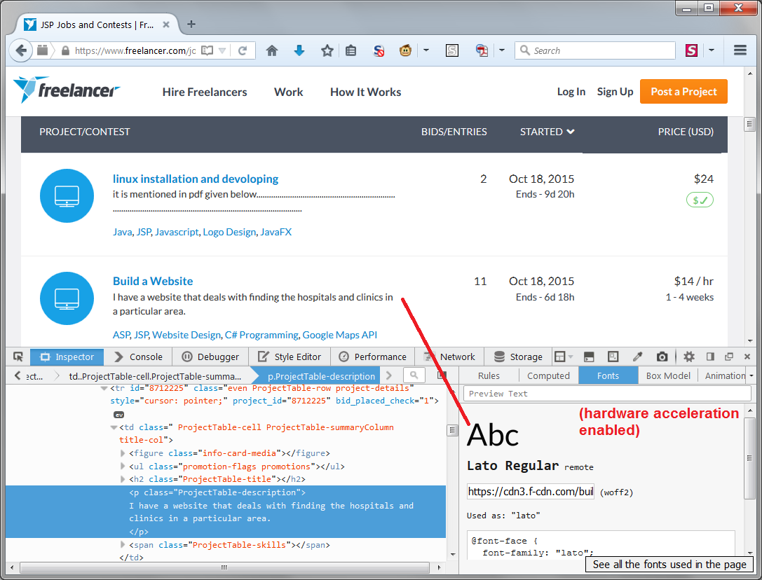
Website freelancer.com has this damaged-looking fonts that are hard to read, it looks like bigger letters have their tops and bottoms cut off/trimmed, or look at capital letter A.
It works and renders fine in other browsers like Chrome. See screenshot attached how it looks with Firefox.
I did try safe mode with all addons disabled. Hardware acceleration disabled.
Moambuepyre rhazor rupive
Opaite Mbohovái (2)
You can try to disable hardware acceleration in Firefox.
- Tools > Options > Advanced > General > Browsing: "Use hardware acceleration when available"
You need to close and restart Firefox after toggling this setting.
You can check if there is an update for your graphics display driver and check for hardware acceleration related issues.
--- Make sure that you allow pages to choose their own fonts.
- Tools > Options > Content : Fonts & Colors > Advanced: [X] "Allow pages to choose their own fonts, instead of my selections above"
You can check the gfx.downloadable_fonts.enabled pref on the about:config page and make sure that it is set to true (if necessary double-click the line to toggle its value to true).
Moambuepyre cor-el rupive
For some reason, this font is a bit ugly on Firefox, even with hardware acceleration enabled (which should improve anti-aliasing). I have attached my sample (not logged in).
If I had to look at this font a lot, I would be inclined to substitute it using a custom style rule. Here are two threads with examples of that:
Moambuepyre jscher2000 - Support Volunteer rupive