

78 versus 68
I tried version 78. I have four suggestions:
1) Return to the version 68 or earlier icons. The new ones look unnaturally bold and cartoonish when close to bits of text, like labels.
2) Restore the ability to use an add-on implementing a "Get All Message" button, or make it a standard feature.
3) Restore the 68-style entry for cc: and bcc: and the ability to enter more than one of each.
4) In the message view, put "Delete" back on the right.
Why mess with a good thing? Change for the sake of change is rarely productive.
Thank you!
Kaikki vastaukset (19)
Dan in St. Louis said
I tried version 78. I have four suggestions: 1) Return to the version 68 or earlier icons. The new ones look unnaturally bold and cartoonish when close to bits of text, like labels.
Yeah, I hated them as well, but after a week or so you get used to them.
2) Restore the ability to use an add-on implementing a "Get All Message" button, or make it a standard feature.
if pressing F5 to difficult, or clicking the down arrow beside the get messages button? Basically you should not need to use a get all messages button. Thunderbird get all mail when it launches and then get it again on a timed basis for POP and on a timed basis for some IMAP providers and get instant notification from others. Get all messages in all honesty belongs in the realms of outlook express and Internet Explorer 4 where we all got bad habits. <blockqote> 3) Restore the 68-style entry for cc: and bcc: and the ability to enter more than one of each. </blockquote> You just press enter and start on the next address. Or a comma. Addresses can actually be pasted in as a comma separated list now as well
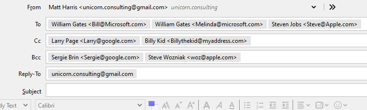
They say a picture is worth lots of words. This is an email header with a lot of fictional recipients that demonstrates the change to how the addresses are displayed and I hope entered.

4) In the message view, put "Delete" back on the right.
I would prefer if they brought back a customize option for the message toolbar. But in my usage it is not something I notice. I have used the compact header addon to get rid of the whole header pane since V3. I customise the main toolbar to hold the mail actions I want.
Why mess with a good thing? Change for the sake of change is rarely productive.
It was not for change for the sake of change. Much of it was imposed by platform changes in the Mozilla platform.
Much of the underlying code Thunderbird was built on has been stripped out of the platform by Mozilla in the past few years. Not wanting to have regard to Thunderbird's needs in that process what in part at least behind Mozilla pulling out of Thunderbird's development in 2012 and leaving it to it's volunteer community to keep it alive.
The toolbars code base disappeared when Mozilla started pulling the XUL components they were built on. What is in 78 is entirely new and as far as I am concerned at least still a work in progress. But further delay in implementing something would have seen an end to Thunderbird. The next version will also have significant change, with the actual elements used as containers for the message list etc going to a new style. That will be a continuation of the "deXUL" process that has been ongoing for a long time now.
The Icons were changed for similar reasons, but also underlying was the intention of building an android version of Thunderbird. Having a single set of icon makes that much easier and the old ones did not fit into android. These use a different graphic format and are vector graphics not bit maps as I understand it.
Matt, thank you for your detailed and thoughtful explanation of how some of the "features" came to be.
Pressing {F5} (or is it {Shift+F5}?) takes my hand off the mouse which is a step backwards since almost all of the "morning run" through my Inboxes is done with the mouse. Click the down-arrow and then the desired action is still 2 clicks instead of 1 -- 1st-world problem, right<G>?
I can't agree with "Get all messages in all honesty belongs in the realms of outlook express and Internet Explorer 4." I have never used either of those as an email client and I fail to see why they are relevant. I'll try scheduling mail checks every half hour (I don't use IMAP) and see if that helps. What makes "Get all messages" a bad idea? For me it's just a time saver. Download them all, then click through and delete, mark as spam, or reply; as needed.
I don't recall that pressing {Enter} after adding a Cc: address did anything at all. I could not find a way to add a 2nd Cc: or Bcc: but if I try version 78 in the future I will try to remember your tips. All I could see was that after entering the 1st Cc: that choice disappeared from the toolbar.
Too bad that the code base change defeated some handy features and uniform appearance. That leaves the impression that it was done to make life easier for the programmers at the expense of the end users.
I will watch this forum for a while and see what else I can learn. Thanks again.
Actually Thunderbird default schedules mail collection for 15 minutes and really that should suffice for most purposes. Outlook/hotmail refuses more frequent connections but there are often folk on these forums using 5 minute collection intervals.
These two bug are I think the grand daddy's of the get mail functions. https://bugzilla.mozilla.org/show_bug.cgi?id=281417 https://bugzilla.mozilla.org/show_bug.cgi?id=301228
I see get all mail in the era of outlook express. At a time when you connected to the internet specifically to get mail and then disconnected again because you paid for online time by the minute. Every extra minute cost you and everything was optimized for getting the data downloaded locally as quickly as possible. My copy of Thunderbird remains open and online all the time. When I am looking at mail about the only time I am pressing a get mail button is when I am looking for a specific email into a specific account to continue what I am doing. But I have about 25 total accounts in Thunderbird, so I really do not want to get mail from all of them at once very often at all.
That leaves the impression that it was done to make life easier for the programmers at the expense of the end users.
That is not entirely incorrect, that is why I still consider some of these "features" a work in progress. Shortcut were taken to get the job done on time.
Thunderbird has a small staff of developers that have done very little in the last couple of years but plug holes and put bog over the cracks caused by the changes Mozilla have made to the platform. Much discussion was had not only recently but in the past few years about what had to be done to keep the project building and what features everyone would like to see that are still not getting the attention they deserve due to the pace of change in the platform. It was even considered at one time to do a full rewrite of Thunderbird using something other than the Mozilla platform. Given the millions of lines of code involved that just could not be made to fly. So a more staged approach is being used to rewrite things when the can be done. But it is only in the last 12 months that it has got to the stage there is it proactive not reactive to build failures.
About the only change you mentioned that was a real desired feature was the addressing changes, and while they are deceptively simple they are also a source of confusion because folks are used to a list that goes down the page and now they have a list that goes across the page. A very simple change, but one that has people sort of squirming. Given that the changes grew from a desire to be able to paste in a comma or semicolon separated list into the address filed. IT has also had it's share of controversial things. You will learn more than you want to know in the implementation bug here https://bugzilla.mozilla.org/show_bug.cgi?id=440377
Like Matt, I initially didn't like the black outline folder icon, but now I actually prefer it.
As for get mail, I know exclusive use the download button, but I've put it on the tab bar because I have the toolbar disabled, per screen shot.
If for deleting message I have never used the message reader pane delete button - preferring the delete key. However, in version 78 there is now a delete column that you can add to the message list pane. I use it quite a lot.

Matt said
About the only change you mentioned that was a real desired feature was the addressing changes, and while they are deceptively simple they are also a source of confusion because folks are used to a list that goes down the page and now they have a list that goes across the page. A very simple change, but one that has people sort of squirming. Given that the changes grew from a desire to be able to paste in a comma or semicolon separated list into the address filed. IT has also had it's share of controversial things.
Matt, thanks again for your clear explanations of how version 78 came to be. I'll wait until there is a stable version with automatic updating of my profile, and then have another look at it. On a computer where I can afford to remove it and go back.
- +1 re: cartoonish icons in treeview (folder tree) - looks like they're angry and yelling at you.
- Changing "Compact" to "Purge" (dialog box for cleaning up folders) caused me to click Cancel. Was the word change necessary after MANY years of Tbird releases? The change is documented in the long release notes, but it took time to find it.
Dan's problem number 3 is what's brought me here. The single line for CC and BCC only works adequately if there is only one name to fill. An address is not actually registered on the line until either you've hit 'return' or entered a comma (which doesn't actually appear on screen). That leaves the problem of how to insert further addresses on the same line - they have to be finished one by one in the same way. If either finishing step has been forgotten, an attempt to go back and correct the line leads to every non-entered address being wiped out.
That's the problem that Dan has encountered - he explains that he couldn't find a way to put in a second CC or BCC address. Nor could I, at the start. Nothing about this is intuitive - I've had to experiment. The 'picture' drawn by Matt is what it might look like after everything's been sorted - but it's not at all clear how to get there.
Matt, thanks for your explanations. They do clarify why the product has moved to where it's at. Maybe I'm a grumpy old man (well, I know I am) but some of the changes really don't seem to be in the right direction, and yes we all have opinions that are formed by our use case:-) ...and in case people give up because this post is too long, my burning question would be is there any way to revert the icons?
I really hate that developers of many fine programs/apps on many platforms seem to want to improve things all the time with their program interface. Functional improvements, great! performance improvements, fantastic! Interface changes - why? and more specifically why not give users the ability to revert for at least 2 major versions afterwards?
Take one example from history, just because one set of users thinks a ribbon interface makes things more efficient doesn't mean that the 50% of existing users who have 5 years plus of menus and pre-selection experience waste 2 weeks re-learning what they already knew and 4 months tripping over the "where the F is that now?" experience at 5-10 minutes a pop.
However back on topic, the two that bug me with the 78 release for TB are a) the new icons. I read on the release notes that this was for HDPI monitors (in addition to your note about Android). I have a 4K monitor and frankly the icons are less readable for me. I have a jigsaw piece for an inbox, which looks square, not rounded on the monitor a cursor arrow for sent, I can't tell the difference at that res between drafts and templates icons they are both sheets of writing. The designs are too simplistic and fail in what they set out to do. If it's also done to make the interfaces look more alike I have to ask what's the point? I do use email on a phone, but only with a phone app. I can't use that well on the Android tablets that I use, so I use another client. They aren't the same because the devices aren't the same. By the logic of making look the same presumably at some point we'll be swiping our PC screens to get the same feel as the Android app? Different devices are exactly that - different, with different OS interfaces. and while I would love to see TB on my android tablet note that I've just stopped using Firefox as Mozilla have completely screwed up the interface on Android, it became unusable and if you read the reviews forums etc there are many doing so. Now I've spent a couple of weeks learning another browser, while it's not perfect I ain't going back. There reasoning apparently included that they had to change some of it because of the core code changes... b) Much as I appreciate that the pilled addresses are now like most other email clients, I am one of those that actually like the list display. My brain works better when checking I have the addressees to scan quickly up and down with full email addresses rather than left to right and down with display names only. It recognises the patterns as well as the text content. I really hope that the address blocks in a forwarded email are not about to get the same treatment. Pasting addresses into a single box (great idea) is about parsing, it's not about the display of the names. It would not be difficult to deal with pasted addresses by parsing and still display in list fashion. (Notes did it for years). If we're stuck with the new way then at least give an option to expand the header area to always display a line for cc and bcc not have to click them in. If you're not a mouser then this takes you again away from efficient usage. In these days of large monitors minimising real estate for menus, toolbars and header display areas really isn't an issue. I have about 30 email accounts around 10 active, a couple with nested folders and I can see all this in one go on my 4k monitor with room to spare.
Appreciate that the "always mark message read after X seconds" bug has been fixed.
However, I also have an issue with the missing CC/BCC lines. Separating people into To/CC/BCC is just proper email etiquette.
I realize you're just copying the UI of other popular editors like Gmail and Outlook Web. There are two ironies here:
- I use Thunderbird to avoid using those interfaces.
- Both of them allow me to access CC/BCC straight from the keyboard.
2 is what bothers me the most. I don't understand why we can't have any one of these:
- An option to always show CC/BCC lines
- UI remembers we clicked CC and shows it on the next launch of the composition window like an option toggle
- A keyboard shortcut - Gmail uses Ctrl+Shift+C for CC
- A way to tab to the CC button - Outlook Web allows this
If this is available and I missed it, please educate me and accept my apologies. But if you read this:
https://support.mozilla.org/en-US/kb/keyboard-shortcuts#w_customize-or-disable-keyboard-shortcuts
You learn there is no shortcut, and just about all the keyboard addons were rendered useless by v68. I understand the importance of refactoring/improving code, but that seems like a serious blow to the ecosystem.
This is a peer user support forum. YOu want to ask for changes to the code. This in NOT THE PLACE.
Enhancement request are managed through Bugzilla. https://bugzilla.mozilla.org/home
Yes, Matt. This is not the user support forum. And yes, developers are tight in time.
But...
There actually is a reason that Mozilla products are losing traction. Check this for 2020. In half a year, Firefox dropped from a meager 9% in market share to 7%. And I recall times where it was at 45%. The development in Thunderbird is not much better.
There is a reason for this.
Rule number 1: Listen to your users when designing products, not to developers.
Rule number 2: Do not make changes to a product which gets into the way your users have learned to use your product.
Rule number 3: Accept the fact that some users need your product to get <work done> and that they are neither interested in eye candy, fancy animated gadgets or other things devs like to play around with. They want to earn their money. Full stop.
Well, yes, I am writing in the wrong forum. I should register at Bugzilla, fill in log forms, explain why I want a feature back, which in my case is a plugin (Nostalgy) which just stopped working when Thunderbird did an auto update to a version where Nostalgy no longer is supported - and then listen to the replies of developers telling me that I should not like doing the things my way but rather do it their way ... an watch my Bugzilla contribution being closed as "WONT'T FIX".
Yes, I know that I am writing in the wrong forum. But some umteen years ago, when I decided to dump Firefox and migrate to Chrome, I wrote a similar mail. And now I restored the old Thunderbird and hope that the new version eventually will support Nostalgy...and...if not, sooner or later I will have to dump Thunderbird.
There are three rules to be observed and the Mozilla sphere of products will continue to decline unless...
Well, yes, I know, I am writing in the wrong forum ;-)
Let's dispel some myths
- If you read the history of the last decade you will see that we bear the mozilla name, but we are fully independent - in other words "we are not Mozilla"
- We are also not Firefox by any stretch of the imagination.
- Improvement in compose addressing has been a highly ranked need for many years, and deserved attention - so we are not just copying others.
- You CAN participate if you choose to do so. There is a UX forum and bugzilla where you can read how it evolved. And be involved in the future.
- The current state of compose is NOT yet the desired end state. There are bugs on file about future changes already planned. There are probably also ideas planned that are not yet in bug form - in short,
This is a community led project, with smart developers. In the end, the best ideas that satisfy the most users tend to win - not the loudest voice.
For your convenience https://github.com/nostalgy/nostalgy/issues/85
re: 1) Return to the version 68 or earlier icons. The new ones look unnaturally bold and cartoonish when close to bits of text, like labels.....my burning question would be is there any way to revert the icons?
You can do this yourself if you want to...read info here:
re :3) Restore the 68-style entry for cc: and bcc: and the ability to enter more than one of each.....he couldn't find a way to put in a second CC or BCC address. Nor could I, at the start. Nothing about this is intuitive -
Often you can find useful information in the Help Articles. This Support Forum does offer Help Articles on all sorts of stuff, although some do need updating to reflect recent changes :)
re :4) In the message view, put "Delete" back on the right.
I have 'Delete' in the Message header section on the right just before the last icon 'More'. It's been in that location for quite a while and it is a logical position. The last of the icons to do with messages, so no accidental clicking on something that could be not quite as desired. For example if muscle memory after all this time still has you click on the very last one called 'More' by accident, it's is not going to set alarm bells going. But I must admit I do use the 'Delete' key.
re:An option to always show CC/BCC lines This is in a bug report as an enhancement, so the idea and possible of how best is being discussed. https://bugzilla.mozilla.org/show_bug.cgi?id=1616514
There is also some discussion looking at ability to display as list: https://bugzilla.mozilla.org/show_bug.cgi?id=1635207
Hello The design of account and email list panes are almost the same but yet, made me roll back to 68 (thanks god I backup profiles)! - on accounts pane folders with new messages highlights in dark violet indistinguishable from black folders without new messages! Please take pity of millions of peoples' eyes! - double-spacing in email list pane just made it twice less usable for the sake of beauty. - hover line under mouse pointer in the email list pane was the last straw to roll back to 68!
Make this changeable please!
Aside from the unclear, VGA-like icons and text colours, the main thing that might drive me back to 68 is the header section - I would like to have the compact version back so the list of messages & the message pane are maximal.
You can fix the folders back to the original. You can reduce the huge white space the developers unwisely introduced for inexplicable reasons. You can use an addon to Customise the header area which the developers simply decided that users did not need it and forced an addon to be created in order to cover shortcomings and other related bugs.
Please read the following links for information. Folders: https://support.mozilla.org/en-US/questions/1309818#answer-1360563
White space and much more related to same area: https://support.mozilla.org/en-US/questions/1307570?
Addon: https://addons.thunderbird.net/en-GB/thunderbird/addon/msghdr-toolbar-customize/
Bug report related to the necessity of the addon above: https://bugzilla.mozilla.org/show_bug.cgi?id=1556261
General FAQ's for version 78: https://support.mozilla.org/en-US/kb/thunderbird-78-faq
Release notes for 78: https://www.thunderbird.net/en-US/thunderbird/78.0/releasenotes/
Release notes for all versions: https://www.thunderbird.net/en-US/thunderbird/releases/
It is easier to deal with specific issues in their own question and easier for people to locate helpful information to their own issues. Please remember, when you post a comment in someone elses question, then you are sending that person an email. If you want a greater part of the Thunderbird community to see your question then start a new one for your particular problem.
However, it is worth using the search for Help Articles or other Thunderbird questions as in recent weeks there maybe answers to your particular problem or query brought about by the update to 78.