another new look
any one actually happy withthe new look ff89 ? it has to be the biggest pile of crap i have had to endure so far . maybe its time to switch to google chrome and leave ff for dead
所有回覆 (20)
shame that proton option is going in update 90 , so we will be stuck with the ugly design until the next ugly update . and round and round it goed until ff has no users left .
as written else where on here ;
Hey folks,
some people have reached out to find out how to downgrade or to find a workaround to go back to the old interface. Please, don't recommend the about:config pref since it will be removed anyway in Firefox 90. I've added a line in our MR1 spreadsheet about this (line 35) so you could use the recommended common response for such request.
This update is terrible. There's no differentiation between items on the menu and, as a result, you have to strain your eyes and take time to find the tab or bookmark you're looking for. Nobody wants to spend time on that. It's a fail.
The design's purpose should be to make the browser work seamlessly, not to look a certain way. We're not going to print out a screenshot of Firefox and hang it on the wall. You've made it more difficult for your users to use. How it looks is unimportant if it isn't achieving the goal. For those of us who have less than perfect eyesight, this design is a serious hurdle. It makes using firefox a pain instead of a joy. For now, I have disabled all the proton features in about:config and it's usable again, but what about the future?
If you are trying to look like Chrome or some other app, then one of you is redundant and unnecessary. We like Firefox as it was, because it works for us! If we liked Chrome better, we'd be using Chrome.
Who is making these decisions and what are they basing them on? Honestly, it almost seems like industrial sabotage, it's so bad.
Well put and I agree 110%.
jscher2000
I use a custom theme called Fantasy of Lights - N.Lights Series 1. I've used that same theme for YEARS. All my menus have been white background with black text using this theme, even through all the MANY FF updates over the years...and this is the first time I've had problems with some of the menus being a dark background with white text...which I CANNOT read due to poor eyesight.
I did try the proton fix and that seems to work. Didn't get the old tabs back, but I can live with that. What I can't live with are menus with black background and white text. If the proton fix goes away in FF90, I guess I go away from FF. I'll have no choice, since it will be unusable for me. If I can't read the menu, what's the point, right?
I'm thinking most of FF employees must be very young and not the brightest bulbs in the pack. Maybe they want to make FF so that only youngsters under 21 use it?
kentuckywoman2 said
I use a custom theme called Fantasy of Lights - N.Lights Series 1. I've used that same theme for YEARS. All my menus have been white background with black text using this theme, even through all the MANY FF updates over the years...and this is the first time I've had problems with some of the menus being a dark background with white text...which I CANNOT read due to poor eyesight.
This theme uses white text, so in Proton, instead of standard black-on-beige, the context menus also use white text (on a black background). As you discovered, switching browser.proton.contextmenus.enabled to false restores the "non-themed" menu appearance. When that is no longer available, we'll have to help you with a different workaround, or you might need to find a theme that uses dark text.
jscher2000
I don't know what theme you're looking at, but no, this does NOT use a black background with white text. I've been using this theme for years, LOTS of years, and it has ALWAYS used a white background with black text.
And frankly, I'm a bit offended that you think I've been using this theme for years and never noticed what color the menus are??????
Believe me, if they had been black backgrounds with white text, I would NOT have been using this theme all these years.
I suggest you look at the themes again. You obviously have the wrong one.
由 kentuckywoman2 於 修改
Hi kentuckywoman2, I meant:
"This theme uses white text on the toolbars, so in Proton, instead of standard black-on-beige, the context menus also use white text (on a black background)."

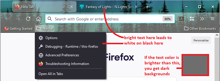
While I do not have serious vision problems, I do prefer my custom theme. My toolbar backgrounds match that square claiming to be a "dark background". My text is green, with yellow and red for tabs depending on their status.
I've figured out, again, how to get everything back where I want it. Including the tabs bar on top, even though it is not where I want it.
What I still want is for the tabs bar to be under the bookmarks bar.
Probably a relatively simple fix but well complicated by FF's need to make worthless changes.
And I still want to know why FF is so slow!
AIVAS said
While I do not have serious vision problems, I do prefer my custom theme. My toolbar backgrounds match that square claiming to be a "dark background". My text is green, with yellow and red for tabs depending on their status.
If you mean in my screenshot, my square is the brightest text color that has black-on-white context menus. If the text color is brighter than that, the context menus flip to white on black.
I've figured out, again, how to get everything back where I want it. Including the tabs bar on top, even though it is not where I want it. What I still want is for the tabs bar to be under the bookmarks bar.
You could look at this thread:
https://support.mozilla.org/questions/1339095
And I still want to know why FF is so slow!
I suggest starting a new question dedicated to that issue:
why only 2 themes dark-black or light-white ? , every other site does this at the moment from facebook to windows 10 and its pointless and boring . ff looks like any other searcher now too . what happened to ff being unique ? what happened to being able to arrange it to look how we want it to instead of being told how it will look . there is no choice on ff anymore , or any other site for that matter . every site will offer the same boring plain look , light or dark theme , tiny icons , huge floating tabs ( above) , options to bookmark not once but several times , a load of icons for twitter , facebook etc etc . ff is dying a slow death at the moment and copying is not the way to go , neither is p1ssing off loyal users to get back the ones that weren't. update 90 will be the nail in the coffin especially once the proton cant be set to false. there is nothing keeping us using ff other than its the same as all the other options , do we stay or use the originals ? someone best tell ff about these posts but then again we have been ignored repeatedly in the past and no doubt in the future too .
Why ff team remove the ICONS besides the menu items, dont you know that this give the posibility to find entries faster insted of reading the whole line, do you realy thinks this kind of "updates" is a somewhat an improvement? Visual changes always should be an alternative for users, nobody what to lose time re-learning things, or re-adapting for unwanted visual changes...who dicides the criteria for that changes?
You could look at this thread: https://support.mozilla.org/questions/1339095
OK, with some testing, the Tabs Bar has been moved under the Browser Bar(s) however moving it changes the colors of the other tool bars, lightening them.
I know how to assign a color to each tool bar so I'm guessing that there is some "lightening" code that is being carried by the Tabs Bar and needs to be adjusted to the new location of the Tabs Bar.
Hi Trev, I've passed on your feedback to the team. Is there anything else we can do to help?
I much prefer the white menus with black print. It is so much easier to read. Also the print on the tabs has gotten finer and I can't see the "x" to close out tabs. I have a pretty border at the top and really don't want to get rid of it but find it difficult to see the "+" to open a tab. Yeah, I am older and wear glasses but there's no reason to make this a more difficult experience. We should be given a choice as to which look we prefer. At first I couldn't figure out if this was a WIN update issue or FF and then realized it was FF. Everything is either too dark (menus) or too light (writing on tabs). It was already difficult to see the lines too see your bookmarks, history and downloads but they are distinct compared to what the tabs look like now.
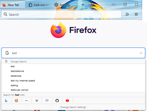
Also, when I open a new tab so I can do a search it won't search in the search box right there on the page like it used to...it goes up to the address bar which is where I don't want to be. I am not sure but could it be that before when I opened a new tab it opened on the DuckDuckGo page instead of the Firefox page? I don't think so as the same icons are there. Is there a fix for this so I can actually do a search in a new tab instead of having to click a second time to get my search engine up?
Not for nothing but all the icons changed, too. Why do you have to do this?
Any help you could offer would be helpful. Thanks.
Since the FF89 update, the Active Tab and other graphical elements (e.g. icon elements in the Menu Bar), now have reduced visibility, and do not stand out enough, against the often higher contrasting items in the main screen, because the "modernisation" has reduced the border thickness (and increased the active tab transparency) too much.
I have used the Firefox LightBlue theme for years, as it has got just the right background to show the highest percentage of site icons in each tab well, but after the FF89 update, I feel that the visibility is not good enough.
Ideally, these should have a setting available to enable users to alter the border thickness, and tab transparency level, to make them stand out better, and possibly a "bold icon mode" for the menu bar items as well. I also feel that the "Download" activity icon needs to be better, and more "animated" during downloads, as casual users might not notice this. One of the worst "icon visibility issues" is actually in a New Tab, if you "mouse-over" where the Search Engine Option drop-down symbol should be (in the search box - if you happen to have that configured in your Menu Bar), it is almost INVISIBLE, you need a magnifying glass to see it! It almost seems that it was not tested when this change was made (perhaps the test team missed it.....) I TOTALLY agree with @tek360 post above by the way!
由 td47 於 修改
For this part --
tek360 said
Also, when I open a new tab so I can do a search it won't search in the search box right there on the page like it used to...it goes up to the address bar which is where I don't want to be. I am not sure but could it be that before when I opened a new tab it opened on the DuckDuckGo page instead of the Firefox page? I don't think so as the same icons are there. Is there a fix for this so I can actually do a search in a new tab instead of having to click a second time to get my search engine up?
-- there is a preference:
(1) In a new tab, type or paste about:config in the address bar and press Enter/Return. Click the button accepting the risk.
(2) In the search box in the page, type or paste handoff and pause while the list is filtered
(3) Double-click the browser.newtabpage.activity-stream.improvesearch.handoffToAwesomebar preference to switch the value from true to false
Success?
More info on about:config: Configuration Editor for Firefox.
Proton is the worst UI "upgrade" I have ever seen.
Thank you jscher2000 as your suggestion fixed that issue. Now about the other stuff that I have no idea how to make look more distinct!
td47 said
One of the worst "icon visibility issues" is actually in a New Tab, if you "mouse-over" where the Search Engine Option drop-down symbol should be (in the search box - if you happen to have that configured in your Menu Bar), it is almost INVISIBLE, you need a magnifying glass to see it! It almost seems that it was not tested when this change was made (perhaps the test team missed it.....)
Do you mean in the search box in the new tab page, or in the short search bar on the toolbar? I'm not sure which symbol you are referring to.