

I'm developing website. In css media query @media (pointer: coarse) is true. But I'm working on laptop without touchscreen. Why? Is there is any workaround?
I'm developing website. In css media query @media (pointer: coarse) is true and @media (pointer: fine) is false. But I'm working on laptop without touchscreen. In attachment there is screenshot from https://developer.mozilla.org/en-US/docs/Web/CSS/@media/pointer It shows what I'm talking about. Only Firefox has this behavior. Ie11, Edge, Chrome working as expected (css media query @media (pointer: coarse) is false and @media (pointer: fine) is true).
So question, why FF behaves this way? is it a bug? Is there is any workaround for Firefox?
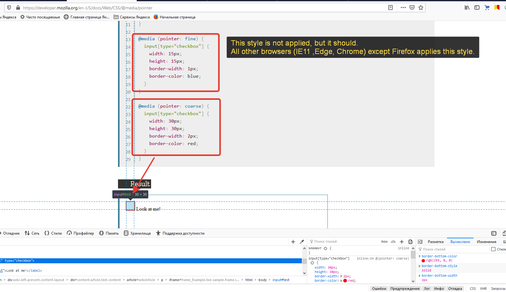
I'm developing website. In css media query @media (pointer: coarse) is true and @media (pointer: fine) is false. But I'm working on laptop without touchscreen.
In attachment there is screenshot from https://developer.mozilla.org/en-US/docs/Web/CSS/@media/pointer
It shows what I'm talking about.
Only Firefox has this behavior. Ie11, Edge, Chrome working as expected (css media query @media (pointer: coarse) is false and @media (pointer: fine) is true).
So question, why FF behaves this way? is it a bug? Is there is any workaround for Firefox?

由 cjorange 於 修改