

How can I eliminate the shadow under the arrow of hidden tabs?
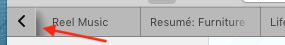
Hello! Can somebody please help me with the code I must include in my customization file (userChrome.css) to eliminate the shadow under the arrows to reveal the tabs overflow on both sides? Thank you very much!
Giải pháp được chọn
Firefox does come with CSS code fade out the tab text via mask-image.
You can use the Browser Toolbox to check what CSS rules are active in this area. You need to make some changes in the developer tools setting to enable this toolbox.
Đọc câu trả lời này trong ngữ cảnh 👍 0Tất cả các câu trả lời (9)
What code do you currently have in userChrome.css for the Tab bar (#TabsToolbar) ?
I'm not sure I understand what you mean with eliminate the shadow under the arrows to reveal the tabs overflow on both sides because the arrow points to a separator betwen the arrow and the first visible tab.
Thank you for your help cor-el!
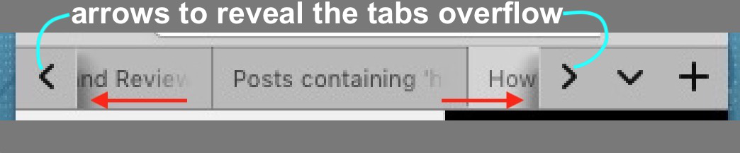
Please take a look at the new pic. I hope is clearer!
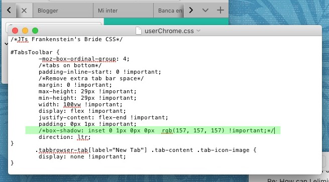
#TabsToolbar {
	-moz-box-ordinal-group: 4;
	/*tabs on bottom*/
	padding-inline-start: 0 !important;
	/*Remove extra tab bar space*/
	margin: 0 !important;
	max-height: 29px !important;
	min-height: 29px !important;
	width: 100vw !important;
	display: flex !important;
	justify-content: flex-end !important;
        padding: 0px 1px !important;
	box-shadow: inset 0 1px 0px 0px  rgb(157, 157, 157) !important;
	direction: ltr;
}
       .tabbrowser-tab[label="New Tab"] .tab-content .tab-icon-image {
        display: none !important;
}
Được chỉnh sửa bởi cor-el vào
You do appear to have a box-shadow rule that might be causing it.
box-shadow: inset 0 1px 0px 0px rgb(157, 157, 157) !important;
Thank you, cor-el. But no. That's not the line, and I don't have anything to tweak that element in all my FF tweak css. (userChrome.css) Just to prove it, I have obfuscated that line: the shadow stays intact. Please take a look of the pic. Thank you,
Giải pháp được chọn
Firefox does come with CSS code fade out the tab text via mask-image.
You can use the Browser Toolbox to check what CSS rules are active in this area. You need to make some changes in the developer tools setting to enable this toolbox.
There is "spacer" element adjacent to the left and right tab scroll buttons. It is 18px wide with gradient fill fade, and is invisible to clicks (pointer events disabled). If you remove the background image and the border image, you can get just a vertical line that looks reasonable to me.
/* Left and right tab scroll buttons adjacent element
   Hide gradient fill shadow, make left border visible */
.arrowscrollbox-overflow-start-indicator,
.arrowscrollbox-overflow-end-indicator {
  background-image: none !important;
  border-image: none !important;
}
See attached "before and after" screenshot with the Browser Toolbox.
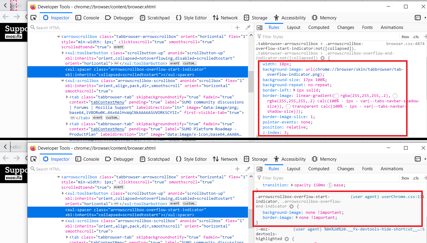
Maybe set a lower opacity (opacity: 0.5;) property to make this separator less sharp.
First of all, Thank you very much to core-el for pointing the FF interface inspector out to me! That was exactly what I needed. A start point to go trial and error and find the way to mold FF interface to my liking; changing things around to learn how they work. I have no education on this matter, so I go tinkering everything to learn. What I've got can't get closer to what I wanted, although I know I can continue to go farther.
jscher2000: Thank you for offering help, too! When I read it, I had already found something similar using the inspector. Anyway, I tested your code and works wonderful!
I continued my customization, so I also got rid of the arrows and their container, so it looks more and more like Safari, which I'm definitively ditching, although I still praise its interface and functionality.
I have been able to: -Eliminate the shadows and the arrows all together -More Safari-like side bar -Recreate a blue button on top of side bar w/white text and icons -Change the Reading List orange icon to black in the side bar drop down menu -Increase the high of the tool bar. -Reduced the high of the search bar -Create a fixed separator to the left of the backward arrow so it won't overlap with the three window control buttons when changing the window size -Centering vertically the 3 control buttons in the tool bar -Forced colored icons to render in gray scale in the tool bar -Disappear badges on some tool bar icons (adds blocked count, etc)
Using other (already made) code snippets I inverted the position of the tabs and other things.
Thank you!
jscher2000 said
There is "spacer" element adjacent to the left and right tab scroll buttons. It is 18px wide with gradient fill fade, and is invisible to clicks (pointer events disabled). If you remove the background image and the border image, you can get just a vertical line that looks reasonable to me./* Left and right tab scroll buttons adjacent element Hide gradient fill shadow, make left border visible */ .arrowscrollbox-overflow-start-indicator, .arrowscrollbox-overflow-end-indicator { background-image: none !important; border-image: none !important; }See attached "before and after" screenshot with the Browser Toolbox.
This answer also CAN solve the problem!