

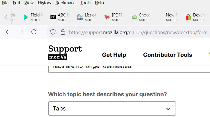
Tabs are no longer delineated
Since updating to the latest version my tabs are all just sitting out in the open without any lines delineating each one and they don't appear to be formatted correctly as per the "MUTED" text which has appeared and is not needed.
Please tell me this is not the new interface.
Выбранное решение
Disable proton in the about:config and you will get some separator lines back between the tabs at least.
WARNING: There are plans to remove this preference in the next two months The preference setting was created as a toggle for developers when building the new design. Now that the new interface has shipped, the preference will be removed.
If you have any issues with the new design, please let us know what it is you don't like, and we can try provide more permanent solutions depending on the issue.
Прочитайте этот ответ в контексте 👍 1Все ответы (7)
Yeah, I have an extension that auto-mutes all tabs by default, so it's annoying that all my tabs suddenly say MUTED under it now in text form, instead of an icon. it's an eyesore and I can't seem to get rid of it.

I also have the original Mute icon as well so the text is pointless. I have 2 mute add-ons and I don't know what causes what.
My main issue is the lack of lines delineating my tabs, around the tab titles which makes the page look messy and harder to work with. I was wondering whether this is part of the new look or whether it can be set back to normal.
Overall this is a terrible upgrade to the appearance of the interface.
Выбранное решение
Disable proton in the about:config and you will get some separator lines back between the tabs at least.
WARNING: There are plans to remove this preference in the next two months The preference setting was created as a toggle for developers when building the new design. Now that the new interface has shipped, the preference will be removed.
If you have any issues with the new design, please let us know what it is you don't like, and we can try provide more permanent solutions depending on the issue.
Изменено Chris Ilias
Thank you for that information.
Why do applications think their users want to constantly chase moving targets as opposed to using what is just a tool and why does every alleged improvement seem to make using the application harder?
Yesss, setting browser.proton.enabled to false adds divider lines AND changes "muted" text to an icon. Double fix! Thanks!
Hi Oldneweng, There are plans to remove this preference in the next two months. The preference setting was created as a toggle for developers when building the new design. Now that the new interface has shipped, the preference will be removed.
To differentiate tabs, there's a Firefox theme on the addons site called Photon Colors, which I found helps a lot.
Go to https://addons.mozilla.org/firefox/addon/photon-colors/ and click on Install Theme.
thanks chris! that solves the color issue, but it looks like changing browser.proton.enabled to false is still necessary to get lines between tabs back and change the "muted" text back to an icon.